

相关文章:
全网最详细超长python学习笔记、14章节知识点很全面十分详细,快速入门,只用看这一篇你就学会了!
【1】windows系统如何安装后缀是whl的python库
【2】超级详细Python-matplotlib画图,手把手教你画图!(线条颜色、大小、线形、标签)
【3】超级详细matplotlib使用教程,手把手教你画图!(多个图、刻度、标签、图例等)
官网参考链接:Pygal — pygal 2.0.0 documentation

基本绘画设置
1. Figure和Subplot
matplotlib的图像都位于Figure对象中,你可以用plt.figure创建一个新的Figure.在subplot上进行绘制
import matplotlib.pyplot as plt
#这时会弹出一个空窗
fig = plt.figure()
#这条代码的意思是:图像应该是2X2的,且当前选中的是第一个
ax1 = fig.add_subplot(2,2,1)

#再绘制两个
ax2 = fig.add_subplot(2,2,2)
ax3 = fig.add_subplot(2,2,3)
plt.show()
如果想添加线性:
from numpy.random import randn
plt.plot(randn(50).cumsum(), 'k--')
#'k--'是一个线型选项,用于告诉matplotlib绘制黑色虚线图。
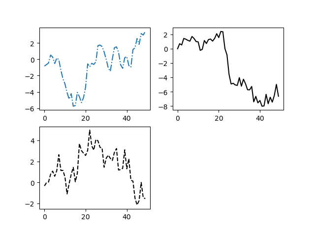
import matplotlib.pyplot as plt
from numpy.random import randn

#'k--'是一个线型选项,用于告诉matplotlib绘制黑色虚线图。
#这时会弹出一个空窗
fig = plt.figure()
#这条代码的意思是:图像应该是2X2的,且当前选中的是第一个
ax1 = fig.add_subplot(2,2,1)
plt.plot(randn(50).cumsum(), linestyle='-.')
#再绘制两个
ax2 = fig.add_subplot(2,2,2)
plt.plot(randn(50).cumsum(), 'k')
ax3 = fig.add_subplot(2,2,3)
plt.plot(randn(50).cumsum(), 'k--')
plt.show()
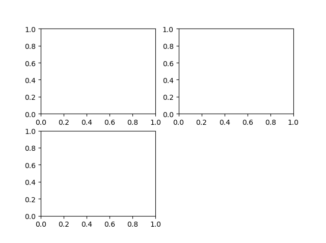
也可以创建一个新的Figure,并返回一个含有已创建subplot对象的NumPy数组:
import matplotlib.pyplot as plt
#创建了一个两行,三列的区域
fig, axes = plt.subplots(2,3)
plt.show()
效果如下:
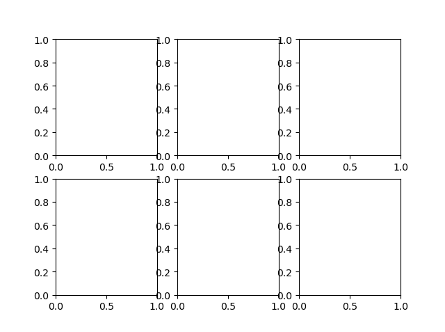
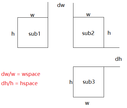
2.调整subplot周围的间距
matplotlib会在subplot外围留下一定的边距,不太美观,利用subplots_adjust方法可以调整间距。
#官网定义:
def subplots_adjust(self, left=None, bottom=None, right=None, top=None, wspace=None, hspace=None)
#wspace, hspace:子图之间的横向间距、纵向间距分别与子图平均宽度、平均高度的比值。
如下图(图中所有子图的宽度和高度对应相等,子图平均宽度和平均高度分别为w和h):
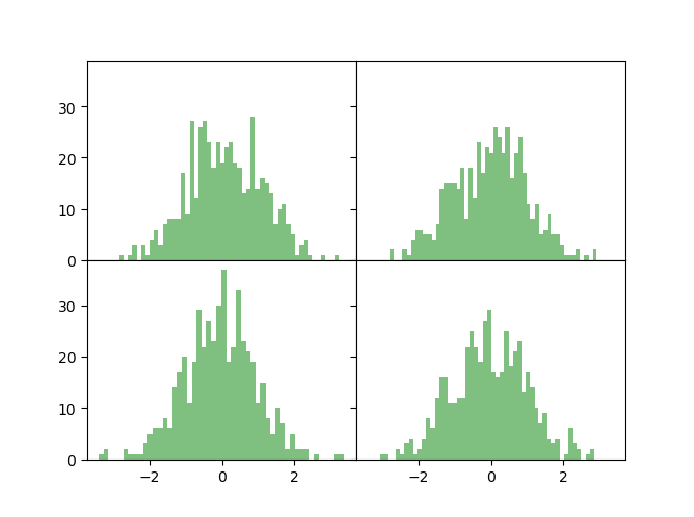
import matplotlib.pyplot as plt
from numpy.random import randn
fig, axes = plt.subplots(2,2, sharex=True, sharey=True)
for i in range(2):
    for j in range(2):
        axes[i,j].hist(randn(500), bins=50, color='g', alpha=0.5)

plt.subplots_adjust(wspace=0, hspace=0)
plt.show()
效果如下:美观很多
3.颜色、标记和线型
根据x,y绘制绿色虚线
import matplotlib.pyplot as plt
import numpy as np
x= np.arange(1, 10, 1)
y=2*x
plt.plot(x, y, 'g--')
#与下面设置是一样的
plt.plot(x, y, linestyle='--', color='g')
plt.show()
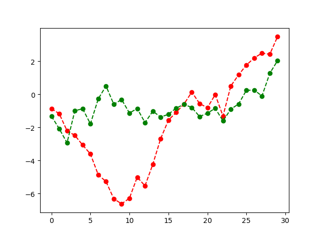
线型图可以加上一些标记,来强调实际的点
import matplotlib.pyplot as plt
import numpy as np
from numpy.random import randn
plt.plot(randn(30).cumsum(), 'ro--')
#等价于
plt.plot(randn(30).cumsum(), color='g', linestyle='dashed', marker='o')
plt.show()
4.刻度、标签和图例
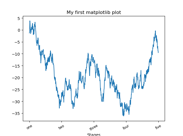
添加刻度和标签
import matplotlib.pyplot as plt
import numpy as np
from numpy.random import randn

fig = plt.figure()
ax = fig.add_subplot(1,1,1)
ax.plot(randn(1000).cumsum())

#修改X轴的刻度
#刻度放在哪些位置
ticks = ax.set_xticks([0,250,500,750,1000])
#也可以将其他值用作标签
labels = ax.set_xticklabels(['one','two','three','four','five'], rotation=30, fontsize='small')

#为X轴设置一个名称
ax.set_title('My first matplotlib plot')
#设置一个标题
ax.set_xlabel('Stages')

plt.show()
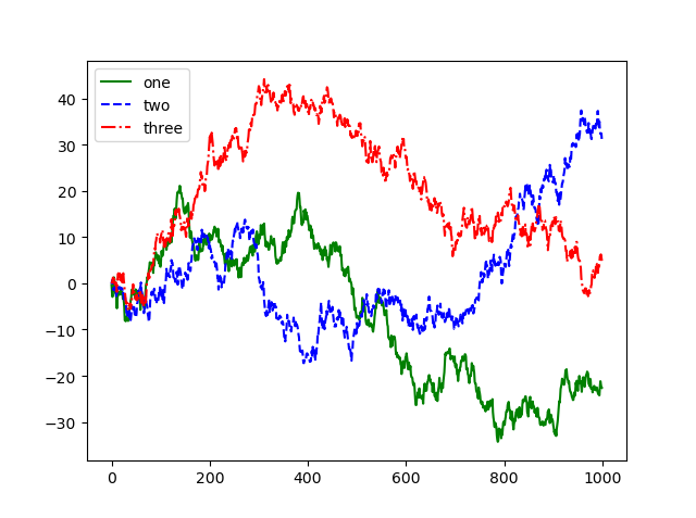
添加图例:
import matplotlib.pyplot as plt
import numpy as np
from numpy.random import randn

fig = plt.figure()
ax = fig.add_subplot(1,1,1)
ax.plot(randn(1000).cumsum(), 'g', label='one')
ax.plot(randn(1000).cumsum(), 'b--', label='two')
ax.plot(randn(1000).cumsum(), 'r-.', label='three')

ax.legend(loc='best')

plt.show()
ax.legend(loc='')
绘制简单的折线图
(1). 函数plot()
import matplotlib.pyplot as plt
squares = [1, 4, 9, 16, 25]
plt.plot(squares)
plt.show()
(2). 修改标签文字和线条粗细
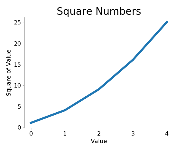
import matplotlib.pyplot as plt
squares = [1, 4, 9, 16, 25]

#参数linewidth 决定了plot() 绘制的线条的粗细
plt.plot(squares, linewidth=5)

设置图表标题, 并给坐标轴加上标签
plt.title("Square Numbers", fontsize=24)
plt.xlabel("Value", fontsize=14)
plt.ylabel("Square of Value", fontsize=14)

设置刻度标记的大小
plt.tick_params(axis='both', labelsize=14)
plt.show()
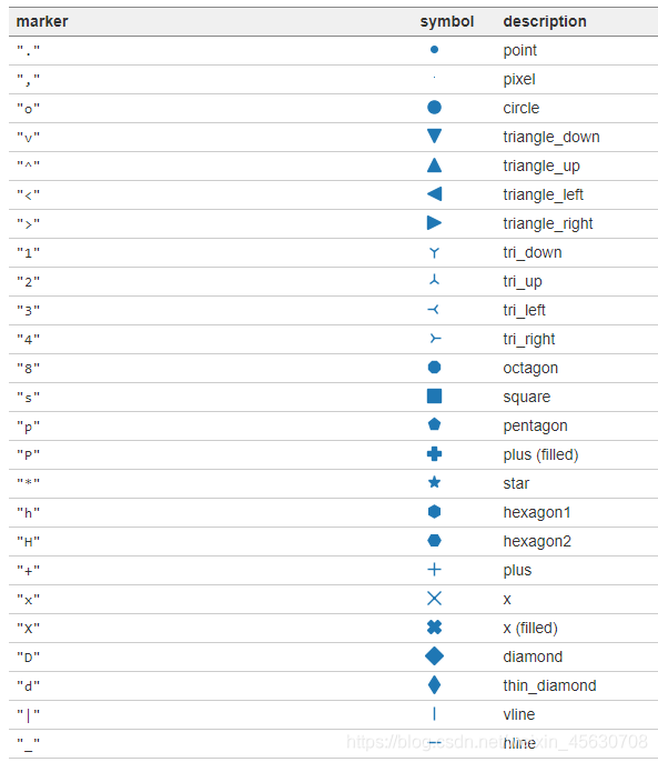
marker标记参数
'.' point marker
',' pixel marker
'o' circle marker
'v' triangle_down marker
'^' triangle_up marker
'<' triangle_left marker '>' triangle_right marker
'1' tri_down marker
'2' tri_up marker
'3' tri_left marker
'4' tri_right marker
's' square marker
'p' pentagon marker
'*' star marker
'h' hexagon1 marker
'H' hexagon2 marker
'+' plus marker
'x' x marker
'D' diamond marker
'd' thin_diamond marker
'|' vline marker
'_' hline marker
</'>
3. 绘制绘制散点图
(1). 使用scatter() 绘制散点图并设置其样式
import matplotlib.pyplot as plt
plt.scatter(2, 4)
plt.show()
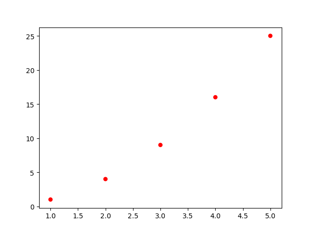
(2).使用scatter() 绘制一系列点
import matplotlib.pyplot as plt

x_values = [1, 2, 3, 4, 5]
y_values = [1, 4, 9, 16, 25]
#并使用实参s 设置了绘制图形时使用的点的尺寸
plt.scatter(x_values, y_values, s=100)
plt.show()
(3).删除数据点的轮廓
可在调用scatter() 时传递实参edgecolor=’none’
plt.scatter(x_values, y_values, edgecolor='none', s=40)
(4).自定义颜色
要修改数据点的颜色, 可向scatter() 传递参数c , 并将其设置为要使用的颜色的名称,
plt.scatter(x_values, y_values, c='red', edgecolor='none', s=40)
(5).使用颜色映射
颜色映射 ( colormap) 是一系列颜色, 它们从起始颜色渐变到结束颜色。
import matplotlib.pyplot as plt

x_values = list(range(1001))
y_values = [x**2 for x in x_values]
plt.scatter(x_values, y_values, c=y_values, cmap=plt.cm.Blues, edgecolor='none', s=40)

设置每个坐标轴的取值范围
plt.axis([0, 1100, 0, 1100000])
plt.show()
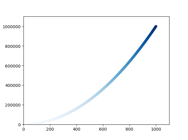
- 我们将参数c 设置成了一个 y 值列表, 并使用参数cmap 告诉pyplot 使用哪个颜色映射。
- 这些代码将 y值较小的点显示为浅蓝色, 并将 y 值较大的点显示为深蓝色.
要让程序自动将图表保存到文件中, 可将对plt.show() 的调用替换为对plt.savefig() 的调用
plt.savefig('squares_plot.png', bbox_inches='tight')
- 第一个实参指定要以什么样的文件名保存图表, 这个文件将存储到scatter_squares.py所在的目录中;
- 第二个实参指定将图表多余的空白区域裁剪掉。 如果要保留图表周围多余的空白区域, 可省略这个实参。
(6). 隐藏坐标轴
plt.axes().get_xaxis().set_visible(False)
plt.axes().get_yaxis().set_visible(False)
(7). 调整尺寸以适合屏幕
函数figure() 用于指定图表的宽度、 高度、 分辨率和背景色。
你需要给形参figsize 指定一个元组, 向matplotlib指出绘图窗口的尺寸, 单位为英寸。
plt.figure(figsize=(10, 6))
3. 随机漫步
choice()函数
#choice([0, 1, 2, 3, 4]) 随机地选择一个0~4之间的整数
x_distance = choice([0, 1, 2, 3, 4])
range()函数
返回一系列连续增加的整数
randint()函数
返回一个1和面数之间的随机数
Original: https://blog.csdn.net/sinat_39620217/article/details/115670663
Author: 汀、
Title: 【3】超级详细matplotlib使用教程,手把手教你画图!(多个图、刻度、标签、图例等)
原创文章受到原创版权保护。转载请注明出处:https://www.johngo689.com/769270/
转载文章受原作者版权保护。转载请注明原作者出处!