

Python:matplotlib分组Bar柱状图
import numpy as np
import matplotlib.pyplot as plt
def get_data(size):
border = 80
x = np.linspace(start=1, stop=size, endpoint=True, num=size, dtype=np.int)
x = np.arange(start=1, stop=size+1, step=1, dtype=np.int)
y1 = np.random.randint(low=border, high=100, size=size)
y2 = np.random.randint(low=50, high=border, size=size)
ret = (x, y1, y2)
return ret
def text_value(ax, bar):
for rect in bar:
height = rect.get_height()
ax.annotate(text='{}’.format(height),
xy=(rect.get_x() + rect.get_width() / 2, height), # 放置文本的坐标位置
xytext=(0, 10), # 竖直方向再偏移10个point
textcoords=”offset points”,
size=35,
color=’purple’,
horizontalalignment=’center’,
verticalalignment=’bottom’)
def main():
plt.rcParams[‘font.sans-serif’] = [‘SimHei’] # 中文乱码
plt.rcParams[‘axes.unicode_minus’] = False # 正负号
data = get_data(5)
x = data[0]
y1 = data[1]
y2 = data[2]
fig, ax = plt.subplots(figsize=(15, 10))
bar_width = 0.4 # 每个柱Bar的宽度
b1 = ax.bar(x=x – bar_width / 2, height=y1, width=bar_width, label=’柱1′, color=’blue’, edgecolor=’yellow’)
b2 = ax.bar(x=x + bar_width / 2, height=y2, width=bar_width, label=’柱2′, color=’green’, edgecolor=’red’)
ax.set_title(‘分组Bar柱状图’, color=’red’, size=30)
ax.set_xlabel(‘X坐标轴’, size=35, color=’black’)
ax.set_ylabel(‘Y坐标轴’, size=30, color=’green’)
ax.set_xticks(x)
ax.set_xticklabels(labels=list(‘zhang’), rotation=-45, size=35, color=’gray’)
ax.set_yticks(ticks=np.linspace(start=30, stop=120, endpoint=True, num=10, dtype=np.int))
ax.legend(loc=’upper right’)
text_value(ax, b1)
text_value(ax, b2)
顶部和右部的边框线消失
ax.spines[‘top’].set_visible(False)
ax.spines[‘right’].set_visible(False)
ax.spines[‘left’].set_color(‘red’)
ax.spines[‘left’].set_linewidth(5)
ax.spines[‘bottom’].set_linewidth(10)
fig.tight_layout(h_pad=None)
画网格
ax.grid(axis=’x’, linestyle=’–‘, linewidth=3, color=’red’) # 显示竖直的网格线
ax.grid(axis=’y’, linestyle=’:’, linewidth=1, color=’gray’, which=’major’) # 显示水平的网格线
ax.axhline(y=80, xmin=0, xmax=0.5, linestyle=’–‘, linewidth=15, color=’red’) # 水平加强线
ax.axvline(x=4, ymin=0, ymax=1, linestyle=’–‘, linewidth=15, color=’yellow’) # 竖直加强线
plt.show()
if name == ‘main‘:
main()
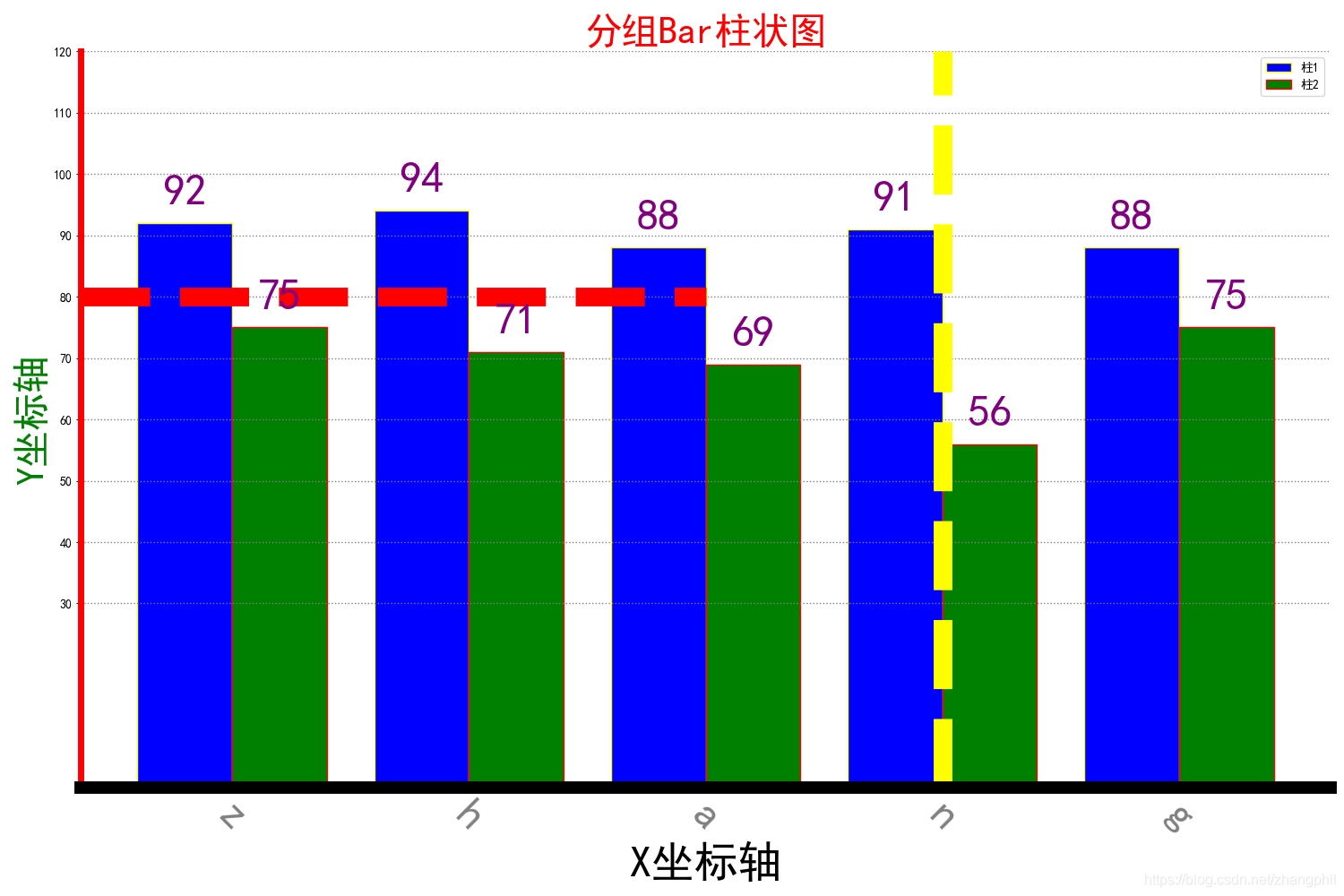
输出结果如图:

Original: https://blog.csdn.net/weixin_42452483/article/details/113967880
Author: 新职语
Title: pythonmatplotlib柱状图_Python:matplotlib分组Bar柱状图
原创文章受到原创版权保护。转载请注明出处:https://www.johngo689.com/769141/
转载文章受原作者版权保护。转载请注明原作者出处!