

仅作为学习笔记
学习资料:
https://datawhalechina.github.io/fantastic-matplotlib/
1. matplotlib的三层api
用Artist对象在画布(canvas)上绘制(Render)图形
绘图区:matplotlib.backend_bases.FigureCanvas
渲染器(画笔):matplotlib.backend_bases.Renderer
图表组件:matplotlib.artist.Artist
2. Artist的分类
- primitive:曲线Line2D,文字text,矩形Rectangle,图像image等标准图形对象。
- container:图形figure、坐标系Axes和坐标轴Axis等基本要素。


常见Artist类
第一列:图表
第二列:artist类
第三列:artist类中的容器
Axes helper methodArtistContainerbar – bar chartsRectangleax.patcheserrorbar – error bar plotsLine2D and Rectangleax.lines and ax.patchesfill – shared areaPolygonax.patcheshist – histogramsRectangleax.patchesimshow – image dataAxesImageax.imagesplot – xy plotsLine2Dax.linesscatter – scatter chartsPolyCollectionax.collections
; 3. 基本元素(primitives)
曲线-Line2D
矩形-Rectangle
多边形-Polygon
图像-image
1.2DLines-曲线
曲线绘制通过类matplotlib.lines.Line2D
matplotlib中线-line的含义:它表示的可以是连接所有顶点的实线样式,也可以是每个顶点的标记。
官网给出的构造函数:
class matplotlib.lines.Line2D(xdata, ydata, linewidth=None, linestyle=None,
color=None, marker=None, markersize=None, markeredgewidth=None,
markeredgecolor=None, markerfacecolor=None, markerfacecoloralt='none',
fillstyle=None, antialiased=None, dash_capstyle=None, solid_capstyle=None,
dash_joinstyle=None, solid_joinstyle=None, pickradius=5, drawstyle=None,
markevery=None, **kwargs)
常用的的参数有:
- xdata:需要绘制的line中点的在x轴上的取值,若忽略,则默认为range(1,len(ydata)+1)
- ydata:需要绘制的line中点的在y轴上的取值
- linewidth:线条的宽度
- linestyle:线型
- color:线条的颜色
- marker:点的标记,详细可参考markers API
- markersize:标记的size
如何设置Line2D的属性?
- 直接在plot()函数中设置
- 通过获得线对象,对线对象进行设置
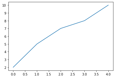
x = range(0,5)
y = [2,5,7,8,10]
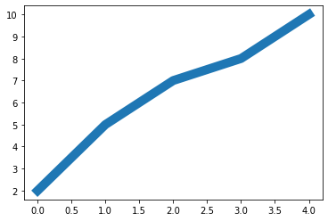
plt.plot(x,y, linewidth=10);
- 通过获得线对象,对线对象进行设置
x = range(0,5)
y = [2,5,7,8,10]
line, = plt.plot(x, y, '-')
line.set_antialiased(False);
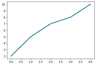
- 获得线属性,使用setp()函数设置
x = range(0,5)
y = [2,5,7,8,10]
lines = plt.plot(x, y)
plt.setp(lines, color='r', linewidth=10);
如何绘制lines?
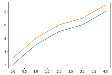
- 绘制直线line
x = range(0,5)
y1 = [2,5,7,8,10]
y2= [3,6,8,9,11]

fig,ax= plt.subplots()
ax.plot(x,y1)
ax.plot(x,y2)
print(ax.lines);
[<matplotlib.lines.Line2D object at 0x000002009D47F070>,
<matplotlib.lines.Line2D object at 0x000002009D47F400>]
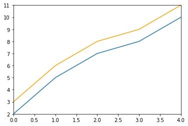
x = range(0,5)
y1 = [2,5,7,8,10]
y2= [3,6,8,9,11]
fig,ax= plt.subplots()
lines = [Line2D(x, y1), Line2D(x, y2,color='orange')]
for line in lines:
    ax.add_line(line)
ax.set_xlim(0,4)
ax.set_ylim(2, 11);
- errorbar绘制误差折线图
类errorbar
官网给出的构造函数:
matplotlib.pyplot.errorbar(x, y, yerr=None, xerr=None, fmt='',
ecolor=None, elinewidth=None, capsize=None, barsabove=False,
lolims=False, uplims=False, xlolims=False, xuplims=False,
errorevery=1, capthick=None, *, data=None, **kwargs)
主要的参数:
- x:需要绘制的line中点的在x轴上的取值
- y:需要绘制的line中点的在y轴上的取值
- yerr:指定y轴水平的误差
- xerr:指定x轴水平的误差
- fmt:指定折线图中某个点的颜色,形状,线条风格,例如’co–’
- ecolor:指定error bar的颜色
- elinewidth:指定error bar的线条宽度
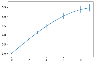
fig = plt.figure()
x = np.arange(10)
y = 2.5 * np.sin(x / 20 * np.pi)
yerr = np.linspace(0.05, 0.2, 10)
plt.errorbar(x, y + 3, yerr=yerr, label='both limits (default)');
2.patches
二维图像类matplotlib.patches.Patch
- 矩形Rectangle:直方图hist,柱状图bar。
class matplotlib.patches.Rectangle(xy, width, height, angle=0.0, **kwargs)
hist-直方图
matplotlib.pyplot.hist(x,bins=None,range=None, density=None, bottom=None,
histtype='bar', align='mid', log=False, color=None, label=None,
stacked=False, normed=None)
x: 数据集
bins: 统计的区间分布;
range: tuple, 显示的区间,bins=None时生效;
density: 默认false显示的是频数统计结果,True显示频率统计结果。频率统计结果=区间数目/(总数*区间宽度),和normed效果一致,官方推荐使用density;
histtype: 可选{‘bar’, ‘barstacked’, ‘step’, ‘stepfilled’}之一,默认bar,推荐使用默认配置,step使用的是梯状,stepfilled对梯状内部填充;
align: 可选{‘left’, ‘mid’, ‘right’}之一,默认’mid’,控制柱状图的水平分布,left或者right,会有部分空白区域,推荐使用默认;
log: 默认False,即y坐标轴是否选择指数刻度;
stacked: 默认为False,是否为堆积状图;
x=np.random.randint(0,100,100)
bins=np.arange(0,101,10)
plt.hist(x,bins,color='fuchsia',alpha=0.5)
plt.xlabel('scores')
plt.ylabel('count')
plt.xlim(0,100);

柱状图bar
matplotlib.pyplot.bar(left, height, alpha=1, width=0.8,
color=, edgecolor=, label=, lw=3)
left:x轴的位置序列;
height:y轴的数值序列;
alpha:透明度,值越小越透明;
width:柱形图的宽度;
color或facecolor:填充的颜色;
edgecolor:边缘颜色;
label:解释每个图像代表的含义,这个参数是为legend()函数做铺垫的。
y = range(1,17)
plt.bar(np.arange(16), y, alpha=0.5, width=0.5, color='yellow', edgecolor='red', label='The First Bar', lw=3);
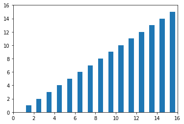
fig = plt.figure()
ax1 = fig.add_subplot(111)

for i in range(1,17):
    rect =  plt.Rectangle((i+0.25,0),0.5,i)
    ax1.add_patch(rect)
ax1.set_xlim(0, 16)
ax1.set_ylim(0, 16);
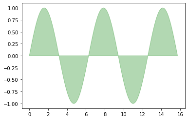
- *多边形Polygon
class matplotlib.patches.Polygon(xy, closed=True, **kwargs)
matplotlib.patches.Polygon类中常用的是fill类,它是基于xy绘制一个填充的多边形
x = np.linspace(0, 5 * np.pi, 1000)
y = np.sin(x)
plt.fill(x, y, color = "g", alpha = 0.3);
- *契形Wedge
一个Wedge契形 是以坐标x,y为中心,半径为r,从θ1扫到θ2(单位是度)。
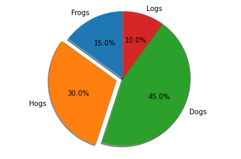
饼状图
matplotlib.pyplot.pie(x, explode=None, labels=None, colors=None, autopct=None, pctdistance=0.6, shadow=False, labeldistance=1.1, startangle=0, radius=1, counterclock=True, wedgeprops=None, textprops=None, center=0, 0, frame=False, rotatelabels=False, *, normalize=None, data=None)
x:契型的形状,一维数组;
explode:如果不是等于None,则是一个len(x)数组,它指定用于偏移每个楔形块的半径的分数;
labels:用于指定每个契型块的标记,取值是列表或为None;
colors:饼图循环使用的颜色序列。如果取值为None,将使用当前活动循环中的颜色;
startangle:饼状图开始的绘制的角度。
labels = 'Frogs', 'Hogs', 'Dogs', 'Logs'
sizes = [15, 30, 45, 10]
explode = (0, 0.1, 0, 0)
fig1, ax1 = plt.subplots()
ax1.pie(sizes, explode=explode, labels=labels, autopct='%1.1f%%', shadow=True, startangle=90)
ax1.axis('equal');
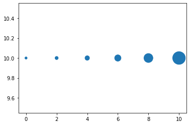
3. collections
绘制散点图
Axes.scatter(self, x, y, s=None, c=None, marker=None, cmap=None, norm=None, vmin=None, vmax=None, alpha=None, linewidths=None, verts=, edgecolors=None, *, plotnonfinite=False, data=None, **kwargs)
x:数据点x轴的位置;
y:数据点y轴的位置;
s:尺寸大小;
c:可以是单个颜色格式的字符串,也可以是一系列颜色;
marker: 标记的类型。
x = [0,2,4,6,8,10]
y = [10]*len(x)
s = [20*2**n for n in range(len(x))]
plt.scatter(x,y,s=s) ;
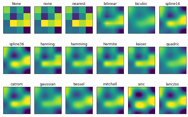
4. images
imshow可以根据数组绘制成图像
使用imshow画图时首先需要传入一个数组,数组对应的是空间内的像素位置和像素点的值,interpolation参数可以设置不同的差值方法,具体效果如下。
methods = [None, 'none', 'nearest', 'bilinear', 'bicubic', 'spline16',
           'spline36', 'hanning', 'hamming', 'hermite', 'kaiser', 'quadric',
           'catrom', 'gaussian', 'bessel', 'mitchell', 'sinc', 'lanczos']
grid = np.random.rand(4, 4)
fig, axs = plt.subplots(nrows=3, ncols=6, figsize=(9, 6),
                        subplot_kw={'xticks': [], 'yticks': []})
for ax, interp_method in zip(axs.flat, methods):
    ax.imshow(grid, interpolation=interp_method, cmap='viridis')
    ax.set_title(str(interp_method))
plt.tight_layout();
4. 对象容器(Object container)
1. Figure容器
fig = plt.figure()
ax1 = fig.add_subplot(211)
ax2 = fig.add_axes([0.1, 0.1, 0.7, 0.3])
print(ax1)
print(fig.axes)
AxesSubplot(0.125,0.536818;0.775×0.343182)
[AxesSubplot:, Axes:]

fig = plt.figure()
ax1 = fig.add_subplot(211)
for ax in fig.axes:
    ax.grid(True)
Figure.patch属性:Figure的背景矩形
Figure.axes属性:一个Axes实例的列表(包括Subplot)
Figure.images属性:一个FigureImages patch列表
Figure.lines属性:一个Line2D实例的列表(很少使用)
Figure.legends属性:一个Figure Legend实例列表(不同于Axes.legends)
Figure.texts属性:一个Figure Text实例列表
2. Axes容器
决定了绘图区域的形状、背景和边框。
fig = plt.figure()
ax = fig.add_subplot(111)
rect = ax.patch
rect.set_facecolor('green')

Axes容器的常见属性有:
artists: Artist实例列表
patch: Axes所在的矩形实例
collections: Collection实例
images: Axes图像
legends: Legend 实例
lines: Line2D 实例
patches: Patch 实例
texts: Text 实例
xaxis: matplotlib.axis.XAxis 实例
yaxis: matplotlib.axis.YAxis 实例
3. Axis容器
包括坐标轴上的刻度线、刻度label、坐标网格、坐标轴标题。
from IPython.core.interactiveshell import InteractiveShell
InteractiveShell.ast_node_interactivity = "all"

fig, ax = plt.subplots()
x = range(0,5)
y = [2,5,7,8,10]
plt.plot(x, y, '-')

axis = ax.xaxis
axis.get_ticklocs()
axis.get_ticklabels()
axis.get_ticklines()
axis.get_data_interval()
axis.get_view_interval()
array([-0.2, 4.2])
4. Tick容器
matplotlib.axis.Tick是从Figure到Axes到Axis到Tick中最末端的容器对象。
Tick包含了tick、grid line实例以及对应的label。
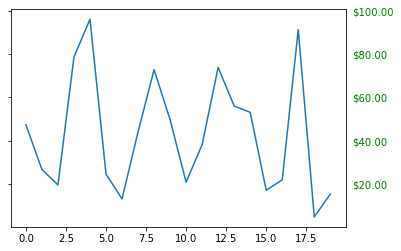
如何将Y轴右边轴设为主轴,并将标签设置为美元符号且为绿色?
fig, ax = plt.subplots()
ax.plot(100*np.random.rand(20))

formatter = matplotlib.ticker.FormatStrFormatter('$%1.2f')
ax.yaxis.set_major_formatter(formatter)

ax.yaxis.set_tick_params(which='major', labelcolor='green',
                         labelleft=False, labelright=True);
思考题
- primitives 和 container的区别和联系是什么,分别用于控制可视化图表中的哪些要素?
primitive是基本要素(在绘图区作图用到的标准图形对象:曲线Line2D,文字text,矩形Rectangle,图像image等),container是容器(包括图形figure、坐标系Axes和坐标轴Axis)包含基本要素。 - 使用提供的drug数据集,对第一列yyyy和第二列state分组求和,画出下面折线图。PA加粗标黄,其他为灰色。
图标题和横纵坐标轴标题,以及线的文本暂不做要求。
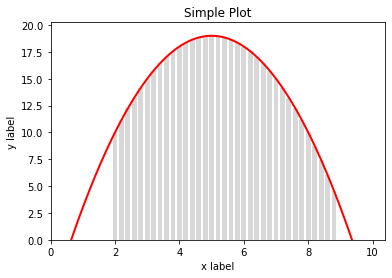
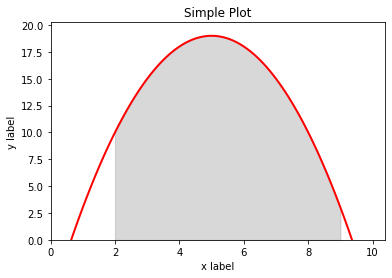
没有学过数据处理,不知道怎么分组求和。 - 分别用一组长方形柱和填充面积的方式模仿画出下图,函数 y = -1 * (x – 2) * (x – 8) +10 在区间[2,9]的积分面积。
参考代码:https://blog.csdn.net/Lumos_why/article/details/122523947
import matplotlib.pyplot as plt

x = np.arange(0,10,0.1)
y = -1 * (x - 2) * (x - 8) + 10
x2 = np.arange(2,9,0.2)
y2 = -1 * (x2 - 2) * (x2 - 8) + 10

fig,ax = plt.subplots()
ax.plot(x,y,color = 'red')
ax.bar(x2,y2,width = 0.15,alpha = 0.3,color = 'gray')

ax.set_xlabel('x label')
ax.set_ylabel('y label')
ax.set_title('Simple Plot')
ax.set_xlim(0)
ax.set_ylim(0)
plt.show()
x = np.arange(0,10,0.1)
y = -1 * (x - 2) * (x - 8) + 10
x2 = np.arange(2,9,0.1)
y2 = -1 * (x2 - 2) * (x2 - 8) + 10

fig,ax = plt.subplots()
ax.plot(x,y,color = 'red')
ax.fill_between(x3,y3,0,color = 'gray',alpha = 0.3)

ax.set_xlabel('x label')
ax.set_ylabel('y label')
ax.set_title('Simple Plot')
ax.set_xlim(0)
ax.set_ylim(0)
plt.show()
Original: https://blog.csdn.net/qq_47978640/article/details/123519374
Author: 以后会改
Title: 数据可视化Day2:艺术画笔见乾坤
原创文章受到原创版权保护。转载请注明出处:https://www.johngo689.com/767328/
转载文章受原作者版权保护。转载请注明原作者出处!