

文章目录
概念
预测模型的区分度(discrimination)
预测模型的区分度(discrimination)是用于反映模型区分阳性样本和阴性样本的能力。一个预测模型的输出中,如果阳性样本的预测值明显大于阴性样本的预测值,我们呈这个模型有较好的区分度。通常,预测模型的区分度由concordance index衡量(AKA. C-index, Harrell’s C-index, concordance C, C statistic)。ROC曲线(Receiver Operating Characteristic curve)是反映敏感性和特异性的综合指标。ROC曲线下面积(area under ROC curve, AUC)在二分类模型中等价于C-index,是用于评价诊断性(diagnostic)模型区分度的常用指标。
ROC曲线
给定一个预测模型,通过选择不同的阈值(threshold probability, pt),可以得到数对真阳性率(true positive rate, TPR)和假阳性率(false positive rate, FPR)。以假阳性率为横坐标,真阳性率为纵坐标,数对TPR和FPR的点相连,即为ROC曲线。多数情况下,样本量并不会很大,因此ROC曲线大多为阶梯状的。AUC可以通过简单的积分求得。
AUC的置信区间
样本量较大时,AUC的分布近似正态。因此,AUC的100(1–α)%置信区间可使用标准正态分布计算:
A U C ± Z α / 2 ∗ S E ( A U C ) AUC±Z_{\alpha/2}SE(AUC)A U C ±Z α/2 ∗S E (A U C )
Hanley和McNeil在1982年提出了一种计算AUC标准误的方式
Hanley JA, McNeil BJ. The meaning and use of the area under a receiver operating characteristic (ROC) curve. Radiology. 1982;143(1):29-36.
令N1为阳性样本的数量,N2为阴性样本的数量,AUC的标准误由以下公式计算:
S E ( A U C ) = A U C ( 1 − A U C ) + ( N 1 − 1 ) ( Q 1 − A U C 2 ) + ( N 2 − 1 ) ( Q 2 − A U C 2 ) N 1 N 2 w h e r e Q 1 = A U C 2 − A U C , Q 2 = 2 ∗ A U C 2 1 + A U C SE(AUC) = \sqrt{\frac{AUC(1-AUC)+(N_1-1)(Q_1-AUC^2)+(N_2-1)(Q_2-AUC^2)}{N_1N_2}} \ where\ Q_1 = \frac{AUC}{2-AUC},\ Q_2 = \frac{2*AUC^2}{1+AUC}S E (A U C )=N 1 N 2 A U C (1 −A U C )+(N 1 −1 )(Q 1 −A U C 2 )+(N 2 −1 )(Q 2 −A U C 2 )w h e r e Q 1 =2 −A U C A U C ,Q 2 =1 +A U C 2 ∗A U C 2
Python实现
ROC坐标点和AUC计算
scikit-learn库的roc_curve()用于生成ROC曲线的每个坐标点(而不是直接绘制出ROC曲线),roc_auc_score()用于计算AUC值
from sklearn.metrics import roc_curve, roc_auc_score

FPR, TPR, _ = roc_curve(label, pred_prob, pos_label = 1)
AUC = roc_auc_score(label, pred_prob)
AUC的95%置信区间
from scipy.stats import norm
import numpy as np
def AUC_CI(auc, label, alpha = 0.05):
    label = np.array(label)
    n1, n2 = np.sum(label == 1), np.sum(label == 0)
    q1 = auc / (2-auc)
    q2 = (2 * auc ** 2) / (1 + auc)
    se = np.sqrt((auc * (1 - auc) + (n1 - 1) * (q1 - auc ** 2) + (n2 -1) * (q2 - auc ** 2)) / (n1 * n2))
    confidence_level = 1 - alpha
    z_lower, z_upper = norm.interval(confidence_level)
    lowerb, upperb = auc + z_lower * se, auc + z_upper * se
    return (lowerb, upperb)
绘制曲线
import matplotlib.pyplot as plt
def plot_AUC(ax, FPR, TPR, AUC, CI, label):
    label = '{}: {} ({}-{})'.format(str(label), round(AUC, 3), round(CI[0], 3), round(CI[1], 3))
    ax.plot(FPR, TPR, label = label)
    return ax
实战操作
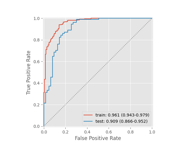
使用scikit-learn的乳腺癌数据集(569个样本,每个样本30个特征,357个阳性样本,212个阴性样本)训练一个二分类逻辑回归模型
1.引用需要使用的第三方库
from sklearn.datasets import load_breast_cancer
from sklearn.model_selection import train_test_split
from sklearn.linear_model import LogisticRegression
from sklearn.metrics import roc_curve, roc_auc_score
from scipy.stats import norm
import numpy as np
import matplotlib.pyplot as plt
2.导入数据集,按7:3拆分训练集和测试集。因为用30个特征预测效果太好了,所以只用2个特征训练模型演示ROC。使用训练集拟合模型,并预测训练集和验证集样本。
features, label = load_breast_cancer(return_X_y = True)
features_train, features_test, label_train, label_test = train_test_split(features[:, :2], label, test_size = 3 / 10, random_state = 1)

LR_model = LogisticRegression(solver = 'liblinear', class_weight = 'balanced').fit(features_train, label_train)
pred_prob_train = LR_model.predict_proba(features_train)[:,1]
pred_prob_test = LR_model.predict_proba(features_test)[:,1]
3.计算ROC曲线相关参数
FPR_train, TPR_train, _ = roc_curve(label_train, pred_prob_train, pos_label = 1)
AUC_train = roc_auc_score(label_train, pred_prob_train)
CI_train = AUC_CI(AUC_train, label_train, 0.05)

FPR_test, TPR_test, _ = roc_curve(label_test, pred_prob_test, pos_label = 1)
AUC_test = roc_auc_score(label_test, pred_prob_test)
CI_test = AUC_CI(AUC_test, label_test, 0.05)
4.绘图
plt.style.use('ggplot')
fig, ax = plt.subplots()
ax = plot_AUC(ax, FPR_train, TPR_train, AUC_train, CI_train, label = 'train')
ax = plot_AUC(ax, FPR_test, TPR_test, AUC_test, CI_test, label = 'test')
5.添加细节
ax.plot((0, 1), (0, 1), ':', color = 'grey')
ax.set_xlim(-0.01, 1.01)
ax.set_ylim(-0.01, 1.01)
ax.set_aspect('equal')
ax.set_xlabel('False Positive Rate')
ax.set_ylabel('True Positive Rate')
ax.legend()
plt.show()
结果图

Original: https://blog.csdn.net/qq_48321729/article/details/123450996
Author: Doct.Y
Title: Python – matplotlib – ROC曲线(Receiver Operating Characteristic curve)
原创文章受到原创版权保护。转载请注明出处:https://www.johngo689.com/766228/
转载文章受原作者版权保护。转载请注明原作者出处!