
align-self属性定义 flex 子项单独在侧轴(纵轴)方向上的对齐方式,可覆盖 align-items 属性。
默认值为 auto,表示继承父元素的 align-items 属性,如果没有父元素,则等同于 stretch。
语法
.item {
  align-self: auto | flex-start | flex-end | center | baseline | stretch;
}
该属性可能取6个值,除了 auto,其他都与 align-items 属性完全一致。
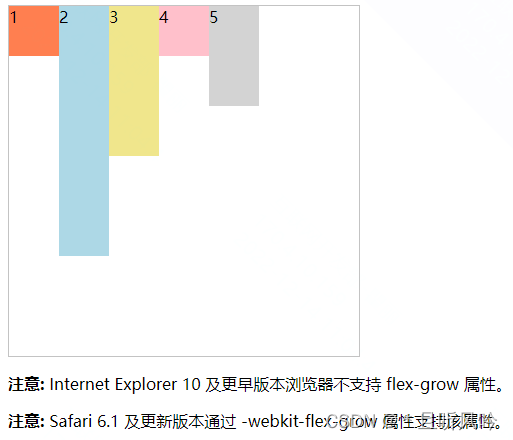
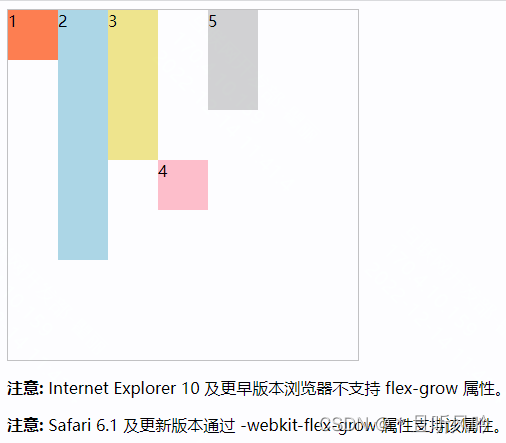
auto
DOCTYPE html>
<html>
<head>
  <style>
    .container {
      width: 350px;
      height: 350px;
      border: 1px solid #c3c3c3;

      display: flex;
      display: -webkit-flex;

        flex-direction: row;

           align-items: baseline;
         }

         .container div { width:50px; }
         .container div:nth-of-type(1) {background-color:coral;height:50px;}
         .container div:nth-of-type(2) {background-color:lightblue;height:250px;}
         .container div:nth-of-type(3) {background-color:khaki;height:150px;}
         .container div:nth-of-type(4) {background-color:pink;height:50px;

            align-self: auto;
          }
            .container div:nth-of-type(5) {background-color:lightgrey;height:100px;}

          style>
        head>
        <body>

          <div class="container">
            <div>1div>
            <div>2div>
            <div>3div>
            <div>4div>
            <div>5div>
          div>

          <p><b>注意:b> Internet Explorer 10 及更早版本浏览器不支持 flex-grow 属性。p>
          <p><b>注意:b> Safari 6.1 及更新版本通过 -webkit-flex-grow 属性支持该属性。p>

        body>
        html>
页面效果:

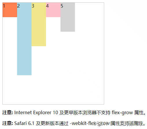
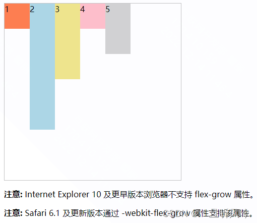
flex-start
DOCTYPE html>
<html>
<head>
  <style>
    .container {
      width: 350px;
      height: 350px;
      border: 1px solid #c3c3c3;

      display: flex;
      display: -webkit-flex;

        flex-direction: row;

           align-items: baseline;
         }

         .container div { width:50px; }
         .container div:nth-of-type(1) {background-color:coral;height:50px;}
         .container div:nth-of-type(2) {background-color:lightblue;height:250px;}
         .container div:nth-of-type(3) {background-color:khaki;height:150px;}
         .container div:nth-of-type(4) {background-color:pink;height:50px;

            align-self: flex-start;
          }
            .container div:nth-of-type(5) {background-color:lightgrey;height:100px;}

          style>
        head>
        <body>

          <div class="container">
            <div>1div>
            <div>2div>
            <div>3div>
            <div>4div>
            <div>5div>
          div>

          <p><b>注意:b> Internet Explorer 10 及更早版本浏览器不支持 flex-grow 属性。p>
          <p><b>注意:b> Safari 6.1 及更新版本通过 -webkit-flex-grow 属性支持该属性。p>

        body>
        html>
页面效果:
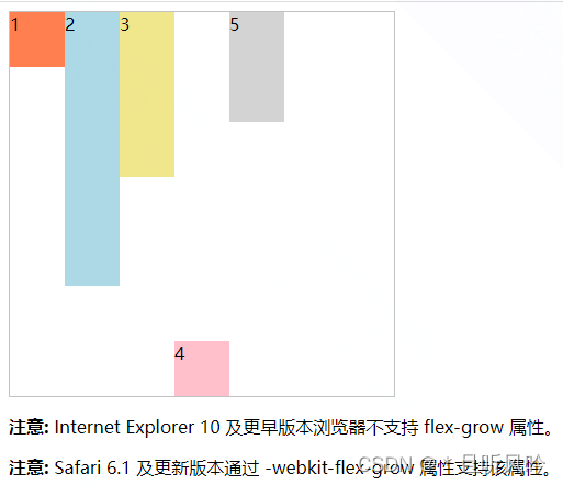
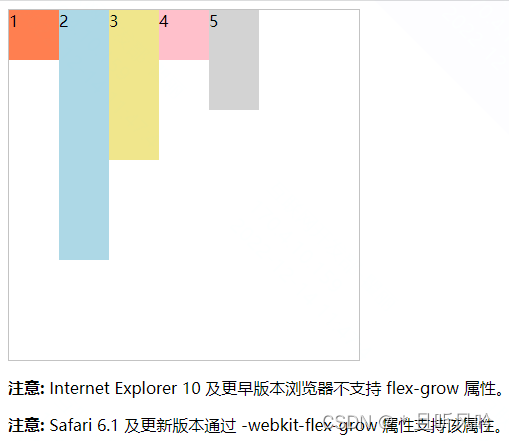
flex-end
DOCTYPE html>
<html>
<head>
  <style>
    .container {
      width: 350px;
      height: 350px;
      border: 1px solid #c3c3c3;

      display: flex;
      display: -webkit-flex;

        flex-direction: row;

           align-items: baseline;
         }

         .container div { width:50px; }
         .container div:nth-of-type(1) {background-color:coral;height:50px;}
         .container div:nth-of-type(2) {background-color:lightblue;height:250px;}
         .container div:nth-of-type(3) {background-color:khaki;height:150px;}
         .container div:nth-of-type(4) {background-color:pink;height:50px;

            align-self: flex-end;
          }
            .container div:nth-of-type(5) {background-color:lightgrey;height:100px;}

          style>
        head>
        <body>

          <div class="container">
            <div>1div>
            <div>2div>
            <div>3div>
            <div>4div>
            <div>5div>
          div>

          <p><b>注意:b> Internet Explorer 10 及更早版本浏览器不支持 flex-grow 属性。p>
          <p><b>注意:b> Safari 6.1 及更新版本通过 -webkit-flex-grow 属性支持该属性。p>

        body>
        html>
页面效果:
center
DOCTYPE html>
<html>
<head>
  <style>
    .container {
      width: 350px;
      height: 350px;
      border: 1px solid #c3c3c3;

      display: flex;
      display: -webkit-flex;

        flex-direction: row;

           align-items: baseline;
         }

         .container div { width:50px; }
         .container div:nth-of-type(1) {background-color:coral;height:50px;}
         .container div:nth-of-type(2) {background-color:lightblue;height:250px;}
         .container div:nth-of-type(3) {background-color:khaki;height:150px;}
         .container div:nth-of-type(4) {background-color:pink;height:50px;

            align-self: center;
          }
            .container div:nth-of-type(5) {background-color:lightgrey;height:100px;}

          style>
        head>
        <body>

          <div class="container">
            <div>1div>
            <div>2div>
            <div>3div>
            <div>4div>
            <div>5div>
          div>

          <p><b>注意:b> Internet Explorer 10 及更早版本浏览器不支持 flex-grow 属性。p>
          <p><b>注意:b> Safari 6.1 及更新版本通过 -webkit-flex-grow 属性支持该属性。p>

        body>
        html>
页面效果:
baseline
页面效果:
; stretch
页面效果:
Original: https://blog.csdn.net/HH18700418030/article/details/126996744
Author: *且听风吟
Title: css flex布局 —— 项目属性 align-self
原创文章受到原创版权保护。转载请注明出处:https://www.johngo689.com/793550/
转载文章受原作者版权保护。转载请注明原作者出处!