

matplotlib绘图库
Matplotlib是绘图库,可以绘制函数图、统计图等。专门用于开发2D/3D图表。在数据挖掘中,其可以将难以理解的大量数据进行可视化,使得结果更加直观。
线性图标
设置图标名称
- plt.title(”)(不可有中文,若要用中文则需修改配置)
- 若用中文,则需修改字体配置plt.rcParams[‘font.sans-serif’]=[某一字体](但还不可表示负号)
- ‘SimHei’:中文黑体
- ‘Kaiti’:中文楷体
- ‘LiSu’:中文隶书
- ‘FangSong’:中文仿宋
- ‘YouYuan’:中文幼圆
- ‘STSong’:华文宋体
- 解决负号问题:plt.rcParams[‘axes.unicode_minus’]=False
创建x轴的数组
创建y轴的数组(用x的关系式表示)
设置x轴和y轴名称
- xlabel()
- ylabel()
- 设置标签文字大小
- fontsize参数:设置文字大小
- linewidth参数:设置线条
设置x,y轴的刻度
matplotlib.pyplot.xticks(ticks=None,labels=None,**kwargs)
matplotlib.pyplot.yticks(ticks=None,labels=None,**kwargs)
作用:把坐标轴变成自己想要的样子
- ticks:xtick位置的列表(索引)
- label:放置在给定刻度线位置的标签(代替原来的x)
- **kwargs:文本属性
- rotation:旋转角度(转参数)
- color:颜色
plt.xticks(range(1,len(time),2),labels=[1,2,3,4,5,6,7,8],rotation=45)
plt.rcParams['font.sans-serif']=['FangSong']
plt.rcParams['axes.unicode_minus']=False
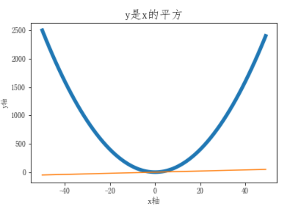
import numpy as np
x = np.arange(-50,50)
import matplotlib.pyplot as plt
y1 = x ** 2
y2 = x
plt.title('y是x的平方',fontsize=16)
plt.xlabel('x轴',fontsize=12)
plt.ylabel('y轴')
plt.plot(x,y1,linewidth=5)
plt.plot(x,y2)

设置图例
plt.legend()
图例是集中于地图一角或一侧的地图上各种符号和颜色所代表内容与指标的说明,有助于更好的认识地图
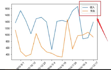
plt.plot(times,income,label='收入')
plt.plot(times,expenses,label='支出')
plt.legend()
图例位置设置
- 一般取’best’(默认)
- loc=’XXX’
- ‘best’:0
- ‘upper right’:1
- upper left:2
- ‘lower left’:3
- ‘lower right’:4
- ‘right’:5
- ‘center left’:6
- ‘center right’:7
- ‘lower center’:8
- ‘upper center’:9
- ‘center’:10
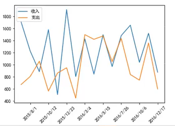
plt.legend(loc='upper left')
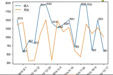
显示每条数据的值(x,y)
plt.text(x,y,string,fontsize=15,verticalalignment=’top’,horizontalalignment=’right’)
for x,y in zip(times,income):
    plt.text(x,y,y)
图片大小和清晰度
plt.figure(figsize=(20,8),dpi=80)#设置图片的长和宽,并设置像素点数(每英寸长度内的像素点数)
散点图
plt.scatter()
- 不同条件(维度)之间的内在关联关系
- 观察数据的离散聚合程度
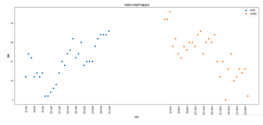
北京2016年3,10月份每天白天的最高气温(分别位于列表a,b):
from matplotlib import pyplot as plt
import matplotlib
matplotlib默认不支持中文字体,需要设置
font = {'family': 'Microsoft YaHei',
        'weight': 'normal',
        'size': '10'}
matplotlib.rc('font', **font)
y_3 = [11, 17, 16, 11, 12, 11, 12, 6, 6, 7, 8, 9, 12, 15, 14, 17, 18, 21, 16, 17, 20, 14, 15, 15, 15, 19, 21, 22, 22, 22, 23]
y_10 = [26, 26, 28, 19, 21, 17, 16, 19, 18, 20, 20, 19, 22, 23, 17, 20, 21, 20, 22, 15, 11, 15, 5, 13, 17, 10, 11, 13, 12, 13, 6]
x_3 = range(1, 32)
x_10 = range(51,82)
#设置图形大小
plt.figure(figsize=(20,8), dpi=80)
散点图
plt.scatter(x_3, y_3, label="3月份")
plt.scatter(x_10, y_10, label="10月份")
#调整x轴的刻度
_x = list(x_3)+list(x_10)
_xticks_labels = ["3月{}日".format(i) for i in range(1, 32)]
_xticks_labels += ["10月{}日".format(i) for i in range(1, 32)]
plt.xticks(_x[::3], _xticks_labels[::3], rotation=270)
添加图例信息
plt.legend(loc="best")
添加描述信息
plt.xlabel("时间")
plt.ylabel("温度")
plt.title("3月和10月的气温变化")
显示
plt.show()
条形图
plt.bar()#竖的条形图
plt.barh()#横的条形图
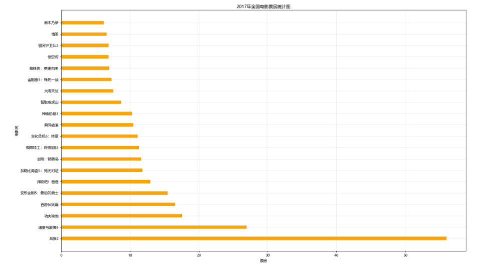
2017年内地电影票房前20的电影(列表a)和电影票房(数据(列表b)
单个图形:
from matplotlib import pyplot as plt
import matplotlib
font = {'family': 'Microsoft YaHei',
        'weight': 'normal',
        'size': '10'}
matplotlib.rc('font', **font)

x = ["战狼2","速度与激情8","功夫瑜伽","西游伏妖篇","变形金刚5:最后的骑士","摔跤吧!爸爸","加勒比海盗5:死无对证","金刚:骷髅岛","极限特工:终极回归","生化危机6:终章","乘风破浪","神偷奶爸3","智取威虎山","大闹天竺","金刚狼3:殊死一战","蜘蛛侠:英雄归来","悟空传","银河护卫队2","情圣","新木乃伊",]
y = [56.01,26.94,17.53,16.49,15.45,12.96,11.8,11.61,11.28,11.12,10.49,10.3,8.75,7.55,7.32,6.99,6.88,6.86,6.58,6.23]

plt.figure(figsize=(20, 15), dpi=80)
绘制条形图
plt.bar(x, y, width=0.3)  # 竖的条形图
plt.barh(x, y, height=0.3, color="orange")  # 横的条形图
plt.grid(alpha=0.3)

显示
plt.ylabel("电影名")
plt.xlabel("票房")
plt.title("2017年全国电影票房统计图")
plt.savefig("./movie.png")
plt.show()
多个图形:
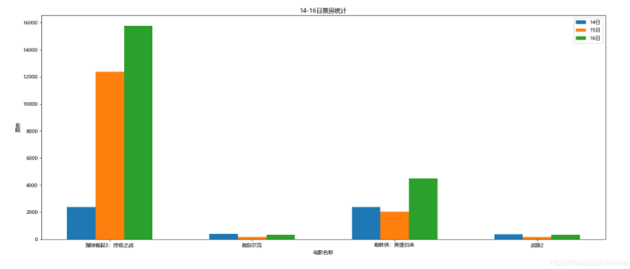
列表a中电影分别在2017-09-14(b_14), 2017-09-15(b_15), 2017-09-16(b_16)三天的票房
from matplotlib import pyplot as plt
import matplotlib

font = {'family': 'Microsoft YaHei',
        'weight': 'normal',
        'size': '10'}
matplotlib.rc('font', **font)

a = ["猩球崛起3:终极之战", "敦刻尔克", "蜘蛛侠:英雄归来", "战狼2"]
b_16 = [15746, 312, 4497, 319]
b_15 = [12357, 156, 2045, 168]
b_14 = [2358, 399, 2358, 362]
bar_width = 0.2
x_14 = list(range(len(a)))
x_15 = [i+bar_width for i in x_14]
x_16 = [i+bar_width*2 for i in x_14]
设置分辨率
plt.figure(figsize=(20, 8), dpi=80)

画条形图
plt.bar(x_14,b_14,width=bar_width,label="14日")
plt.bar(x_15,b_15,width=bar_width,label="15日")
plt.bar(x_16,b_16,width=bar_width,label="16日")
设置x轴刻度
plt.xticks(x_15,a)
设置图例
plt.legend(loc="best")
显示
plt.xlabel("电影名称")
plt.ylabel("票房")
plt.title("14-16日票房统计")
plt.show()
直方图:
ply.hist()
250部电影的时长(列表a中),希望统计出这些电影时长的分布状态
from matplotlib import pyplot as plt
import matplotlib
font = {'family': 'Microsoft YaHei',
        'weight': 'normal',
        'size': '10'}
matplotlib.rc('font', **font)
a = [131,  98, 125, 131, 124, 139, 131, 117, 128, 108, 135, 138, 131, 102, 107, 114, 119, 128, 121, 142, 127, 130, 124, 101, 110, 116, 117, 110, 128, 128, 115,  99, 136, 126, 134,  95, 138, 117, 111,78, 132, 124, 113, 150, 110, 117,  86,  95, 144, 105, 126, 130,126, 130, 126, 116, 123, 106, 112, 138, 123,  86, 101,  99, 136,123, 117, 119, 105, 137, 123, 128, 125, 104, 109, 134, 125, 127,105, 120, 107, 129, 116, 108, 132, 103, 136, 118, 102, 120, 114,105, 115, 132, 145, 119, 121, 112, 139, 125, 138, 109, 132, 134,156, 106, 117, 127, 144, 139, 139, 119, 140,  83, 110, 102,123,107, 143, 115, 136, 118, 139, 123, 112, 118, 125, 109, 119, 133,112, 114, 122, 109, 106, 123, 116, 131, 127, 115, 118, 112, 135,115, 146, 137, 116, 103, 144,  83, 123, 111, 110, 111, 100, 154,136, 100, 118, 119, 133, 134, 106, 129, 126, 110, 111, 109, 141,120, 117, 106, 149, 122, 122, 110, 118, 127, 121, 114, 125, 126,114, 140, 103, 130, 141, 117, 106, 114, 121, 114, 133, 137,  92,121, 112, 146,  97, 137, 105,  98, 117, 112,  81,  97, 139, 113,134, 106, 144, 110, 137, 137, 111, 104, 117, 100, 111, 101, 110,105, 129, 137, 112, 120, 113, 133, 112,  83,  94, 146, 133, 101,131, 116, 111,  84, 137, 115, 122, 106, 144, 109, 123, 116, 111,111, 133, 150]
plt.figure(figsize=(20, 8), dpi=80)
根据组距求出组数
bind_width = 3
num_binds = int((max(a)-min(a))/bind_width)
plt.hist(a, num_binds)
设置x轴的刻度
plt.xticks(range(min(a),max(a)+bind_width,bind_width))
plt.grid()
plt.show()
144, 109, 123, 116, 111,111, 133, 150]
plt.figure(figsize=(20, 8), dpi=80)
根据组距求出组数
bind_width = 3
num_binds = int((max(a)-min(a))/bind_width)
plt.hist(a, num_binds)
设置x轴的刻度
plt.xticks(range(min(a),max(a)+bind_width,bind_width))
plt.grid()
plt.show()

Original: https://blog.csdn.net/weixin_74244187/article/details/127592886
Author: six274
Title: matplotlib绘图库
原创文章受到原创版权保护。转载请注明出处:https://www.johngo689.com/769620/
转载文章受原作者版权保护。转载请注明原作者出处!