

本内容来自《跟着迪哥学Python数据分析与机器学习实战》,该篇博客将其内容进行了整理,加上了自己的理解,所做小笔记。若有侵权,联系立删。
迪哥说以下的许多函数方法都不用死记硬背,多查API多看文档,确实,跟着迪哥混就完事了~~~
Matplotlib菜鸟教程
Matplotlib官网API
以下代码段均在Jupyter Notebook下进行运行操作
每天过一遍,腾讯阿里明天见~
一、常规绘图方法
导入工具包,一般用plt来当作Matplotlib的别名
import matplotlib.pyplot as plt
from mpl_toolkits.mplot3d import Axes3D
import numpy as np
import math
import random
%matplotlib inline
画一个简单的折线图,只需要把二维数据点对应好即可
给定横坐标[1,2,3,4,5],纵坐标[1,4,9,16,25],并且指明x轴与y轴的名称分别为xlabel和ylabel
plt.plot([1,2,3,4,5],[1,4,9,16,25])
plt.xlabel('xlabel',fontsize=16)
plt.ylabel('ylabel')
"""
Text(0, 0.5, 'ylabel')
"""


Ⅰ,细节设置
字符类型-实线-.虚点线.点o圆点^上三角点v下三角点
fontsize表示字体的大小
plt.plot([1,2,3,4,5],[1,4,9,16,25],'-.')

plt.xlabel('xlabel',fontsize=16)
plt.ylabel('ylabel',fontsize=16)
"""
Text(0, 0.5, 'ylabel')
"""

plt.plot([1,2,3,4,5],[1,4,9,16,25],'-.',color='r')
"""
[]
"""

多次调用plot()函数可以加入多次绘图的结果
颜色和线条参数也可以写在一起,例如,”r–”表示红色的虚线
yy = np.arange(0,10,0.5)
plt.plot(yy,yy,'r--')
plt.plot(yy,yy**2,'bs')
plt.plot(yy,yy**3,'go')
"""
[]
"""

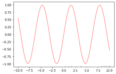
linewidth设置线条宽度
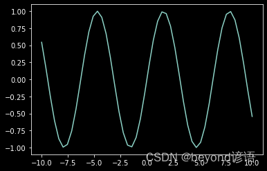
x = np.linspace(-10,10)
y = np.sin(x)

plt.plot(x,y,linewidth=3.0)
"""
[]
"""

plt.plot(x,y,color='b',linestyle=':',marker='o',markerfacecolor='r',markersize=10)
"""
[]
"""

alpha表示透明程度
line = plt.plot(x,y)

plt.setp(line,color='r',linewidth=2.0,alpha=0.4)
"""
[None, None, None]
"""
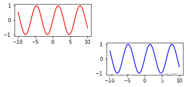
Ⅱ,子图与标注
subplot(211)表示要画的图整体是2行1列的,一共包括两幅子图,最后的1表示当前绘制顺序是第一幅子图
subplot(212)表示还是这个整体,只是在顺序上要画第2个位置上的子图
整体表现为竖着排列
plt.subplot(211)
plt.plot(x,y,color='r')
plt.subplot(212)
plt.plot(x,y,color='b')
"""
[]
"""

横着排列,那就是1行2列了
plt.subplot(121)
plt.plot(x,y,color='r')
plt.subplot(122)
plt.plot(x,y,color='b')
"""
[]
"""

不仅可以创建一行或者一列,还可以创建多行多列
plt.subplot(321)
plt.plot(x,y,color='r')
plt.subplot(324)
plt.plot(x,y,color='b')
"""
[]
"""
在图上加一些标注
plt.plot(x,y,color='b',linestyle=':',marker='o',markerfacecolor='r',markersize=10)
plt.xlabel('x:---')
plt.ylabel('y:---')

plt.title('beyondyanyu:---')

plt.text(0,0,'beyondyanyu')

plt.grid(True)

plt.annotate('beyondyanyu',xy=(-5,0),xytext=(-2,0.3),arrowprops=dict(facecolor='red',shrink=0.05,headlength=20,headwidth=20))
"""
Text(-2, 0.3, 'beyondyanyu')
"""

有时为了整体的美感和需求也可以把网格隐藏起来,通过plt.gca()来获得当前图表,然后改变其属性值
x = range(10)
y = range(10)
fig = plt.gca()
plt.plot(x,y)
fig.axes.get_xaxis().set_visible(False)
fig.axes.get_yaxis().set_visible(False)

随机创建一些数据
x = np.random.normal(loc=0.0,scale=1.0,size=300)
width = 0.5
bins = np.arange(math.floor(x.min())-width, math.ceil(x.max())+width, width)
ax = plt.subplot(111)

ax.spines['top'].set_visible(False)
ax.spines['right'].set_visible(False)

plt.tick_params(bottom='off',top='off',left='off',right='off')

plt.grid()

plt.hist(x,alpha=0.5,bins=bins)
"""
(array([ 0.,  0.,  1.,  3.,  2., 16., 29., 50., 50., 61., 48., 21., 10.,
         6.,  3.]),
 array([-4.5, -4. , -3.5, -3. , -2.5, -2. , -1.5, -1. , -0.5,  0. ,  0.5,
         1. ,  1.5,  2. ,  2.5,  3. ]),
 )
"""

在x轴上,如果字符太多,横着写容易堆叠在一起了,这时可以斜着写
x = range(10)
y = range(10)
labels = ['beyondyanyu' for i in range(10)]
fig,ax = plt.subplots()
plt.plot(x,y)
plt.title('beyondyanyu')
ax.set_xticklabels(labels,rotation=45,horizontalalignment='right')
"""
[Text(-2.0, 0, 'beyondyanyu'),
 Text(0.0, 0, 'beyondyanyu'),
 Text(2.0, 0, 'beyondyanyu'),
 Text(4.0, 0, 'beyondyanyu'),
 Text(6.0, 0, 'beyondyanyu'),
 Text(8.0, 0, 'beyondyanyu'),
 Text(10.0, 0, 'beyondyanyu')]
"""

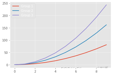
绘制多个线条或者多个类别数据,使用legend()函数给出颜色和类别的对应关系
loc=’best’相当于让工具包自己找一个合适的位置来显示图表中颜色所对应的类别
x = np.arange(10)
for i in range(1,4):
    plt.plot(x,i*x**2,label='Group %d '%i)
plt.legend(loc='best')
"""

"""
help函数,可以直接打印出所有可调参数
print(help(plt.legend))
"""
Help on function legend in module matplotlib.pyplot:
legend(*args, **kwargs)
Place a legend on the axes.
Call signatures::
legend()
legend(labels)
legend(handles, labels)
The call signatures correspond to three different ways how to use
this method.
**1. Automatic detection of elements to be shown in the legend**
The elements to be added to the legend are automatically determined,
when you do not pass in any extra arguments.
In this case, the labels are taken from the artist. You can specify
them either at artist creation or by calling the
:meth:~.Artist.set_label method on the artist::
line, = ax.plot([1, 2, 3], label='Inline label')
ax.legend()
or::
line, = ax.plot([1, 2, 3])
line.set_label('Label via method')
ax.legend()
Specific lines can be excluded from the automatic legend element
selection by defining a label starting with an underscore.
This is default for all artists, so calling .Axes.legend without
any arguments and without setting the labels manually will result in
no legend being drawn.
**2. Labeling existing plot elements**
To make a legend for lines which already exist on the axes
(via plot for instance), simply call this function with an iterable
of strings, one for each legend item. For example::
ax.plot([1, 2, 3])
ax.legend(['A simple line'])
Note: This way of using is discouraged, because the relation between
plot elements and labels is only implicit by their order and can
easily be mixed up.
**3. Explicitly defining the elements in the legend**
For full control of which artists have a legend entry, it is possible
to pass an iterable of legend artists followed by an iterable of
legend labels respectively::
legend((line1, line2, line3), ('label1', 'label2', 'label3'))
Parameters
----------
handles : sequence of .Artist, optional
A list of Artists (lines, patches) to be added to the legend.
Use this together with *labels*, if you need full control on what
is shown in the legend and the automatic mechanism described above
is not sufficient.
The length of handles and labels should be the same in this
case. If they are not, they are truncated to the smaller length.
labels : list of str, optional
A list of labels to show next to the artists.
Use this together with *handles*, if you need full control on what
is shown in the legend and the automatic mechanism described above
is not sufficient.
Returns
-------
~matplotlib.legend.Legend
Other Parameters
----------------
loc : str or pair of floats, default: :rc:legend.loc ('best' for axes, 'upper right' for figures)
The location of the legend.
The strings
.BboxBase, 2-tuple, or 4-tuple of floats
Box that is used to position the legend in conjunction with *loc*.
Defaults to axes.bbox (if called as a method to .Axes.legend) or
figure.bbox (if .Figure.legend). This argument allows arbitrary
placement of the legend.
Bbox coordinates are interpreted in the coordinate system given by
*bbox_transform*, with the default transform
Axes or Figure coordinates, depending on which .BboxBase is given, then it specifies the bbox
matplotlib.font_manager.FontProperties or dict
The font properties of the legend. If None (default), the current
:data:matplotlib.rcParams will be used.
fontsize : int or {'xx-small', 'x-small', 'small', 'medium', 'large', 'x-large', 'xx-large'}
The font size of the legend. If the value is numeric the size will be the
absolute font size in points. String values are relative to the current
default font size. This argument is only used if *prop* is not specified.
labelcolor : str or list
Sets the color of the text in the legend. Can be a valid color string
(for example, 'red'), or a list of color strings. The labelcolor can
also be made to match the color of the line or marker using 'linecolor',
'markerfacecolor' (or 'mfc'), or 'markeredgecolor' (or 'mec').
numpoints : int, default: :rc:legend.numpoints
The number of marker points in the legend when creating a legend
entry for a .Line2D (line).
scatterpoints : int, default: :rc:legend.scatterpoints
The number of marker points in the legend when creating
a legend entry for a .PathCollection (scatter plot).
scatteryoffsets : iterable of floats, default: legend.markerscale
The relative size of legend markers compared with the originally
drawn ones.
markerfirst : bool, default: True
If *True*, legend marker is placed to the left of the legend label.
If *False*, legend marker is placed to the right of the legend label.
frameon : bool, default: :rc:legend.frameon
Whether the legend should be drawn on a patch (frame).
fancybox : bool, default: :rc:legend.fancybox
Whether round edges should be enabled around the ~.FancyBboxPatch which
makes up the legend's background.
shadow : bool, default: :rc:legend.shadow
Whether to draw a shadow behind the legend.
framealpha : float, default: :rc:legend.framealpha
The alpha transparency of the legend's background.
If *shadow* is activated and *framealpha* is legend.facecolor
The legend's background color.
If axes.facecolor.
edgecolor : "inherit" or color, default: :rc:legend.edgecolor
The legend's background patch edge color.
If axes.edgecolor.
mode : {"expand", None}
If *mode* is set to matplotlib.transforms.Transform
The transform for the bounding box (*bbox_to_anchor*). For a value
of ~matplotlib.axes.Axes.transAxes transform will be used.
title : str or None
The legend's title. Default is no title (legend.title_fontsize
The font size of the legend's title.
borderpad : float, default: :rc:legend.borderpad
The fractional whitespace inside the legend border, in font-size units.
labelspacing : float, default: :rc:legend.labelspacing
The vertical space between the legend entries, in font-size units.
handlelength : float, default: :rc:legend.handlelength
The length of the legend handles, in font-size units.
handletextpad : float, default: :rc:legend.handletextpad
The pad between the legend handle and text, in font-size units.
borderaxespad : float, default: :rc:legend.borderaxespad
The pad between the axes and legend border, in font-size units.
columnspacing : float, default: :rc:legend.columnspacing
The spacing between columns, in font-size units.
handler_map : dict or None
The custom dictionary mapping instances or types to a legend
handler. This *handler_map* updates the default handler map
found at matplotlib.legend.Legend.get_legend_handler_map.
Notes
-----
Some artists are not supported by this function. See
:doc:/tutorials/intermediate/legend_guide for details.
Examples
--------
.. plot:: gallery/text_labels_and_annotations/legend.py
None
"""
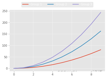
loc参数中还可以指定特殊位置
fig = plt.figure()
ax = plt.subplot(111)

x = np.arange(10)
for i in range(1,4):
    plt.plot(x,i*x**2,label='Group %d'%i)
ax.legend(loc='upper center',bbox_to_anchor=(0.5,1.15),ncol=3)
"""

"""
Ⅲ,风格设置
查看一下Matplotlib有哪些能调用的风格
plt.style.available
"""
['Solarize_Light2',
 '_classic_test_patch',
 'bmh',
 'classic',
 'dark_background',
 'fast',
 'fivethirtyeight',
 'ggplot',
 'grayscale',
 'seaborn',
 'seaborn-bright',
 'seaborn-colorblind',
 'seaborn-dark',
 'seaborn-dark-palette',
 'seaborn-darkgrid',
 'seaborn-deep',
 'seaborn-muted',
 'seaborn-notebook',
 'seaborn-paper',
 'seaborn-pastel',
 'seaborn-poster',
 'seaborn-talk',
 'seaborn-ticks',
 'seaborn-white',
 'seaborn-whitegrid',
 'tableau-colorblind10']
"""
默认的风格代码
x = np.linspace(-10,10)
y = np.sin(x)
plt.plot(x,y)
"""
[]
"""

可以通过plt.style.use()函数来改变当前风格
plt.style.use('dark_background')
plt.plot(x,y)
"""
[]
"""
plt.style.use('bmh')
plt.plot(x,y)
"""
[]
"""

plt.style.use('ggplot')
plt.plot(x,y)
"""
[]
"""

二、常规图表绘制
Ⅰ,条形图
np.random.seed(0)
x = np.arange(5)
y = np.random.randint(-5,5,5)
fig,axes = plt.subplots(ncols=2)
v_bars = axes[0].bar(x,y,color='red')
h_bars = axes[1].bar(x,y,color='red')

axes[0].axhline(0,color='gray',linewidth=2)
axes[1].axhline(0,color='gray',linewidth=2)

plt.show()

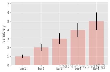
在绘图过程中,有时需要考虑误差棒,以表示数据或者实验的偏离情况,做法也很简单,在bar()函数中,已经有现成的yerr和xerr参数,直接赋值即可:
mean_values = [1,2,3,4,5]
variance = [0.2,0.4,0.6,0.8,1.0]
bar_label = ['bar1','bar2','bar3','bar4','bar5']
x_pos = list(range(len(bar_label)))

plt.bar(x_pos,mean_values,yerr=variance,alpha=0.3)
max_y = max(zip(mean_values,variance))
plt.ylim([0,(max_y[0]+max_y[1])*1.2])

plt.ylabel('variable y')
plt.xticks(x_pos,bar_label)

plt.show()
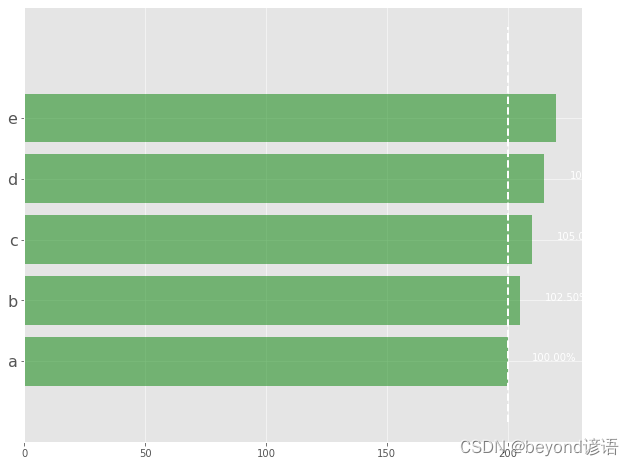
可以加入更多对比细节,先把条形图绘制出来,细节都可以慢慢添加:
data = range(200,225,5)
bar_labels = ['a','b','c','d','e']
fig = plt.figure(figsize=(10,8))
y_pos = np.arange(len(data))
plt.yticks(y_pos,bar_labels,fontsize=16)
bars = plt.barh(y_pos,data,alpha=0.5,color='g')
plt.vlines(min(data),-1,len(data)+0.5,linestyles='dashed')
for b,d in zip(bars,data):
    plt.text(b.get_width()+b.get_width()*0.05,b.get_y()+b.get_height()/2,'{0:.2%}'.format(d/min(data)))

plt.show()
把条形图画得更个性一些,也可以让各种线条看起来不同
patterns = ('-','+','x','\\','*','o','O','.')
mean_value = range(1,len(patterns)+1)
x_pos = list(range(len(mean_value)))
bars = plt.bar(x_pos,mean_value,color='white')
for bar,pattern in zip(bars,patterns):
    bar.set_hatch(pattern)

plt.show()

Ⅱ,盒装图
盒图(boxplot)主要由最小值(min)、下四分位数(Q1)、中位数(median)、上四分位数(Q3)、最大值(max)五部分组成
在每一个小盒图中,从下到上就分别对应之前说的5个组成部分,计算方法如下:
IQR=Q3–Q1,即上四分位数与下四分位数之间的差
min=Q1–1.5×IQR,正常范围的下限
max=Q3+1.5×IQR,正常范围的上限
方块代表异常点或者离群点,离群点就是超出上限或下限的数据点
boxplot()函数就是主要绘图部分
sym参数用来展示异常点的符号,可以用正方形,也可以用加号
vert参数表示是否要竖着画,它与条形图一样,也可以横着画
yy_data = [np.random.normal(0,std,100) for std in range(1,4)]
fig = plt.figure(figsize=(8,6))
plt.boxplot(yy_data,sym='s',vert=True)
plt.xticks([y+1 for y in range(len(yy_data))],['x1','x2','x3'])
plt.xlabel('x')
plt.title('box plot')
"""
Text(0.5, 1.0, 'box plot')
"""

boxplot()函数就是主要绘图部分,查看完整的参数,最直接的办法看帮助文档
参数功能x指定要绘制箱线图的数据notch是否以凹口的形式展现箱线图,默认非凹口sym指定异常点的形状,默认为+号显示vert是否需要将箱线图垂直摆放,默认垂直摆放positions指定箱线图的位置,默认为[0,1,2…]widths指定箱线图的宽度,默认为0.5patch_artist是否填充箱体的颜色meanline是否用线的形式表示均值,默认用点来表示showmeans是否显示均值,默认不显示showcaps是否显示箱线图顶端和末端的两条线,默认显示showbox是否显示箱线图的箱体,默认显示showfliers是否显示异常值,默认显示boxprops设置箱体的属性,如边框色、填充色等labels为箱线图添加标签,类似于图例的作用filerprops设置异常值的属性,如异常点的形状、大小、填充色等medianprops设置中位数的属性,如线的类型、粗细等meanprops设置均值的属性,如点的大小、颜色等capprops设置箱线图顶端和末端线条的属性,如颜色、粗细等
print(help(plt.boxplot))
"""
Help on function boxplot in module matplotlib.pyplot:
boxplot(x, notch=None, sym=None, vert=None, whis=None, positions=None, widths=None, patch_artist=None, bootstrap=None, usermedians=None, conf_intervals=None, meanline=None, showmeans=None, showcaps=None, showbox=None, showfliers=None, boxprops=None, labels=None, flierprops=None, medianprops=None, meanprops=None, capprops=None, whiskerprops=None, manage_ticks=True, autorange=False, zorder=None, *, data=None)
Make a box and whisker plot.
Make a box and whisker plot for each column of *x* or each
vector in sequence *x*. The box extends from the lower to
upper quartile values of the data, with a line at the median.
The whiskers extend from the box to show the range of the
data. Flier points are those past the end of the whiskers.
Parameters
----------
x : Array or a sequence of vectors.
The input data.
notch : bool, default: False
Whether to draw a noteched box plot (True), or a rectangular box
plot (False). The notches represent the confidence interval (CI)
around the median. The documentation for *bootstrap* describes how
the locations of the notches are computed.
.. note::
In cases where the values of the CI are less than the
lower quartile or greater than the upper quartile, the
notches will extend beyond the box, giving it a
distinctive "flipped" appearance. This is expected
behavior and consistent with other statistical
visualization packages.
sym : str, optional
The default symbol for flier points. An empty string ('') hides
the fliers. If None, then the fliers default to 'b+'. More
control is provided by the *flierprops* parameter.
vert : bool, default: True
If True, draws vertical boxes.
If False, draw horizontal boxes.
whis : float or (float, float), default: 1.5
The position of the whiskers.
If a float, the lower whisker is at the lowest datum above
None forces the value of the median for the corresponding
dataset. For entries that are None, the medians are computed
by Matplotlib as normal.
conf_intervals : array-like, optional
A 2D array-like of shape True). For entries that are None,
the notches are computed by the method specified by the other
parameters (e.g., *bootstrap*).
positions : array-like, optional
Sets the positions of the boxes. The ticks and limits are
automatically set to match the positions. Defaults to
False produces boxes with the Line2D artist. Otherwise,
boxes and drawn with Patch artists.
labels : sequence, optional
Labels for each dataset (one per dataset).
manage_ticks : bool, default: True
If True, the tick locations and labels will be adjusted to match
the boxplot positions.
autorange : bool, default: False
When True and the data are distributed such that the 25th and
75th percentiles are equal, *whis* is set to (0, 100) such
that the whisker ends are at the minimum and maximum of the data.
meanline : bool, default: False
If True (and *showmeans* is True), will try to render the
mean as a line spanning the full width of the box according to
*meanprops* (see below). Not recommended if *shownotches* is also
True. Otherwise, means will be shown as points.
zorder : float, default: .Line2D instances created. That dictionary has the
following keys (assuming vertical boxplots):
- 还有一种图形与盒图长得有点相似,叫作小提琴图(violinplot)
小提琴图给人以”胖瘦”的感觉,越”胖”表示当前位置的数据点分布越密集,越”瘦”则表示此处数据点比较稀疏。
小提琴图没有展示出离群点,而是从数据的最小值、最大值开始展示
fig,axes = plt.subplots(nrows=1,ncols=2,figsize=(12,5))
yy_data = [np.random.normal(0,std,100) for std in range(6,10)]
axes[0].violinplot(yy_data,showmeans=False,showmedians=True)
axes[0].set_title('violin plot')

axes[1].boxplot(yy_data)
axes[1].set_title('box plot')

for ax in axes:
    ax.yaxis.grid(True)
ax.set_xticks([y+1 for y in range(len(yy_data))])
ax.set_xticklabels(['x1','x2','x3','x4'])
"""
[Text(1, 0, 'x1'), Text(2, 0, 'x2'), Text(3, 0, 'x3'), Text(4, 0, 'x4')]
"""

Ⅲ,直方图与散点图
直方图(Histogram)可以更清晰地表示数据的分布情况
画直方图的时候,需要指定一个bins,也就是按照什么区间来划分
例如:np.arange(−10,10,5)=array([−10,−5,0,5])
data = np.random.normal(0,20,1000)
bins = np.arange(-100,100,5)
plt.hist(data,bins=bins)
plt.xlim([min(data)-5,max(data)+5])
plt.show()

同时展示不同类别数据的分布情况,也可以分别绘制,但是要更透明一些,否则就会堆叠在一起
data1 = [random.gauss(15,10) for i in range(500)]
data2 = [random.gauss(5,5) for i in range(500)]
bins = np.arange(-50,50,2.5)
plt.hist(data1,bins=bins,label='class 1',alpha=0.3)
plt.hist(data2,bins=bins,label='class 2',alpha=0.3)
plt.legend(loc='best')
plt.show()

通常散点图可以来表示特征之间的相关性,调用 scatter()函数即可
N = 1000
x = np.random.randn(N)
y = np.random.randn(N)
plt.scatter(x,y,alpha=0.3)
plt.grid(True)
plt.show()

Ⅳ,3D图
展示三维数据需要用到3D图
fig = plt.figure()
ax = fig.add_subplot(111,projection='3d')
plt.show()

往空白3D图中填充数据
以不同的视角观察结果,只需在最后加入ax.view_init()函数,并在其中设置旋转的角度即可
np.random.seed(1)

def randrange(n,vmin,vmax):
    return (vmax-vmin)*np.random.rand(n)+vmin

fig = plt.figure()

ax = fig.add_subplot(111,projection='3d')
n = 100

for c,m,zlow,zhigh in [('r','o',-50,-25),('b','x','-30','-5')]:
    xs = randrange(n,23,32)
    ys = randrange(n,0,100)
    zs = randrange(n,int(zlow),int(zhigh))
    ax.scatter(xs,ys,zs,c=c,marker=m)
plt.show()
其他图表的3D图绘制方法相同,只需要调用各自的绘图函数即可
fig = plt.figure()
ax = fig.add_subplot(111,projection='3d')
for c,z in zip(['r','g','b','y'],[30,20,10,0]):
    xs = np.arange(20)
    ys = np.random.rand(20)
    cs = [c]*len(xs)
    ax.bar(xs,ys,zs=z,zdir='y',color=cs,alpha=0.5)
plt.show()

Ⅴ,布局设置
ax1 = plt.subplot2grid((3,3),(0,0))

ax2 = plt.subplot2grid((3,3),(1,0))

ax3 = plt.subplot2grid((3,3),(0,2),rowspan=3)

ax4 = plt.subplot2grid((3,3),(2,0),colspan=2)

ax5 = plt.subplot2grid((3,3),(0,1),rowspan=2)
不同子图的规模不同,在布局时,也可以在图表中再嵌套子图
x = np.linspace(0,10,1000)
y2 = np.sin(x**2)
y1 = x**2
fig,ax1 = plt.subplots()

设置嵌套图的参数含义如下:
left:绘制区左侧边缘线与Figure画布左侧边缘线距离
bottom:绘图区底部边缘线与Figure画布底部边缘线的距离
width:绘图区的宽度
height:绘图区的高度
x = np.linspace(0,10,1000)
y2 = np.sin(x**2)
y1 = x**2
fig,ax1 = plt.subplots()
left,bottom,width,height = [0.22,0.42,0.3,0.35]
ax2 = fig.add_axes([left,bottom,width,height])
ax1.plot(x,y1)
ax2.plot(x,y2)
"""
[]
"""

Original: https://blog.csdn.net/qq_41264055/article/details/124572298
Author: beyond谚语
Title: Matplotlib(数据可视化库)—讲解
原创文章受到原创版权保护。转载请注明出处:https://www.johngo689.com/769301/
转载文章受原作者版权保护。转载请注明原作者出处!