

1 函数介绍
matplotlib.pyplot.hist(
    x,
    bins=None,
    range=None,
    density=None,
    bottom=None,
    histtype='bar',
    align='mid',
    log=False,
    color=None,
    label=None,
    stacked=False,
    normed=None)
2 参数说明
x
数据集,最终的直方图将对数据集进行统计
bins
统计的区间分布
range
tuple, 显示的区间,
range在没有给出bins时生效 density
bool,默认为false,显示的是
频数统计结果
,为True则显示频率统计结果,这里需要注意,频率统计结果=区间数目/(总数区间宽度)
histtype*
可选{‘bar’, ‘barstacked’, ‘step’, ‘stepfilled’}之一,默认为bar,step使用的是梯状,stepfilled则会对梯状内部进行填充,效果与bar类似
align
可选{‘left’, ‘mid’, ‘right’}之一,默认为’mid’,控制柱状图的水平分布
log
bool,默认False,即y坐标轴是否选择指数刻度
color
直方图填充颜色edgecolor指定直方图的边界色
stacked
bool,默认为False,是否为堆积状图
3 具体使用
3.1 bins
import matplotlib.pyplot as plt
import numpy as np
x=np.random.randint(0,100,1000)
plt.hist(x,bins=50)


3.2 range
import matplotlib.pyplot as plt
import numpy as np
x=np.random.randint(0,100,1000)
plt.hist(x,range=[0,10])

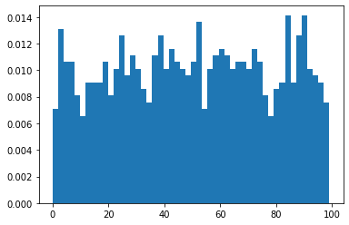
3.3 density
import matplotlib.pyplot as plt
import numpy as np
x=np.random.randint(0,100,1000)
plt.hist(x,bins=50,density=True)
3.4 histtype=’step’
import matplotlib.pyplot as plt
import numpy as np
x=np.random.randint(0,100,1000)
plt.hist(x,bins=10,histtype='step')

3.5 orientation
从竖直方向的直方图,变为水平方向的直方图
import matplotlib.pyplot as plt
import numpy as np
x=np.random.randint(0,100,1000)
plt.hist(x,bins=50,
        orientation='horizontal')

3.6 edgecolor 边界颜色
import matplotlib.pyplot as plt
import numpy as np
x=np.random.randint(0,100,1000)
plt.hist(x,bins=50,
        edgecolor='red')

3.7 多组 直方图
直接联立即可
import matplotlib.pyplot as plt
import numpy as np
x=np.random.randint(0,10,100)
plt.hist(x,bins=10)
plt.hist(x+2,bins=10)
plt.hist(x+5,bins=10)

3.7.1 设置透明度
import matplotlib.pyplot as plt
import numpy as np
x=np.random.randint(0,10,100)
plt.hist(x,bins=10,alpha=0.7)
plt.hist(x+2,bins=10,alpha=0.7)
plt.hist(x+5,bins=10,alpha=0.7)

Original: https://blog.csdn.net/qq_40206371/article/details/120610093
Author: UQI-LIUWJ
Title: matplotlib 笔记:hist(直方图)
原创文章受到原创版权保护。转载请注明出处:https://www.johngo689.com/767588/
转载文章受原作者版权保护。转载请注明原作者出处!