

文章目录
1.创建一个(或多个)图表
创建一个图表
plt.plot()
创建多个图表
方法一:
fig, ((ax1, ax2), (ax3, ax4)) = plt.subplots(2, 2, layout='constrained')
方法二:
plt.subplot(2, 1, 1)
plt.subplot(2, 1, 2)
plt.subplot(2, 2, 1)
plt.subplot(2, 2, 2)
还可以加入 share_x=True/False, share_y=True/False来决定是否共享x/y轴
方法一的图表标题和x/y轴标签设置
ax1.set_title('Time Domain Signal')
ax1.set_xlabel('Time')
ax1.set_ylabel('Amplitude')
2. Axis标签位置
ax.set_ylabel('轴名称', loc='top')

3.基本绘图样式
"""基本绘图类型,通常是 y 与 x。"""
ax.plot(x, y)
ax.scatter(x, y)
ax.bar(x, height)/barh(y, width)
ax.stem(x, y)
ax.step(x, y)
ax.fill_between(x, y1, y2)

"""绘制数据数组 Z(x, y) 和字段 U(x, y)、V(x, y)。"""
ax.imshow(Z)
ax.pcolormesh(X, Y, Z)
ax.contour(X, Y, Z)
ax.contourf(X, Y, Z)
ax.barbs(X, Y, U, V)
ax.quiver(X, Y, U, V)
ax.streamplot(X, Y, U, V)

"""统计分析图"""
ax.hist(x)
ax.boxplot(X)
ax.errorbar(x, y, yerr, xerr)
ax.violinplot(D)
ax.eventplot(D)
ax.hist2d(x, y)
ax.hexbin(x, y, C)
ax.pie(x)

"""非结构化坐标图"""
ax.tricontour(x, y, z)
ax.tricontourf(x, y, z)
ax.tripcolor(x, y, z)
ax.triplot(x, y)
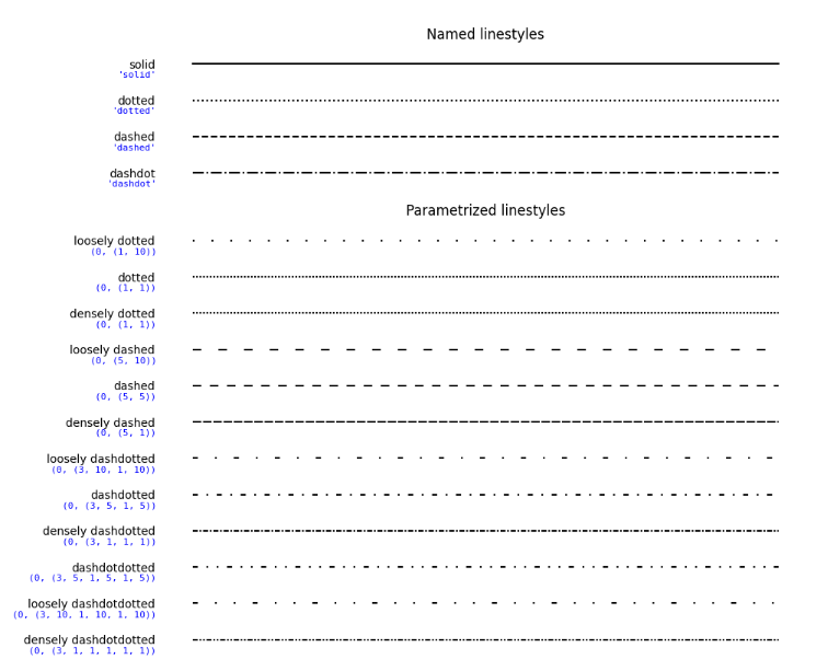
4.线条样式
linestyle_str = [
     ('solid', 'solid'),
     ('dotted', 'dotted'),
     ('dashed', 'dashed'),
     ('dashdot', 'dashdot')]

linestyle_tuple = [
     ('loosely dotted',        (0, (1, 10))),
     ('dotted',                (0, (1, 1))),
     ('densely dotted',        (0, (1, 1))),

     ('loosely dashed',        (0, (5, 10))),
     ('dashed',                (0, (5, 5))),
     ('densely dashed',        (0, (5, 1))),

     ('loosely dashdotted',    (0, (3, 10, 1, 10))),
     ('dashdotted',            (0, (3, 5, 1, 5))),
     ('densely dashdotted',    (0, (3, 1, 1, 1))),

     ('dashdotdotted',         (0, (3, 5, 1, 5, 1, 5))),
     ('loosely dashdotdotted', (0, (3, 10, 1, 10, 1, 10))),
     ('densely dashdotdotted', (0, (3, 1, 1, 1, 1, 1)))]
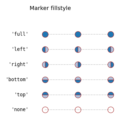
5.标记(marker)参考
一共有四类:未填充标记、填充标记、利用TEX符号创建的标记以及从路径创建的标记
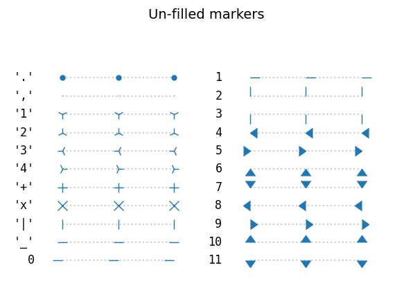
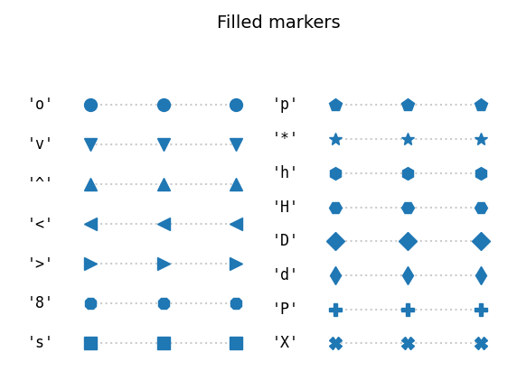
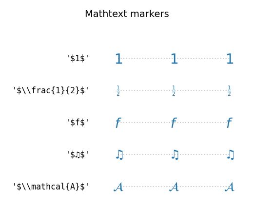
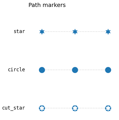
此外,填充标记还可以选择填充样式:
; 6.颜色设置
Matplotlib有九种设置颜色的格式:
import matplotlib.pyplot as plt
import numpy as np

t = np.linspace(0.0, 2.0, 201)
s = np.sin(2 * np.pi * t)

fig, ax = plt.subplots(facecolor=(.2, .22, .16))

ax.set_facecolor('#424c50')

ax.set_title('Voltage vs. time chart', color='0.944')

ax.set_xlabel('time (s)', color='c')

ax.set_ylabel('voltage (mV)', color='DarkSeaGreen')

ax.plot(t, s, color='xkcd:grey green')

ax.plot(t, .7*s, color='C8', linestyle='-.')

ax.tick_params(labelcolor='tab:orange')

plt.show()
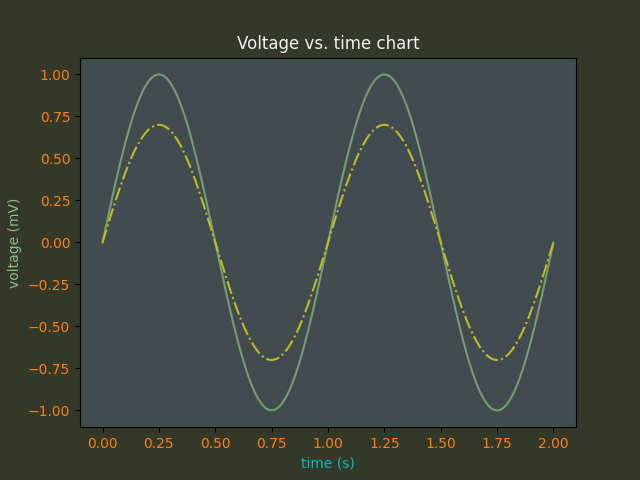
效果如图所示。
附上颜色索引网址(特别好看,还有国风哟):
结语
总之,要想画出有趣好看的图表,还需要多多练习和探索哦~
随缘出第二期。
Original: https://blog.csdn.net/qq_41488033/article/details/126185768
Author: 秦哈哈
Title: 【Matplotlib】Matplotlib绘图样式索引(含形状、颜色、标签位置)
原创文章受到原创版权保护。转载请注明出处:https://www.johngo689.com/767320/
转载文章受原作者版权保护。转载请注明原作者出处!