


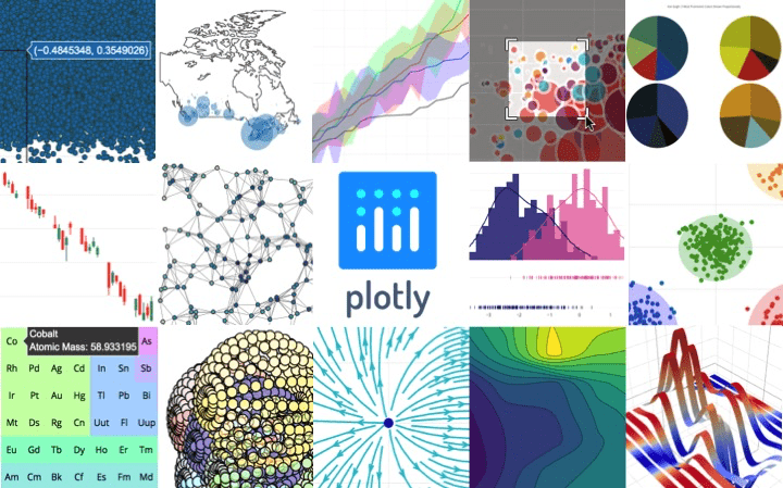
关键词
Matplotlib、Pyecharts、Seaborn、Plotly、Bokeh
Pyecharts
简介 – pyecharts – A Python Echarts Plotting Library built with love.![]() https://pyecharts.org/#/zh-cn/intro ; Python ❤️ ECharts = pyecharts
https://pyecharts.org/#/zh-cn/intro ; Python ❤️ ECharts = pyecharts
一次性导入所有图表
from pyecharts.charts import *
pyecharts的配置项
from pyecharts import options as opts
from pyecharts.components import Table
from pyecharts.commons.utils import JsCode

'''直角坐标系'''
chart = Bar()  #柱状图
chart = Line(init_opts=opts.InitOpts(width="1000px",height="500px"))  #折线图
chart = Scatter()  #散点图
chart.add_xaxis(x_data)   ##需要转换为list
chart.add_yaxis('', y_data,  #data可以传入ChartItems
                areastyle_opts=opts.AreaStyleOpts(opacity=0.5), #区域颜色填充
                label_opts=opts.LabelOpts(is_show=True),  #节点标签
                category_gap="70%", # 柱子宽度设置
                yaxis_index=0,  #可选,当使用第二个y坐标轴时
               )
chart.extend_axis(  #添加额外的坐标轴
    yaxis = opts.AxisOpts(
            name="uv",
            type_="value",
            min_=0,
            max_=1.6,
            interval=0.4,
            axislabel_opts=opts.LabelOpts(formatter="{value} 万人"),  #坐标轴刻度
)
xy轴翻转
chart.reversal_axis()
overlap层叠多个图
chart_1.overlap(chart_2)
#全局设置 tooltip交互
chart.set_global_opts(
    tooltip_opts=opts.TooltipOpts(
        is_show=True,trigger="axis",  # 触发类型
        trigger_on='mousemove|click',  # 触发条件,点击或者悬停均可出发
        axis_pointer_type="cross" # 指示器类型,鼠标移动到图表区可以查看效果
    ),
    xaxis_opts=opts.AxisOpts(
        type_="category",
        boundary_gap=True,    # 两边不显示间隔
        axisline_opts=opts.AxisLineOpts(is_show=True),  # 轴不显示
        axispointer_opts=opts.AxisPointerOpts(is_show=True,type_="shadow"),
        axislabel_opts=opts.LabelOpts(rotate=15)   # 坐标轴标签配置
    ),
    yaxis_opts=opts.AxisOpts(
        name="pv",
        type_="value",
        min_=0,
        max_=100,
        interval=20,
        axislabel_opts=opts.LabelOpts(formatter="{value} 万次"),  # 坐标轴标签配置
        axistick_opts=opts.AxisTickOpts(is_show=True),  # 刻度显示
        splitline_opts=opts.SplitLineOpts(is_show=True),  # 分割线
    ),
    title_opts=opts.TitleOpts(title="pv与uv趋势图",subtitle),
)
'''Grid整合图'''
ggrid = (
    Grid()
    .add(bar, grid_opts=opts.GridOpts(pos_bottom="60%"))
    .add(line, grid_opts=opts.GridOpts(pos_top="60%"))
)
ggrid.render_notebook()
'''饼图'''
chart = Pie()
chart.set_series_opts(label_opts=opts.LabelOpts(
    formatter="{b}: {c}",    #{a}系列名称,{b}数据名称,{c}数值名称
    font_size = '15',
    font_style = 'oblique',
    font_weight = 'bolder'
)
chart.add('',data_pair,  #[['Apple', 123], ['Huawei', 153]]
       radius=['50%', '70%']  #圆环效果
       rosetype='area'  #扇形的花瓣 'area'或'radius'
       center=['25%', '50%']  #多个饼图 指定显示位置
       )
'''漏斗图'''
chart = Funnel()
chart.add("",data_pair,  #[['访问', 30398], ['注册', 15230]]
        gap=2,  #间隔距离
         sort_ = "descending",  #ascending, none
        tooltip_opts=opts.TooltipOpts(trigger="item", formatter="{a} {b} : {c}%",is_show=True),
        label_opts=opts.LabelOpts(is_show=True, position="ourside"),
        itemstyle_opts=opts.ItemStyleOpts(border_color="#fff", border_width=1),
         )
'''地理坐标系'''
chart = Map(init_opts=opts.InitOpts(
        bg_color='#080b30',  # 设置背景颜色
        theme='dark',         # 设置主题
        width='980px',     # 设置图的宽度
        height='700px',     # 设置图的高度
)  #区域地图
添加自定义坐标点
chart.add_coordinate('x', 116.397428, 39.90923)
chart.add_coordinate('y', 112.398615, 29.91659)
#添加数据
chart.add("label",data,   #data键值对列表
    maptype='china',      # 必须的参数,指定地图类型
    is_map_symbol_show=False,  # 不显示红点
    )
全局配置项
chart.set_global_opts(
    # 视觉组件是必须的,需要通过视觉组件的颜色来展示数据大小
    visualmap_opts=opts.VisualMapOpts(max_=100),
    # 标题设置
    title_opts=opts.TitleOpts(
        title=title, # 主标题
        subtitle=subtitle, # 副标题
        pos_left='center',  # 标题展示位置
        title_textstyle_opts=dict(color='#fff') # 设置标题字体颜色
    ),
    # 图例设置
    legend_opts=opts.LegendOpts(
        is_show=True, # 是否显示图例
        pos_left='right', # 图例显示位置
        pos_top='3%',  #图例距离顶部的距离
        orient='horizontal'  # 图例水平布局
    ),
)

chart = Geo() #点地图(GEO)
chart.add_schema(maptype='china')
chart.add("", data,
    type_='scatter'  #Scatter,effectScatter(带涟漪效果的散点),Line(流向图),HeatMap
    )

#timeline
tl = Timeline()
tl.add_schema(
        is_auto_play = True,    # 是否自动播放
        play_interval = 1500,   # 播放速度
        is_loop_play = True,   # 是否循环播放
    )
tl.add(label, bar)

#展示
chart.render_notebook()

'''词云'''
from pyecharts.charts import WordCloud
from pyecharts.globals import SymbolType
word1 = WordCloud(init_opts=opts.InitOpts(width='750px', height='750px'))
word1.add("", [*zip(df_ticai.index.tolist(), df_ticai.values.tolist())],
          word_size_range=[20, 200],
          shape=SymbolType.DIAMOND)
word1.set_global_opts(title_opts=opts.TitleOpts('标题关键词分布'),
                      toolbox_opts=opts.ToolboxOpts())
word1.render_notebook()
Plotly
Plotly Python Graphing Library Plotly’s  https://plotly.com/python/;
- plotly是一个基于javascript的绘图库,plotly绘图种类丰富,效果美观;
- 易于保存与分享plotly的绘图结果,并且可以与Web无缝集成;
- ploty默认的绘图结果,是一个HTML网页文件,通过浏览器可以直接查看;
1. Plotly绘图原理
ployly常用的两个绘图模块:graph_objs(go)和express(px)
- 直接使用px调用某个绘图方法时,会自动创建画布,并画出图形。
2. 代码
import plotly as py
import plotly.graph_objs as go
import plotly.express as px
from plotly import tools

#散点图
fig = px.scatter(
    tips,
    x="total_bill",
    y="tip",
    color="sex",  # 颜色和标记来同时区分
    symbol="smoker",
    facet_col="time",  #  切面图的列元素
    facet_col_wrap=2,  #  每行最多子图
    # 改变图例名称
    labels={"sex": "Gender", "smoker": "Smokes"}
)
fig.show()

#柱状图
fig = px.bar(
    tips, # 数据框
    x="day", #   xy轴
    y="total_bill",
    color="smoker",  # 颜色
    barmode="stack",   # 柱状图模式
    facet_col="sex",  # 切面图的列元素
    category_orders={"day": ["Thur", "Fri", "Sat", "Sun"], # 自定义顺序
                     "smoker": ["Yes", "No"],
                     "sex": ["Male", "Female"]})

fig.update_layout(legend_traceorder="reversed")  # 设置顺序
fig.show()
2.1 改变图例位置
#图例legend位置设置
fig.update_layout(legend=dict(
    yanchor="top",  # y轴顶部
    y=0.99,
    xanchor="left",  # x轴靠左
    x=0.01,
    orientation="h",  # 开启水平显示
))
2.2 布局调整代码
fig.update_layout(title='GDP per capita (happy vs less happy countries)',
                  xaxis_title='GDP per capita',
                  titlefont={'size': 24},
                  width=600,
                  height=400,
                  template="plotly_dark",
                  showlegend=True,
                  paper_bgcolor="lightgray",
                  plot_bgcolor='lightgray',
                  font=dict(
                      color ='black',
                      )
                  )
2.3 trendlines
#demo
import plotly.express as px

df = px.data.tips()
fig = px.scatter(df, x="total_bill", y="tip", facet_col="smoker", color="sex",
log_x=False, #为True时对x变量log变化
                 trendline="ols",  #线性拟合-最小二乘
                 trendline_options=dict(log_x=True),  #log拟合
                 trendline_scope="overall",    #全局
                 trendline_color_override="black",

)
fig.show()

'''
Locally Weighted Scatterplot Smoothing (LOWESS)
'''
df = px.data.stocks(datetimes=True)
fig = px.scatter(df, x="date", y="GOOG", trendline="lowess", trendline_options=dict(frac=0.1))
fig.show()

'''
Moving Averages
'''
fig1 = px.scatter(df, x="date", y="GOOG", trendline="rolling", trendline_options=dict(window=5),
                title="5-point moving average")

#
fig2 = px.scatter(df, x="date", y="GOOG", trendline="ewm", trendline_options=dict(halflife=2),
                title="Exponentially-weighted moving average (halflife of 2 points)")

fig3 = px.scatter(df, x="date", y="GOOG", trendline="expanding", trendline_options=dict(function="mean"), title="Expanding mean")

#自定义
fig4 = px.scatter(df, x="date", y="GOOG", trendline="rolling", trendline_options=dict(function="median", window=5),
                title="Rolling Median")

'''高斯滑动'''
fig = px.scatter(df, x="date", y="GOOG", trendline="rolling",
                 trendline_options=dict(window=5, win_type="gaussian", function_args=dict(std=2)),
                title="Rolling Mean with Gaussian Window")
#trendline统计学结果
results = px.get_trendline_results(fig)
print(results)

'''只显示trendlines'''
df = px.data.stocks(indexed=True, datetimes=True)
fig = px.scatter(df, trendline="rolling", trendline_options=dict(window=5),
                title="5-point moving average")
fig.data = [t for t in fig.data if t.mode == "lines"]
fig.update_traces(showlegend=True) #trendlines have showlegend=False by default
fig.show()
3. 工具函数
3.1 多张图导出到一个html文件
多张图导出到一个html文件
def plot_list(df_list):
    fig_list =[]
    from plotly.subplots import make_subplots

    # Creation des figures
    i=0
    for df in df_list:
        i+=1
        fig = go.Figure()
        fig.add_trace(go.Scatter(x=list(df.Date), y=list(df.Temp), name="Température"))

        # Add figure title
        fig.update_layout(
            title_text=f"Cas n°{i}")

        # Set x-axis title
        fig.update_xaxes(title_text="Date")

        fig_list.append(fig)

    # Création d'un seul fichier HTML
    filename=f"{os.path.join('output', 'full_list.html')}"
    dashboard = open(filename, 'w')
    dashboard.write("" + "\n")
    include_plotlyjs = True

    for fig in fig_list:
        inner_html = fig.to_html(include_plotlyjs = include_plotlyjs).split('')[1].split('')[0]
        dashboard.write(inner_html)
        include_plotlyjs = False
    dashboard.write("" + "\n")
Matplotlib
教程 | Matplotlib 中文![]() https://www.matplotlib.org.cn/tutorials/;
https://www.matplotlib.org.cn/tutorials/;
1. 导入
import matplotlib.pyplot as plt
2. 显示
#显示数组
plt.imshow(arr, origin='lower')  #origin调整原点位置
3. 图表
plt.spy() #This function plots a black dot for every nonzero entry of the array
4. 功能函数
#设置坐标轴范围
plt.xlim((-5, 5))
plt.ylim((-2, 2))
#设置坐标轴名称、字体、大小
plt.xlabel('xxxxxxxxxxx',fontdict={'family' : 'Times New Roman', 'size'   : 16})
plt.ylabel('yyyyyyyyyyy',fontdict={'family' : 'Times New Roman', 'size'   : 16})
#设置坐标轴刻度、字体、大小, 方向
plt.xticks(np.arange(-5, 5, 0.5),fontproperties = 'Times New Roman', size = 10)
plt.yticks(np.arange(-2, 2, 0.3),fontproperties = 'Times New Roman', size = 10)
plt.rcParams['xtick.direction'] = 'in'
plt.rcParams['ytick.direction'] = 'in'
#标题
plt.title('station', fontdict={'family' : 'Times New Roman', 'size'   : 16})
#图例
plt.legend(prop={'family' : 'Times New Roman', 'size'   : 16})

#为每一个坐标点标记数据
for index, value in enumerate(y): plt.text(value, index,str(value))

#作图
bar=plt.bar()
plt.bar_label(bar)  #柱状图数值

#子图
fig, ax = plt.subplots(nrow, ncol, sharex, sharey, figsize)
ax = ax.flatten()  #用ax[0] ax[1] ... 对应图片位置

fig.tight_layout()  #子图自动调整布局

#保存
fig.savefig()
*pandas.DataFrame.plot
DataFrame.plot(x=None, y=None, kind='line', ax=None,
 subplots=False, sharex=None, sharey=False, layout=None,
 figsize=None, use_index=True, title=None, grid=None, legend=True,
 style=None, logx=False, logy=False, loglog=False, xticks=None,
 yticks=None, xlim=None, ylim=None, rot=None, fontsize=None,
colormap=None, position=0.5, table=False, yerr=None, xerr=None,
stacked=True/False, sort_columns=False, secondary_y=False, mark_right=True, **kwds)
1. kind图表类型
‘line’ : line plot (default) # 折线图
‘bar’  : vertical bar plot   # 条形图
‘barh’ : horizontal bar plot # 横向条形图
‘hist’ : histogram           # 柱状图
‘box’  : boxplot             #箱线图
‘kde’  : Kernel Density Estimation plot #密度估计图,主要对柱状图添加Kernel 概率密度线
‘density’ : same as ‘kde’
‘area’ : area plot           #区域图
‘pie’ : pie plot             #饼图
‘scatter’ : scatter plot     #散点图  需要传入columns方向的索引
‘hexbin’ : hexbin plot       #具有六边形单元的二维直方图
问题
1. x轴标签堆积
#方案1 - 设置间距
import matplotlib.ticker as ticker
ax.xaxis.set_major_locator(ticker.MultipleLocator(base=10))

#方案2 - 清空原标签后重设置
lenn=int(max(axes[0].get_xticks()))
axes[0].get_xaxis().set_minor_locator(ticker.MultipleLocator(100))
axes[0].xaxis.set_ticks(ticks=np.arange(0,lenn,lenn//10))
axes[0].set_xticklabels(labels=np.arange(0,lenn,lenn//10))
Seaborn
Bokeh
- Bokeh有自己的数据结构ColumnDataSource
Original: https://blog.csdn.net/m0_64768308/article/details/125930898
Author: noobiee
Title: Python可视化分析
原创文章受到原创版权保护。转载请注明出处:https://www.johngo689.com/766079/
转载文章受原作者版权保护。转载请注明原作者出处!