

一、坐标轴的定制
1、概述:
坐标轴及其组成部分对应着matplotlib中一些类的对象︰坐标轴是axis.Axis类的对象,x轴是axis.Xaxis类的对象,y轴是axis.Yaxis类的对象;轴脊是spines.Spine类的对象;刻度是axis.Ticker类的对象。
使用Axes类的对象访问spines属性后,会返回一个OrderedDict类的对象。OrderedDict类是dict的子类,它可以维护添加到字典中键值对的顺序。
2、任意位置添加坐标轴:
matplotlib支持向画布的任意位置添加自定义大小的坐标系统,同时显示坐标轴,而不再受规划区域的限制。通过pyplot模块的axes()函数创建一个Axes类的对象,并将Axes类的对象添加到当前画布中。
axes(arg=None, projection=None. polar=False. aspect.frame on.**kwargs)
还可以使用Figure类对象的add_axes()方法向当前画布的任意位置上添加Axes类对象。
3、刻度定制:
matplotlib.ticker模块中提供了两个类:Locator和Formatter,分别代表刻度定位器和刻度格式器,用于指定刻度线的位置和刻度标签的格式。
刻度定位器Locator是刻度定位器的基类,它派生了很多子类,通过这些子类构建的刻度定位器可以调整刻度的间隔、选择刻度的位置。matplotlib.dates模块中还提供了很多与日期时间相关的定位器。
matplotlib也支持自定义刻度定位器,我们只需要定义一个Locator 的子类,并在该子类中重写__call__()方法即可。
刻度定位器使用matplotlib的set_major_locator()或set_minor_locator()方法设置坐标轴的主刻度或次刻度的定位器。
4、隐藏和移动轴脊:
坐标轴一般将轴脊作为刻度的载体,在轴脊上显示刻度标签和刻度线。matplotlib中的坐标系默认有4个轴脊,分别是上轴脊、下轴脊、左轴脊和右轴脊,其中上轴脊和右轴脊并不经常使用,大多数情况下可以将上轴脊和右轴脊隐藏。
使用pyplot的axis()函数可以设置或获取一些坐标轴的属性,包括显示或隐藏坐标轴的轴脊。
axis(option, *args,**kwargs)
部分轴脊隐藏
matplotlib可以只隐藏坐标轴的部分轴脊,只需要访问spines属性先获取相应的轴脊,再调用set_color()方法将轴脊的颜色设为none即可
移动轴脊
matplotlib的Spine类中提供了一个可以设置轴脊位置的set_position()方法,通过这个方法可以将轴脊放置到指定的位置,以满足一些特定场景的需求。
set position(self, position)
二、绘制3D图表和统计地图
1、mplot3d概述:
matplotlib不仅专注于二维图表的绘制,也具有绘制3D图表、统计地图的功能,并将这些功能分别封装到工具包mpl_toolkits.mplot3d、mpl_toolkits.basemap中,另外可以结合animation模块给图表添加动画效果。
mplot3d是matplotlib中专门绘制3D图表的工具包,它主要包含一个继承自Axes的子类Axes3D,使用Axes3D类可以构建一个三维坐标系的绘图区域。
Axes3D()方法
Axes3D()是构造方法,它直接用于构建一个Axes3D类的对象。
Axes3D(fig, rect=None, *args, azim=-60, elev=30, zscale=None,sharez=None, proj_type='persp',**kwargs)
add_subplot()方法
在调用add subplot()方法添加绘图区域时为该方法传入pro
jection= ‘3d’,即指定坐标系的类型为三维坐标系,并返回一个Axes3D类的对象。
import matplotlib.pyplot as plt from mpl_toolkits.mplot3d import Axes3Dfig = plt.figure()
ax = fig.add_ subplot(111, projection='3d')
2、绘制常见的3d图:
常见的3D图表包括3D线框图、3D曲面图、3D柱形图、3D散点图等。Axes3D类中提供了一些绘制3D图表的方法,
绘制3D线框图
Axes3D类的对象使用plot_wireframe()方法绘制线框图。
plot_wireframe(self,X,Y,Z,*args,**kwargs)
绘制3D曲面图
Axes3D类的对象使用plot_surface()方法绘制3D曲面图。
plot_surface(self,X,Y,Z,*args, norm=None, vmin=None, vmax=None,
lightsource=None,**kwargs)
3、animation的概述:
matplotlib在1.1版本的标准库中加入了动画模块
-animation,使用该模块的Animation类可以实现一些基本的动画效果。Animation类是一个动画基类,它针对不同的行为分别派生了不同的子类,主要包括FuncAnimation、ArtistAnimation类。
· FuncAnimation类表示基于重复调用一个函数的动画。
. ArtistAnimation类表示基于—组固定Artist
(标准的绘图元素,比如
文本、线条、矩形等)对象的动画。
FuncAnimation类
FuncAnimation是基于函数的动画类,它通过重复地调用同一丞数来制作动画。
FuncAnimation(tig, func, frames=None, init_func=None,fargs=None,
save _count=None,*,/view20/M00/34/21/wKh2DmC4usGAf0azAGSmfdci9Yw2l_6511240_d03a59fa
ArtistAnimation类
ArtistAnimation是基于一组Artist对象的动画类,它通过一帧一帧的数据制作动画。
ArtistAnimation(fig, artists,interval, repeat_delay, repeat,
blit,*args,**kwargs)
4、basemap概述
在数据可视化中,人们有时需将采集的数据按照其地理位置显示到地图上,常见于城市人口、飞机航线、矿藏分布等场景,有助于用户理解与空间有关的信息。basemap是matplotlib中的地图工具包,它本身不会参与任何绘图操作,而是会将给定的地理坐标转换到地图投影上,之后将数据交给matplotlib进行绘图。
安装basemap
在Anaconda中安装basemap的方式比较简单,可以直接在Anaconda Prompt工具中输入如下命令∶
conda nstall basemap
安装完成后,在Anaconda Prompt的命令提示符后面输入python,之后输入如下
from mpl_toolkits.basemap import Basemap
代码演示:
import numpy as np
from datetime import datetime
import matplotlib.pyplot as plt
from matplotlib.dates import DateFormatter,HourLocator
plt.rcParams["font.sans-serif"]=["SimHei"]
plt.rcParams["axes.unicode_minus"]=False
dates=['201910240','2019102402','2019102404','2019102406','2019102408',
'2019102410','2019102412','2019102414','2019102416','2019102418',
'2019102420','2019102422','201910250']
x_date=[datetime.strptime(d,'%Y%m%d%H') for d in dates]
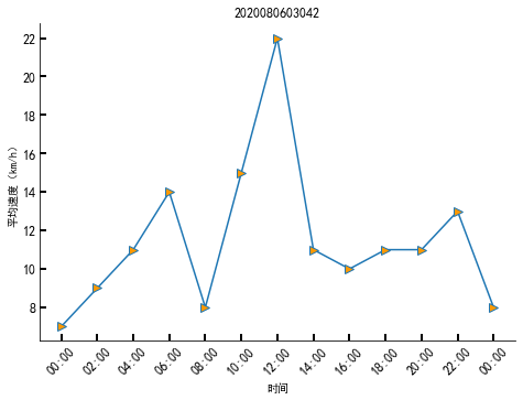
y_date=np.array([7,9,11,14,8,15,22,11,10,11,11,13,8])
fig=plt.figure()
ax=fig.add_axes((0.0,0.0,1.0,1.0))
ax.plot(x_date,y_date,'->',ms=8,mfc='#FF9900')
ax.set_xlabel('时间')
ax.set_ylabel('平均速度(km/h)')
date_fmt=DateFormatter('%H:%M')
ax.xaxis.set_major_formatter(date_fmt)
ax.xaxis.set_major_locator(HourLocator(interval=2))
ax.tick_params(direction='in',length=6,width=2,labelsize=12)
ax.xaxis.set_tick_params(labelrotation=45)
plt.title("2020080603042")
plt.show()


import numpy as np
import matplotlib.pyplot as plt
import matplotlib.patches as mpathes
polygon=mpathes.RegularPolygon((0.5,0.5),6,0.2,color='g')
ax=plt.axes((0.3,0.3,0.5,0.5))
ax.add_patch(polygon)
ax.axis('off')
plt.title('2020080603042')
plt.show()

import numpy as np
import matplotlib.pyplot as plt
import matplotlib.patches as mpathes
polygon=mpathes.RegularPolygon((0.5,0.5),6,0.2,color='g')
ax=plt.axes((0.3,0.3,0.5,0.5))
ax.add_patch(polygon)
ax.spines['top'].set_color('none')
ax.spines['left'].set_color('none')
ax.spines['right'].set_color('none')
plt.title('2020080603042')
plt.show()

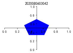
import numpy as np
import matplotlib.pyplot as plt
import matplotlib.patches as mpathes
polygon=mpathes.RegularPolygon((0.5,0.5),6,0.2,color='g')
ax=plt.axes((0.3,0.3,0.5,0.5))
ax.add_patch(polygon)
ax.spines['top'].set_color('none')
ax.spines['left'].set_color('none')
ax.spines['right'].set_color('none')
ax.yaxis.set_ticks_position('none')
ax.set_yticklabels([])
plt.title('2020080603042')
plt.show()

import numpy as np
from datetime import datetime
import matplotlib.pyplot as plt
from matplotlib.dates import DateFormatter,HourLocator
plt.rcParams["font.sans-serif"]=["SimHei"]
plt.rcParams["axes.unicode_minus"]=False
dates=['201910240','2019102402','2019102404','2019102406','2019102408',
       '2019102410','2019102412','2019102414','2019102416','2019102418',
       '2019102420','2019102422','201910250']
x_date=[datetime.strptime(d,'%Y%m%d%H') for d in dates]
y_date=np.array([7,9,11,14,8,15,22,11,10,11,11,13,8])
fig=plt.figure()
ax=fig.add_axes((0.0,0.0,1.0,1.0))
ax.plot(x_date,y_date,'->',ms=8,mfc='#FF9900')
ax.set_xlabel('时间')
ax.set_ylabel('平均速度(km/h)')
date_fmt=DateFormatter('%H:%M')
ax.xaxis.set_major_formatter(date_fmt)
ax.xaxis.set_major_locator(HourLocator(interval=2))
ax.tick_params(direction='in',length=6,width=2,labelsize=12)
ax.xaxis.set_tick_params(labelrotation=45)
ax.spines['top'].set_color('none')
ax.spines['right'].set_color('none')
plt.title('2020080603042')
plt.show()
import numpy as np
import matplotlib.pyplot as plt
import matplotlib.patches as mpathes
xy=np.array([0.5,0.5])
polygon=mpathes.RegularPolygon(xy,5,0.2,color='b')
ax=plt.axes((0.3,0.3,0.5,0.5))
ax.add_patch(polygon)
ax.spines['top'].set_color('none')
ax.spines['right'].set_color('none')
ax.spines['left'].set_position(('data',0.5))
ax.spines['bottom'].set_position(('data',0.5))
plt.title('2020080603042')
plt.show()
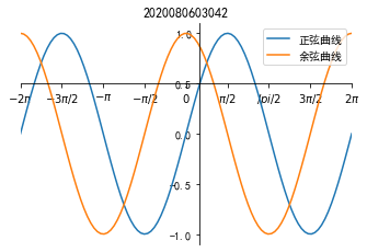
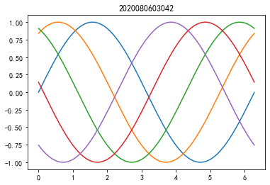
import numpy as np
import matplotlib.pyplot as plt
plt.rcParams["font.sans-serif"]=["SimHei"]
plt.rcParams["axes.unicode_minus"]=False
x_data=np.linspace(-2*np.pi,2*np.pi,100)
y_one=np.sin(x_data)
y_two=np.cos(x_data)
fig=plt.figure()
ax=fig.add_axes((0.2,0.2,0.7,0.7))
ax.plot(x_data,y_one,label='正弦曲线')
ax.plot(x_data,y_two,label='余弦曲线')
ax.legend()
ax.set_xlim(-2*np.pi,2*np.pi)
ax.set_xticks([-2*np.pi,-3*np.pi/2,-1*np.pi,-1*np.pi/2,
              0,np.pi/2,np.pi,3*np.pi/2,2*np.pi])
ax.set_xticklabels(['$-2\pi$','$-3\pi/2$','$-\pi$','$-\pi/2$',
                    '$0$','$\pi/2$','$/pi/2$','$3\pi/2$','$2\pi$',])
ax.set_yticks([-1.0,-0.5,0.0,0.5,1.0])
ax.set_yticklabels([-1.0,-0.5,0.0,0.5,1.0])
ax.spines['top'].set_color('none')
ax.spines['right'].set_color('none')
ax.spines['left'].set_position(('data',0.5))
ax.spines['bottom'].set_position(('data',0.5))
plt.title('2020080603042')
plt.show()
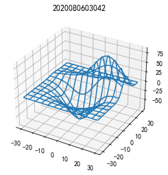
import matplotlib.pyplot as plot
from mpl_toolkits.mplot3d import axes3d
fig=plt.figure()
ax=fig.add_subplot(111,projection='3d')
X,Y,Z=axes3d.get_test_data(0.05)
ax.plot_wireframe(X,Y,Z,rstride=10,cstride=10)
plt.title('2020080603042')
plt.show()
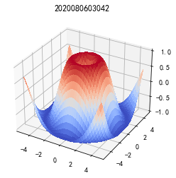
import matplotlib.pyplot as plot
from mpl_toolkits.mplot3d import axes3d
from matplotlib import cm
import numpy as np
x1=np.arange(-5,5,0.25)
y1=np.arange(-5,5,0.25)
x1,y1=np.meshgrid(x1,y1)
r1=np.sqrt(x1**2+y1**2)
z1=np.sin(r1)
fig=plt.figure()
ax=fig.add_subplot(111,projection='3d')
ax.plot_surface(x1,y1,z1,cmap=cm.coolwarm,linewidth=0,
                   antialiased=False)
ax.set_zlim(-1.01,1.01)
plt.title('2020080603042')
plt.show()
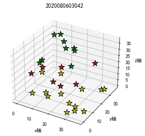
import numpy as np
import matplotlib.pyplot as plt
from mpl_toolkits.mplot3d import axes3d
plt.rcParams["font.sans-serif"]=["SimHei"]
plt.rcParams["axes.unicode_minus"]=False
x=np.random.randint(0,40,30)
y=np.random.randint(0,40,30)
z=np.random.randint(0,40,30)
fig=plt.figure()
ax=fig.add_subplot(111,projection='3d')
for xx,yy,zz in zip(x,y,z):
    color='y'
    if 10<zz<20:
        color='#C71000'
    elif zz>=20:
        color='#008000'
    ax.scatter(xx,yy,zz,c=color,marker='*',s=160,
              linewidth=1,edgecolor='black')
ax.set_xlabel('x轴')
ax.set_ylabel('y轴')
ax.set_zlabel('z轴')
ax.set_title('3D散点图 42',fontproperties='simhei',fontsize=14)
plt.tight_layout()
plt.title('2020080603042')
plt.show()
import numpy as np
import matplotlib.pyplot as plt
from matplotlib.animation import FuncAnimation
x=np.arange(0,2*np.pi,0.01)
fig,ax=plt.subplots()
line,=ax.plot(x,np.sin(x))
def animate(i):
    line.set_ydata(np.sin(x+i/10.0))
    return line
def init():
    line.set_ydata(np.sin(x))
    return line
ani=FuncAnimation(fig=fig,func=animate,frames=100,
                 init_func=init,interval=20,blit=False)
plt.title('2020080603042')
plt.show()

import numpy as np
import matplotlib.pyplot as plt
from matplotlib.animation import ArtistAnimation
x=np.arange(0,2*np.pi,0.01)
fig,ax=plt.subplots()
arr=[]
for i in range(5):
    line=ax.plot(x,np.sin(x+i))
    arr.append(line)
ani=ArtistAnimation(fig=fig,artists=arr,repeat=True)
plt.title('2020080603042')
plt.show()
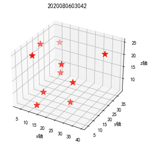
import numpy as np
import matplotlib.pyplot as plt
from mpl_toolkits.mplot3d import axes3d
from matplotlib.animation import FuncAnimation
plt.rcParams["font.sans-serif"]=["SimHei"]
plt.rcParams["axes.unicode_minus"]=False
xx=np.array([13,5,25,13,9,18,3,39,13,27])
yy=np.array([4,38,16,26,7,19,23,25,10,15])
zz=np.array([7,19,6,12,25,19,23,25,10,15])
fig=plt.figure()
ax=fig.add_subplot(111,projection='3d')
star=ax.scatter(xx,yy,zz,c='#F71000',marker='*',s=160)
def animate(i):
    if i%2:
        color='#F71000'
    else:
        color='white'
    next_star=ax.scatter(xx,yy,zz,c=color,marker='*',s=160,
                        linewidth=1,edgcolor='black')
    return next_star
def init():
    return star
ani=FuncAnimation(fig=fig,func=animate,frames=None,init_func=init,
                 interval=1000,blit=False)
ax.set_xlabel('x轴')
ax.set_ylabel('y轴')
ax.set_zlabel('z轴')
ax.set_title('3D散点图 42',fontproperties='simhei',fontsize=14)
plt.tight_layout()
plt.title('2020080603042')
plt.show()
Original: https://blog.csdn.net/qq_55682472/article/details/123951068
Author: 20的我
Title: python大数据可视化坐标轴的定制与绘制3D图表及统计地图
原创文章受到原创版权保护。转载请注明出处:https://www.johngo689.com/765798/
转载文章受原作者版权保护。转载请注明原作者出处!