

机器学习-数据科学库-day2
- matplotlib
* - 在一个图上绘制多个折线图
- 对比常用统计图
- 绘制散点图
- 绘制条形图
- 绘制条形图(横向)
- 绘制多个条形图
- 绘制直方图
- 用条形图近似(模拟)直方图
- matplotlib常见问题总结
- matplotlib使用的流程总结
matplotlib
在一个图上绘制多个折线图
假设大家在30岁的时候,根据自己的实际情况,统计出来了你和你同桌各自从11岁到30岁每年交的女(男)朋友的数量如列表a和b,请在一个图中绘制出该数据的折线图,以便比较自己和同桌20年间的差异,同时分析每年交女(男)朋友的数量走势
a = [1,0,1,1,2,4,3,2,3,4,4,5,6,5,4,3,3,1,1,1]
b = [1,0,3,1,2,2,3,3,2,1 ,2,1,1,1,1,1,1,1,1,1]
要求:
y轴表示个数
x轴表示岁数,比如11岁,12岁等
from matplotlib import pyplot as plt
from matplotlib import font_manager
import matplotlib

font = {'family': 'SimHei',
        'weight': 'bold',
        'size': '10'}
matplotlib.rc("font", **font)

x=range(11,31)
y_1 = [1,0,1,1,2,4,3,2,3,4,4,5,6,5,4,3,3,1,1,1]
y_2 = [1,0,3,1,2,2,3,3,2,1 ,2,1,1,1,1,1,1,1,1,1]

plt.figure(figsize=(20,8),dpi=80)

plt.plot(x,y_1,label="自己",color="orange",linestyle=":")
plt.plot(x,y_2,label="同桌",color="cyan",linestyle="-.")

_x_label=["{}岁".format(i) for i in x]
plt.xticks(x,_x_label)
plt.yticks(range(0,9))

plt.xlabel("年龄")
plt.ylabel("你和同桌从11岁到30岁交男女朋友的个数")
plt.title("每年交女(男)朋友的数量走势")

plt.grid(alpha=0.3)

plt.legend(loc="upper left")

plt.show()
运行结果:


对比常用统计图

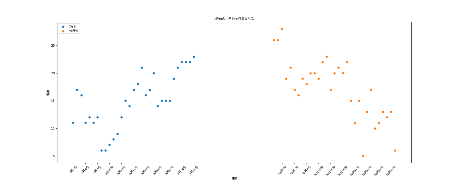
; 绘制散点图
技术要点:plt.scatter(x,y)
假设通过爬虫你获取到了北京2016年3,10月份每天白天的最高气温(分别位于列表a,b),那么此时如何寻找出气温和随时间(天)变化的某种规律?
a = [11,17,16,11,12,11,12,6,6,7,8,9,12,15,14,17,18,21,16,17,20,14,15,15,15,19,21,22,22,22,23]
b = [26,26,28,19,21,17,16,19,18,20,20,19,22,23,17,20,21,20,22,15,11,15,5,13,17,10,11,13,12,13,6]
from matplotlib import pyplot as plt
from matplotlib import font_manager

my_font=font_manager.FontProperties(fname="C:/Windows/Fonts/simhei.ttf")

y_3 = [11,17,16,11,12,11,12,6,6,7,8,9,12,15,14,17,18,21,16,17,20,14,15,15,15,19,21,22,22,22,23]
y_10 = [26,26,28,19,21,17,16,19,18,20,20,19,22,23,17,20,21,20,22,15,11,15,5,13,17,10,11,13,12,13,6]

x_3=range(1,32)
x_10=range(51,82)

plt.figure(figsize=(20,8),dpi=80)

plt.scatter(x_3,y_3,label="3月份")
plt.scatter(x_10,y_10,label="10月份")

plt.legend(prop=my_font,loc="upper left")

_x=list(x_3)+list(x_10)
_xtick_labels= ["3月{}号".format(i) for i in x_3]
_xtick_labels += ["10月{}号".format(i-50) for i in x_10]
plt.xticks(_x[::3],_xtick_labels[::3],fontproperties=my_font,rotation=45)

plt.xlabel("日期",fontproperties=my_font)
plt.ylabel("温度",fontproperties=my_font)
plt.title("3月份和10月份每日最高气温",fontproperties=my_font)

plt.show()
运行结果:
绘制条形图
假设你获取到了2017年内地电影票房前20的电影(列表a)和电影票房数据(列表b),那么如何更加直观的展示该数据?
a = [“战狼2″,”速度与激情8″,”功夫瑜伽”,”西游伏妖篇”,”变形金刚5:最后的骑士”,”摔跤吧!爸爸”,”加勒比海盗5:死无对证”,”金刚:骷髅岛”,”极限特工:终极回归”,”生化危机6:终章”,”乘风破浪”,”神偷奶爸3″,”智取威虎山”,”大闹天竺”,”金刚狼3:殊死一战”,”蜘蛛侠:英雄归来”,”悟空传”,”银河护卫队2″,”情圣”,”新木乃伊”,]
b=[56.01,26.94,17.53,16.49,15.45,12.96,11.8,11.61,11.28,11.12,10.49,10.3,8.75,7.55,7.32,6.99,6.88,6.86,6.58,6.23] 单位:亿
from matplotlib import pyplot as plt
from matplotlib import font_manager

my_font=font_manager.FontProperties(fname="C:/Windows/Fonts/simhei.ttf")

a = ["战狼2","速度与激情8","功夫瑜伽","西游伏妖篇","变形金刚5:\n最后的骑士","摔跤吧!爸爸","加勒比海盗5:\n死无对证","金刚:\n骷髅岛","极限特工:\n终极回归","生化危机6:\n终章","乘风破浪","神偷奶爸3","智取威虎山","大闹天竺","金刚狼3:\n殊死一战","蜘蛛侠:\n英雄归来","悟空传","银河护卫队2","情圣","新木乃伊",]

b=[56.01,26.94,17.53,16.49,15.45,12.96,11.8,11.61,11.28,11.12,10.49,10.3,8.75,7.55,7.32,6.99,6.88,6.86,6.58,6.23]

plt.figure(figsize=(20,10),dpi=80)

plt.bar(range(len(a)),b,width=0.3,color="orange")

plt.xticks(range(len(a)),a,fontproperties=my_font,rotation=90)

plt.show()
运行结果:

绘制条形图(横向)
from matplotlib import pyplot as plt
from matplotlib import font_manager

my_font=font_manager.FontProperties(fname="C:/Windows/Fonts/simhei.ttf")

a = ["战狼2","速度与激情8","功夫瑜伽","西游伏妖篇","变形金刚5:最后的骑士","摔跤吧!爸爸","加勒比海盗5:死无对证","金刚:骷髅岛","极限特工:终极回归","生化危机6:终章","乘风破浪","神偷奶爸3","智取威虎山","大闹天竺","金刚狼3:殊死一战","蜘蛛侠:英雄归来","悟空传","银河护卫队2","情圣","新木乃伊",]

b=[56.01,26.94,17.53,16.49,15.45,12.96,11.8,11.61,11.28,11.12,10.49,10.3,8.75,7.55,7.32,6.99,6.88,6.86,6.58,6.23]

plt.figure(figsize=(20,10),dpi=80)

plt.barh(range(len(a)),b,height=0.3,color="orange")

plt.yticks(range(len(a)),a,fontproperties=my_font,rotation=0)

plt.grid(alpha=0.6)
plt.show()
运行结果:

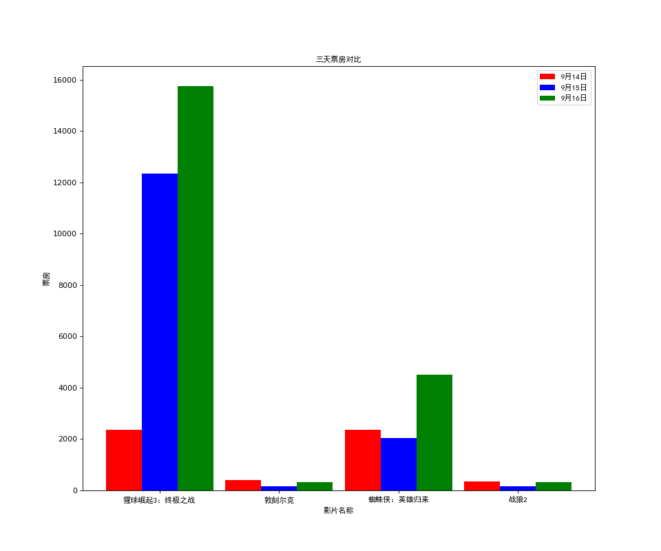
绘制多个条形图
假设你知道了列表a中电影分别在2017-09-14(b_14), 2017-09-15(b_15), 2017-09-16(b_16)三天的票房,为了展示列表中电影本身的票房以及同其他电影的数据对比情况,应该如何更加直观的呈现该数据?
a = [“猩球崛起3:终极之战”,”敦刻尔克”,”蜘蛛侠:英雄归来”,”战狼2″]
b_16 = [15746,312,4497,319]
b_15 = [12357,156,2045,168]
b_14 = [2358,399,2358,362]
from matplotlib import pyplot as plt
from matplotlib import font_manager

my_font=font_manager.FontProperties(fname="C:/Windows/Fonts/simhei.ttf")

_bar_width=0.3
a = ["猩球崛起3:终极之战","敦刻尔克","蜘蛛侠:英雄归来","战狼2"]
b_16 = [15746,312,4497,319]
b_15 = [12357,156,2045,168]
b_14 = [2358,399,2358,362]

plt.figure(figsize=(12,10),dpi=80)
x_14=list(range(len(a)))
x_15=[i+ _bar_width for i in x_14]
x_16=[i+ _bar_width*2 for i in x_14]

plt.bar(x_14,b_14,width=_bar_width,label="9月14日",color="red")
plt.bar(x_15,b_15,width=_bar_width,label="9月15日",color="blue")
plt.bar(x_16,b_16,width=_bar_width,label="9月16日",color="green")

_x_ticks=[i+ _bar_width for i in x_14]

plt.xticks(_x_ticks,a,fontproperties=my_font)

plt.legend(prop=my_font)

plt.xlabel("影片名称",fontproperties=my_font)
plt.ylabel("票房",fontproperties=my_font)
plt.title("三天票房对比",fontproperties=my_font)

plt.show()
运行结果:
绘制直方图
假设你获取了250部电影的时长(列表a中),希望统计出这些电影时长的分布状态(比如时长为100分钟到120分钟电影的数量,出现的频率)等信息,你应该如何呈现这些数据?
a=[131, 98, 125, 131, 124, 139, 131, 117, 128, 108, 135, 138, 131, 102, 107, 114, 119, 128, 121, 142, 127, 130, 124, 101, 110, 116, 117, 110, 128, 128, 115, 99, 136, 126, 134, 95, 138, 117, 111,78, 132, 124, 113, 150, 110, 117, 86, 95, 144, 105, 126, 130,126, 130, 126, 116, 123, 106, 112, 138, 123, 86, 101, 99, 136,123, 117, 119, 105, 137, 123, 128, 125, 104, 109, 134, 125, 127,105, 120, 107, 129, 116, 108, 132, 103, 136, 118, 102, 120, 114,105, 115, 132, 145, 119, 121, 112, 139, 125, 138, 109, 132, 134,156, 106, 117, 127, 144, 139, 139, 119, 140, 83, 110, 102,123,107, 143, 115, 136, 118, 139, 123, 112, 118, 125, 109, 119, 133,112, 114, 122, 109, 106, 123, 116, 131, 127, 115, 118, 112, 135,115, 146, 137, 116, 103, 144, 83, 123, 111, 110, 111, 100, 154,136, 100, 118, 119, 133, 134, 106, 129, 126, 110, 111, 109, 141,120, 117, 106, 149, 122, 122, 110, 118, 127, 121, 114, 125, 126,114, 140, 103, 130, 141, 117, 106, 114, 121, 114, 133, 137, 92,121, 112, 146, 97, 137, 105, 98, 117, 112, 81, 97, 139, 113,134, 106, 144, 110, 137, 137, 111, 104, 117, 100, 111, 101, 110,105, 129, 137, 112, 120, 113, 133, 112, 83, 94, 146, 133, 101,131, 116, 111, 84, 137, 115, 122, 106, 144, 109, 123, 116, 111,111, 133, 150]
from matplotlib import pyplot as plt
from matplotlib import font_manager

a=[131,  98, 125, 131, 124, 139, 131, 117, 128, 108, 135, 138, 131, 102, 107, 114, 119, 128, 121, 142, 127, 130, 124, 101, 110, 116, 117, 110, 128, 128, 115,  99, 136, 126, 134,  95, 138, 117, 111,78, 132, 124, 113, 150, 110, 117,  86,  95, 144, 105, 126, 130,126, 130, 126, 116, 123, 106, 112, 138, 123,  86, 101,  99, 136,123, 117, 119, 105, 137, 123, 128, 125, 104, 109, 134, 125, 127,105, 120, 107, 129, 116, 108, 132, 103, 136, 118, 102, 120, 114,105, 115, 132, 145, 119, 121, 112, 139, 125, 138, 109, 132, 134,156, 106, 117, 127, 144, 139, 139, 119, 140,  83, 110, 102,123,107, 143, 115, 136, 118, 139, 123, 112, 118, 125, 109, 119, 133,112, 114, 122, 109, 106, 123, 116, 131, 127, 115, 118, 112, 135,115, 146, 137, 116, 103, 144,  83, 123, 111, 110, 111, 100, 154,136, 100, 118, 119, 133, 134, 106, 129, 126, 110, 111, 109, 141,120, 117, 106, 149, 122, 122, 110, 118, 127, 121, 114, 125, 126,114, 140, 103, 130, 141, 117, 106, 114, 121, 114, 133, 137,  92,121, 112, 146,  97, 137, 105,  98, 117, 112,  81,  97, 139, 113,134, 106, 144, 110, 137, 137, 111, 104, 117, 100, 111, 101, 110,105, 129, 137, 112, 120, 113, 133, 112,  83,  94, 146, 133, 101,131, 116, 111,  84, 137, 115, 122, 106, 144, 109, 123, 116, 111,111, 133, 150]

plt.figure(figsize=(18,10),dpi=80)

bin_width=3
num_bins= (max(a)-min(a))//bin_width
print(max(a),min(a),max(a)-min(a))
print(num_bins)

plt.hist(a,num_bins,density=True)

plt.xticks(list(range(min(a),max(a)))[::bin_width],rotation=45)
plt.grid()
plt.show()
运行结果:

用条形图近似(模拟)直方图
在美国2004年人口普查发现有124 million的人在离家相对较远的地方工作。根据他们从家到上班地点所需要的时间,通过抽样统计(最后一列)出了下表的数据,这些数据能够绘制成直方图么?
interval = [0,5,10,15,20,25,30,35,40,45,60,90]
width = [5,5,5,5,5,5,5,5,5,15,30,60]
quantity = [836,2737,3723,3926,3596,1438,3273,642,824,613,215,47]
from matplotlib import pyplot as plt
from matplotlib import font_manager

interval = [0,5,10,15,20,25,30,35,40,45,60,90]
width = [5,5,5,5,5,5,5,5,5,15,30,60]
quantity = [836,2737,3723,3926,3596,1438,3273,642,824,613,215,47]

plt.figure(figsize=(18,10),dpi=80)

plt.bar(range(len(quantity)),quantity,width=1.0)

_x=[i-0.5 for i in range(13)]
_xtick_labels=interval+[150]
plt.xticks(_x,_xtick_labels)

plt.grid()
plt.show()
运行结果:

matplotlib常见问题总结
- 应该选择那种图形来呈现数据
- matplotlib.plot(x,y)
- matplotlib.bar(x,y)
- matplotlib.scatter(x,y)
- matplotlib.hist(data,bins,normed)
- xticks和yticks的设置
- label和titile,grid的设置
- 绘图的大小和保存图片
matplotlib使用的流程总结
- 明确问题
- 选择图形的呈现方式
- 准备数据
- 绘图和图形完善
Original: https://blog.csdn.net/weixin_47049321/article/details/124003957
Author: weixin_47049321
Title: 机器学习-数据科学库-day2
原创文章受到原创版权保护。转载请注明出处:https://www.johngo689.com/765613/
转载文章受原作者版权保护。转载请注明原作者出处!