

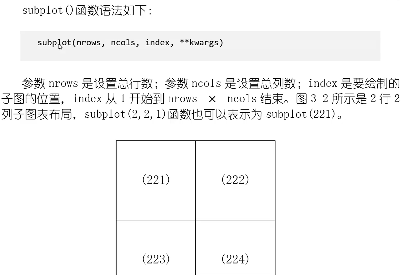
目录
Matplotlib库
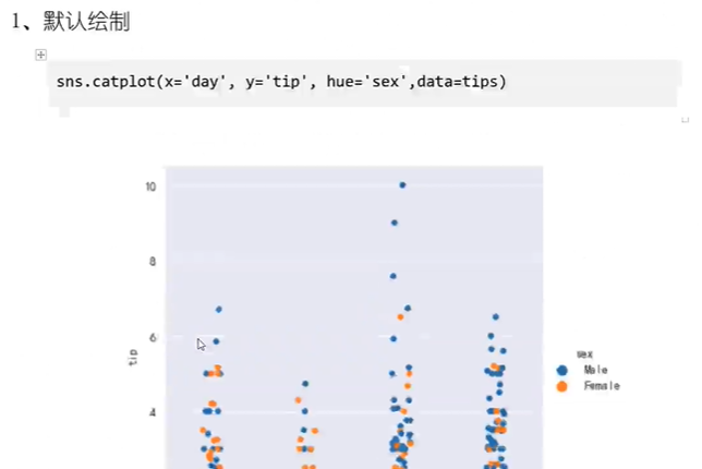
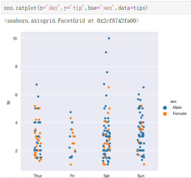
显示图形
import matplotlib.pyplot as plt
%matplotlib inline
#设置中文字体
plt.rcParams['font.family'] = ['SimHei']
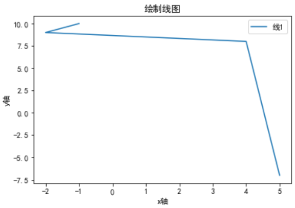
x=[5,4,2,1]
y=[7,8,9,10]

#设置图表大小
plt.figure(figsize=(10,5))

#绘制线段
plt.plot(x,y,label='线1')
plt.ylabel('y轴')
plt.xlabel('x轴')
#添加标题
plt.title('绘制线图')
#设置图例
plt.legend()
将inline换成notbook后,变成可交互式图形


inline 和 notebook 这两个魔法指令只能在Jupyter notebook里面使用、
在ipython里面不能使用


设置中文字体
1.指定字体文件

3.指定不同的字体

将所有文字设置为中文
导致乱码
import matplotlib.pyplot as plt
plt.rcParams['font.family']=['SimHei']
import matplotlib.font_manager as fm
fontPath = r'C:/Windows/Fonts/SIMLI.TTF'
font30 = fm.FontProperties(fname=fontPath,size=30)
x=[5,4,-2,-1]
y=[-7,8,9,10]

#设置图表大小
plt.figure(figsize=(10,5))

#绘制线段
plt.plot(x,y,label='线1')
plt.ylabel('y轴')
plt.xlabel('x轴')
#添加标题
plt.title('绘制线图')
#设置图例
plt.legend()

设置负号,防止乱码
import matplotlib.pyplot as plt
plt.rcParams['font.family']=['SimHei']
import matplotlib.font_manager as fm
fontPath = r'C:/Windows/Fonts/SIMLI.TTF'
font30 = fm.FontProperties(fname=fontPath,size=30)
#设置负号,防止乱码
plt.rcParams['axes.unicode_minus']=False
设置线条颜色和风格
import matplotlib.pyplot as plt
import numpy as np
x = np.linspace(0,10,1000)
x
plt.plot(x,x+0,color='blue')
plt.plot(x,x+1,color='g')
plt.plot(x,x+2,c='#FF5D24')
plt.plot(x,x+3,color=(0.1,0.168,0.168))

线条风格:linstyle
import matplotlib.pyplot as plt
import numpy as np
x = np.linspace(0,10,1000)
x
plt.plot(x,x+0,color='blue',linestyle='solid')#实线
plt.plot(x,x+1,color='g',linestyle='dashed')#虚线
plt.plot(x,x+2,c='#FF5D24',linestyle='dashdot')#点划线
plt.plot(x,x+3,color=(0.1,0.168,0.168),linestyle='dotted')#实点线

plt.plot(x,x+0,color='blue',linestyle='solid')#实线
plt.plot(x,x+1,color='g',linestyle='dashed')#虚线
plt.plot(x,x+2,c='#FF5D24',linestyle='dashdot')#点划线
plt.plot(x,x+3,color=(0.1,0.168,0.168),linestyle='dotted')#实点线
plt.plot(x,x+0,color='blue',linestyle='-')#实线
plt.plot(x,x+1,color='g',linestyle='--')#虚线
plt.plot(x,x+2,c='#FF5D24',linestyle='-.')#点划线
plt.plot(x,x+3,color=(0.1,0.168,0.168),linestyle=':')#实点线

颜色和线条样式合并
只能使用八种颜色值
plt.plot(x,x+0,'b-')#实线
plt.plot(x,x+1,'g--')#虚线
plt.plot(x,x+2,'r-.')#点划线
plt.plot(x,x+3,':g')#实点线

保存图片

绘制柱状图

import matplotlib.pyplot as plt
import numpy as np

plt.rcParams['font.family']=['SimHei']
#设置字体大小
plt.rcParams['font.size']=20
#设置负号,防止乱码
plt.rcParams['axes.unicode_minus']=False
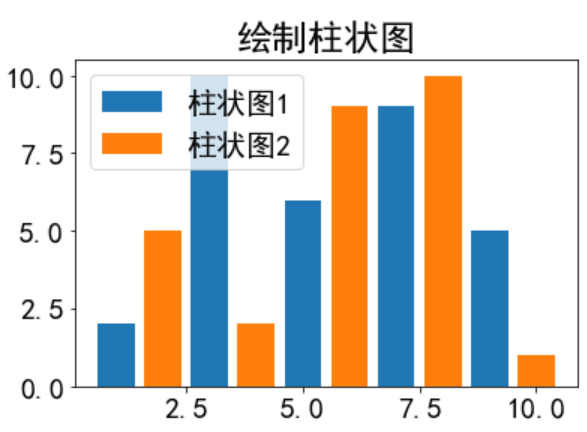
x1=[1,3,5,7,9]
y1=[2,10,6,9,5]

x2=[2,4,6,8,10]
y2=[5,2,9,10,1]

#绘制图表
plt.bar(x1,y1,label='柱状图1')
plt.bar(x2,y2,label='柱状图2')

plt.title('绘制柱状图')

plt.ylabel=('y轴')
plt.xlabel=('x轴')

plt.legend()#设置图例
饼状图

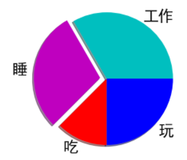
activites=['工作','睡','吃','玩']
slices=[8,7,3,6]
cols=['c','m','r','b']
g=plt.pie(slices,labels=activites,colors=cols,shadow=True,explode=(0,0.1,0,0),autopct='%.1f%%')

去掉 autopct就没有百分比了
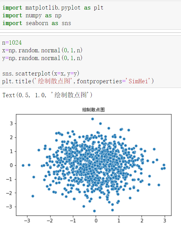
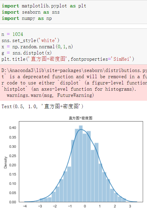
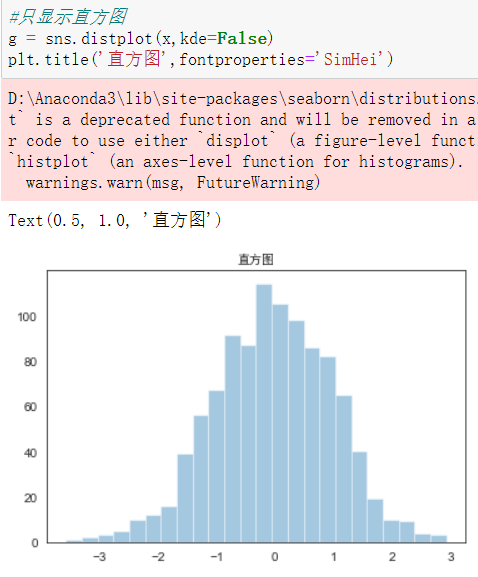
绘制散点图
n=1024
x=np.random.normal(0,1,n)
y=np.random.normal(0,1,n)

plt.scatter(x,y)
plt.title('绘制散点图')

代码:
注意:’str’ object is not callable
直接重新开一个文件运行,这个是一次性的!
import matplotlib.pyplot as plt
import numpy as np
%matplotlib inline

plt.rcParams['font.family']=['SimHei']
plt.rcParams['axes.unicode_minus']=False
x1=[1,3,5,7,9]
y1=[2,10,6,9,5]
x2=[2,4,6,8,10]
y2=[5,2,9,10,1]
x=[5,4,2,1]
y=[7,8,9,10]
def drowxiantu():
"""绘制线图"""
#绘制线图
plt.plot(x,y,label='线1')
plt.ylabel('y轴')
plt.xlabel('x轴')
#添加标题
plt.title('绘制线图')
#设置图例
plt.legend()
def drowzhuzhuangtu():
"""绘制柱状图"""
#绘制图表
plt.bar(x1,y1,label='柱状图1')
plt.bar(x2,y2,label='柱状图2')
plt.title('绘制柱状图')
plt.ylabel=('y轴')
plt.xlabel=('x轴')
plt.legend()#设置图例
def drowbingzhuangtu():
"""绘制饼状图"""
activites=['工作','睡','吃','玩']
slices=[8,7,3,6]
cols=['c','m','r','b']
g=plt.pie(slices,labels=activites,colors=cols,shadow=True,explode=(0,0.1,0,0),autopct='%.1f%%')
def drowsandiantu():
"""绘制散点图"""
n=1024
x=np.random.normal(0,1,n)
y=np.random.normal(0,1,n)
plt.scatter(x,y)
plt.title('绘制散点图')
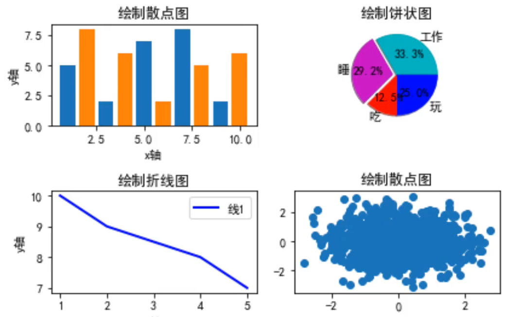
plt.subplot(223)
drowxiantu()
plt.subplot(221)
drowbingzhuangtu()
plt.subplot(222)
drowsandiantu()
plt.subplot(224)
drowzhuzhuangtu()
plt.tight_layout()
成功运行效果

课后练习

import matplotlib.pyplot as plt
#line 1 points
x1=[10,20,30]
y1=[20,40,10]
#line 2 points
x2=[10,20,30]
y2=[40,10,30]
#Set the x axis label of the current axis.

plt.xlabel('x-axis')
#Set the y axis label of the current axis.

plt.ylabel('y-axis')
#Set a title
plt.title('Two or more lines with different widths and colors with suitable legends')
#Display the figure
plt.plot(x1,y1,color='blue',linewidth=3,label='line1-width-3',linestyle='dotted')
plt.plot(x2,y2,color='red',linewidth=5,label='line1-width-5',linestyle='dashed')
#show a legend on the plot
plt.legend()

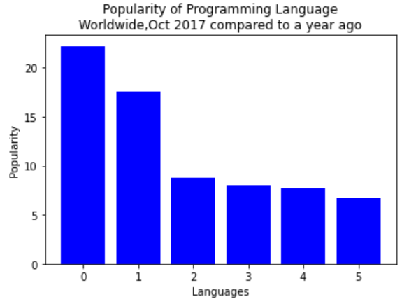
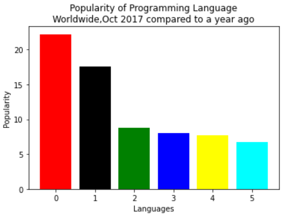
import matplotlib.pyplot as plt

x=['Java','Python','PHP','JavaScript','C#','C++']
popularity=[22.2,17.6,8.8,8,7.7,6.7]
x_pos=[i for i,_ in enumerate(x)]

plt.bar(x_pos,popularity,color='blue')
plt.xlabel("Languages")
plt.ylabel("Popularity")
plt.title("Popularity of Programming Language\n" + "Worldwide,Oct 2017 compared to a year ago")

import matplotlib.pyplot as plt

x=['Java','Python','PHP','JavaScript','C#','C++']
popularity=[22.2,17.6,8.8,8,7.7,6.7]
x_pos=[i for i,_ in enumerate(x)]

plt.bar(x_pos,popularity,color=['red','black','green','blue','yellow','cyan'])
plt.xlabel("Languages")
plt.ylabel("Popularity")
plt.title("Popularity of Programming Language\n" + "Worldwide,Oct 2017 compared to a year ago")
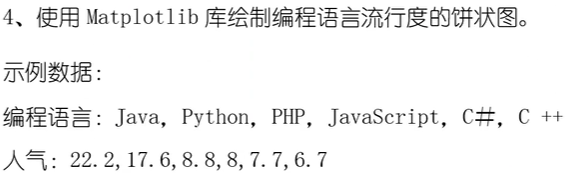
import matplotlib.pyplot as plt
#Plot data
languages=['Java','Python','PHP','JavaScript','C#','C++']
popularity=[22.2,17.6,8.8,8,7.7,6.7]
colors=['red','gold','yellowgreen','blue','lightcoral','lightskyblue']
explode=(0.1,0,0,0,0,0)
#Plot
plt.pie(popularity,explode=explode,labels=languages,colors=colors,autopct='%.1f%%',shadow=True)


import numpy as np
import matplotlib.pyplot as plt

#绘图数据
men_means=(22,30,33,30,26)
women_means=(25,32,30,35,29)
n_groups=5
index=np.arange(n_groups)
bar_width=0.35
rects1=plt.bar(index,men_means,bar_width,label='Men')
rects2=plt.bar(index + bar_width,women_means,bar_width,label='Women')
plt.xlabel('Person')
plt.ylabel('Scores')
plt.title('Scores by person')
plt.xticks(index + bar_width,('G1','G2','G3','G4','G5'))
plt.legend()


import numpy as np
import matplotlib.pyplot as plt

x=np.random.rand(200)
y=np.random.rand(200)
plt.scatter(x,y,s=70,facecolors='none',edgecolors='g')
plt.xlabel("X")
plt.ylabel("Y")

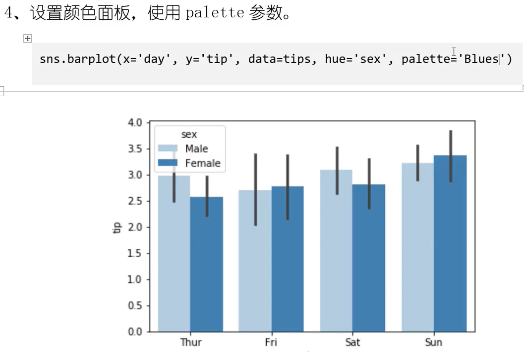
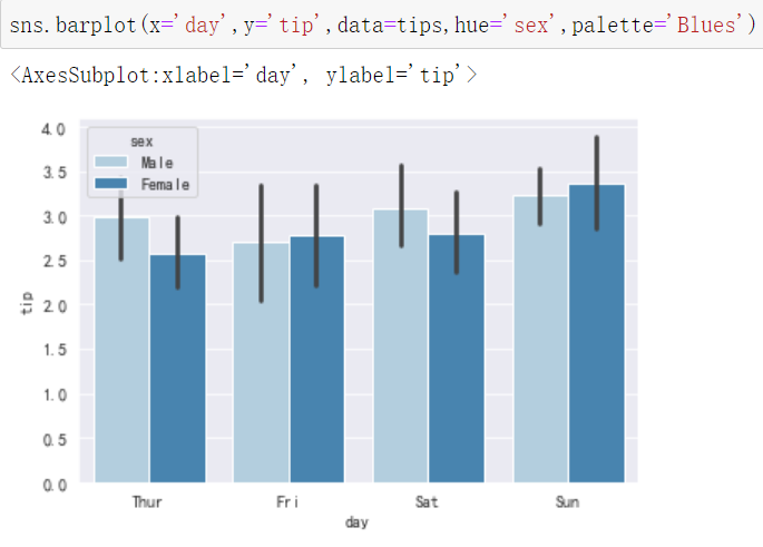
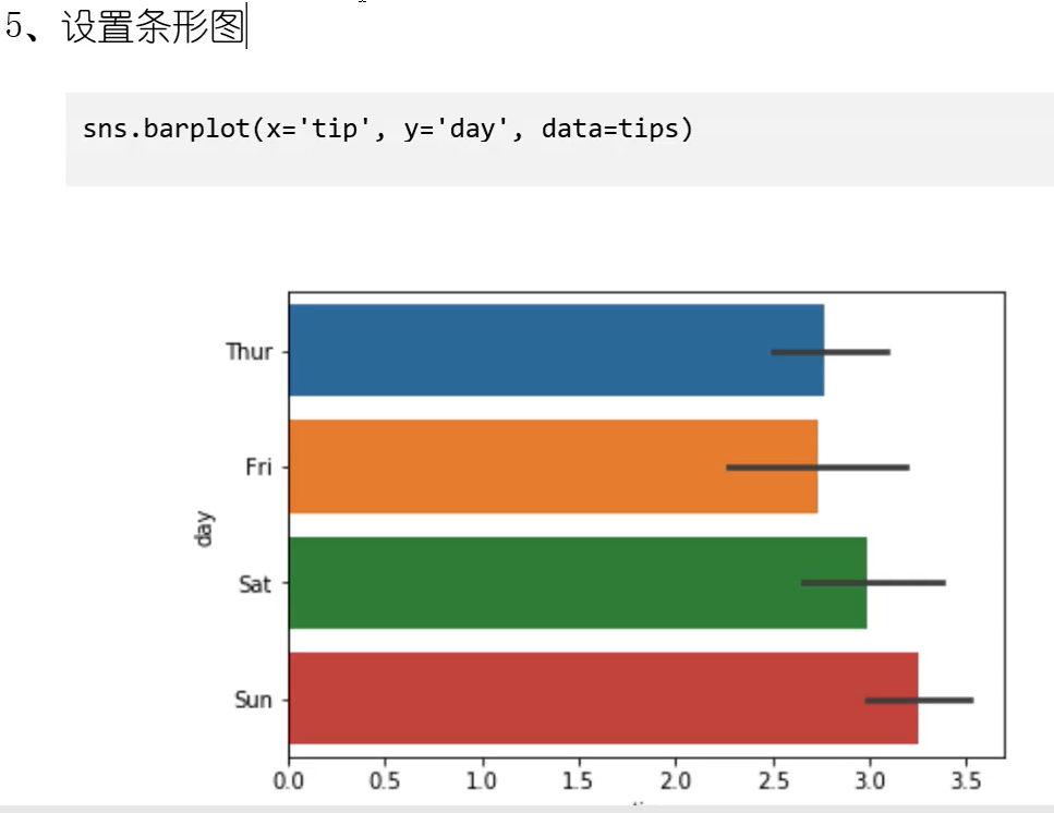
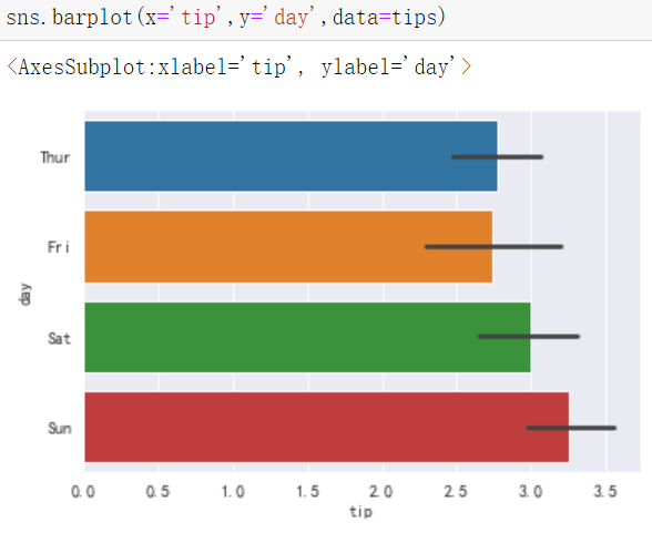
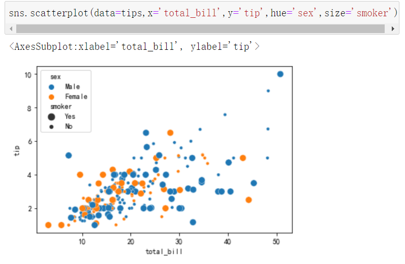
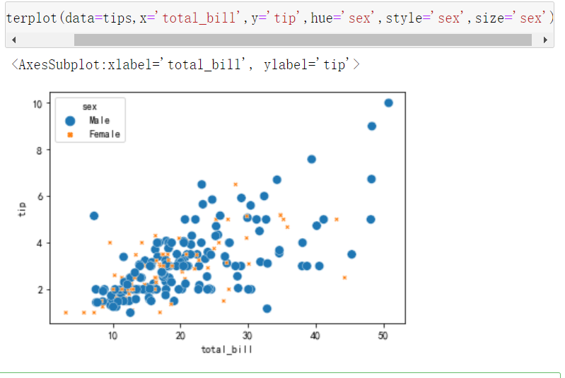
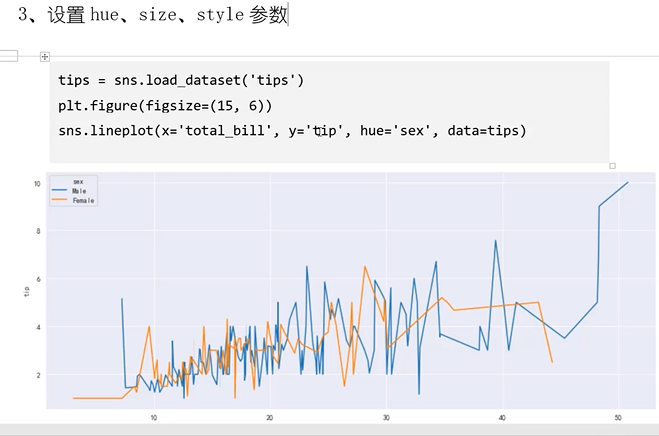
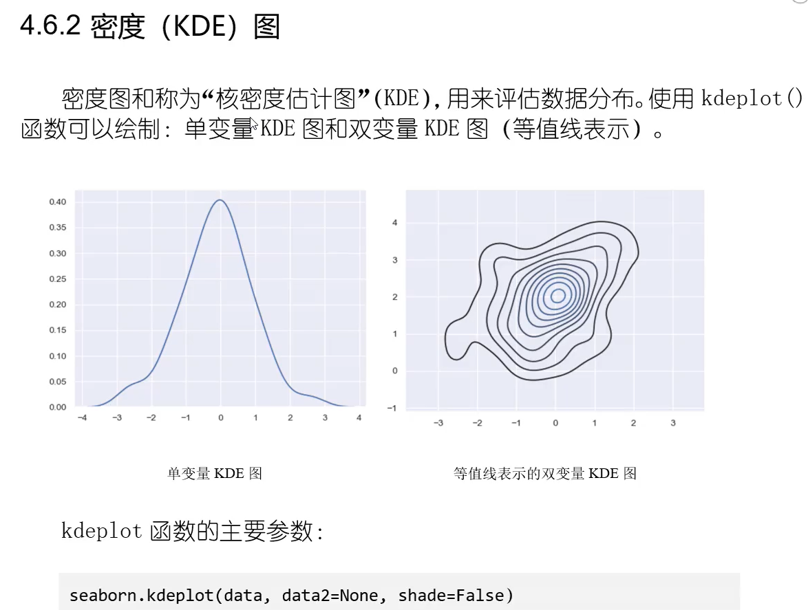
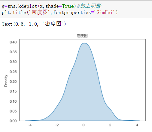
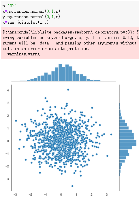
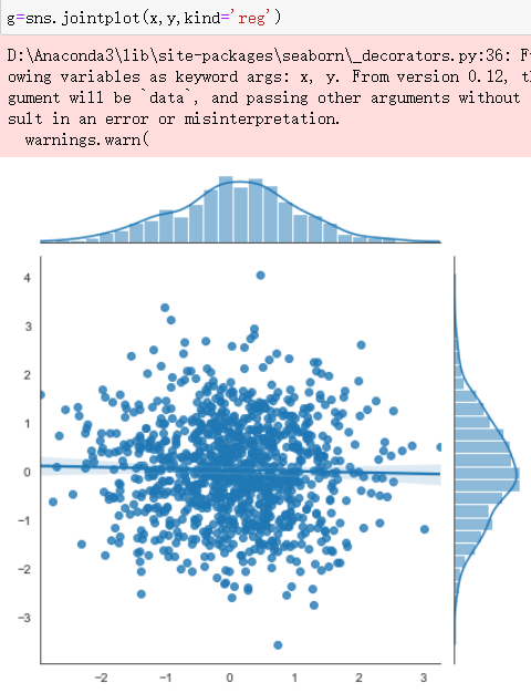
Seaborn库


4.3 Seaborn的样式控制

import matplotlib.pyplot as plt
import numpy as np
%matplotlib inline
plt.rcParams['font.family']=['SimHei']
plt.rcParams['font.size']=20
plt.rcParams['axes.unicode_minus']=False
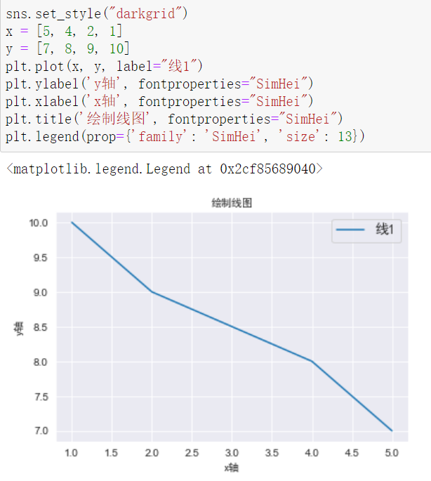
import matplotlib.pyplot as plt
import numpy as np
import seaborn as sns

sns.set()

x=[5,4,2,1]
y=[7,8,9,10]
plt.plot(x,y,label="线1")
plt.ylabel('y轴',fontproperties="SimHei")
plt.xlabel('x轴',fontproperties="SimHei")
plt.title('绘制线图',fontproperties="SimHei")
plt.legend(prop={'family':'SimHei','size':13})

import matplotlib.pyplot as plt
import numpy as np
import seaborn as sns
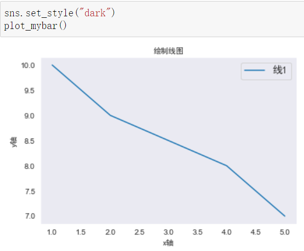
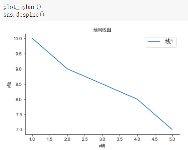
def plot_mybar():
x = [5, 4, 2, 1]
y = [7, 8, 9, 10]
plt.plot(x, y, label="线1")
plt.ylabel('y轴', fontproperties="SimHei")
plt.xlabel('x轴', fontproperties="SimHei")
plt.title('绘制线图', fontproperties="SimHei")
plt.legend(prop={'family': 'SimHei', 'size': 13})
sns.set_style("whitegrid")
plot_mybar()


中文乱码问题
1.seaborn里可以用给每一个函数设置中文来解决乱码问题
2.在set_style里全局设置中文
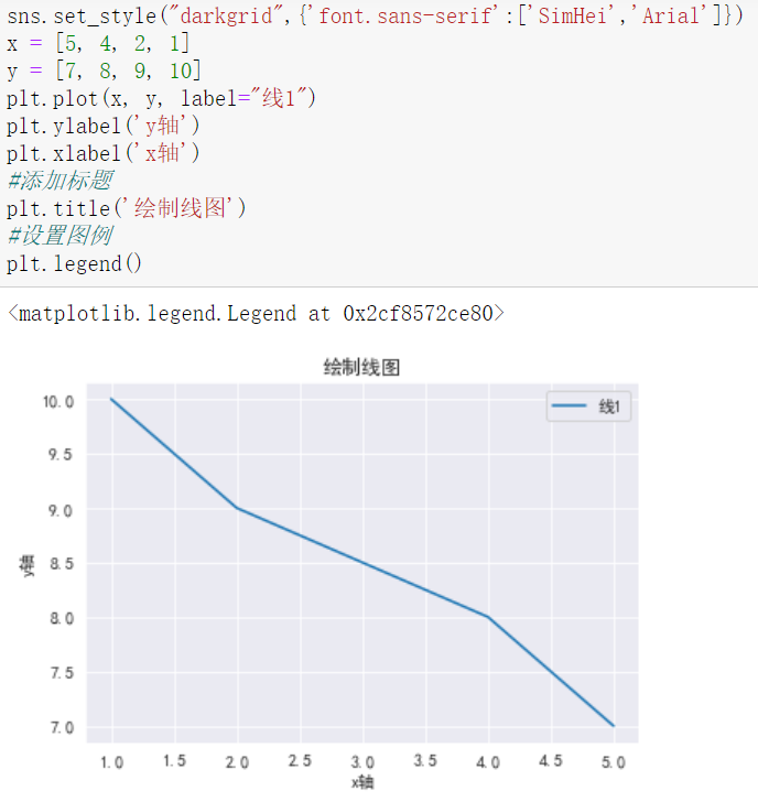
之后再绘制图形,不给每个函数设置中文同样不会出现乱码问题
柱状图
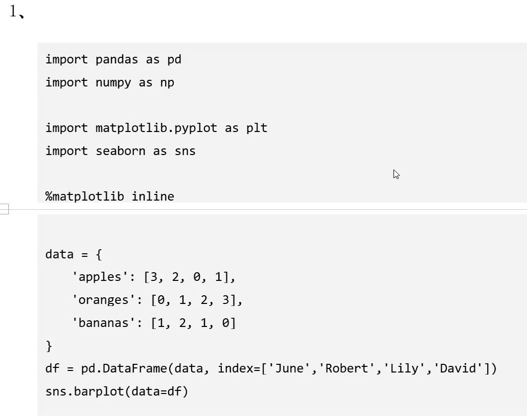
2.


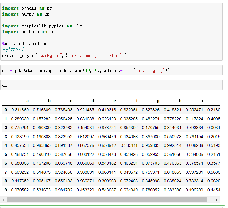
import pandas as pd
import numpy as np
import matplotlib.pyplot as plt
import seaborn as sns
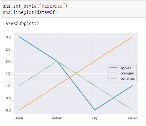
data={
'apples':[3,2,0,1],
'oranges':[0,1,2,3],
'bananas':[1,2,1,0]
}
df=pd.DataFrame(data,index=['June','Robert','Lily','David'])
df

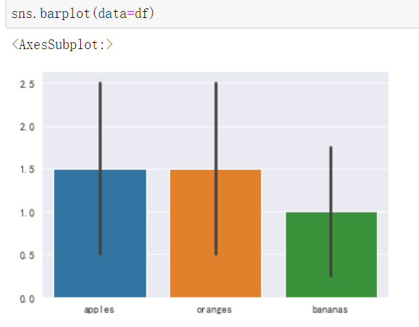
用head()打印前几条
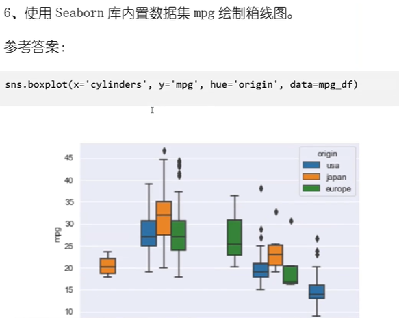
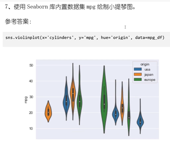
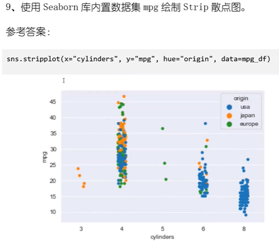
对数据分类


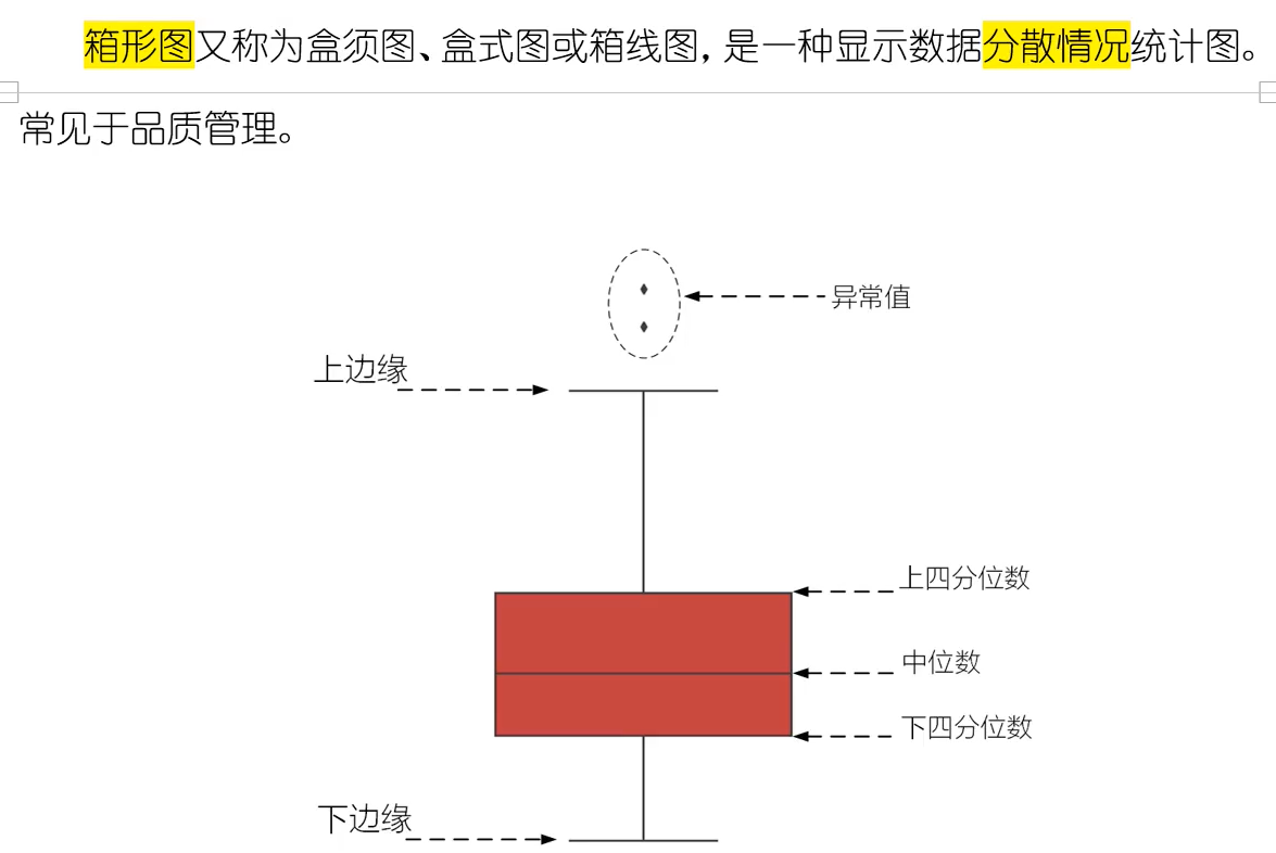
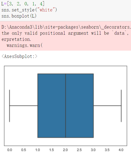
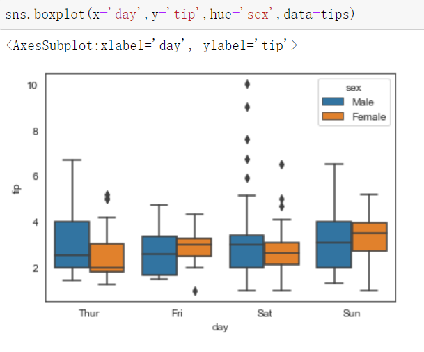
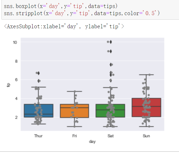
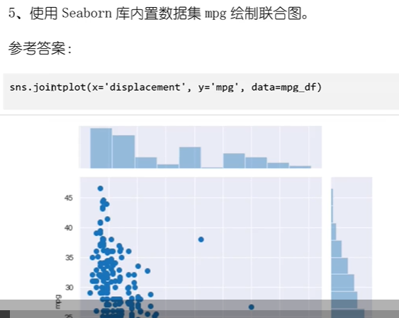
箱型图


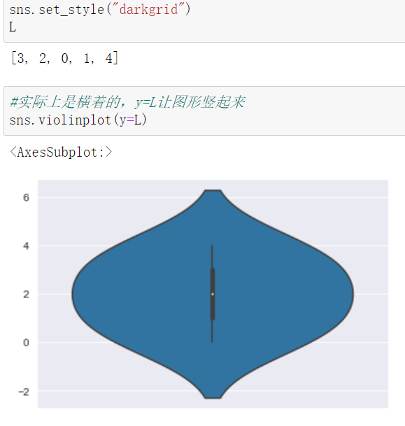
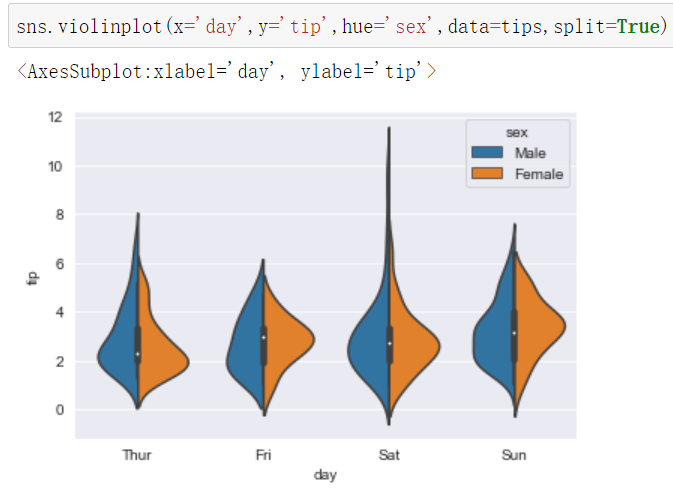
小提琴图


分类散点图Strip图


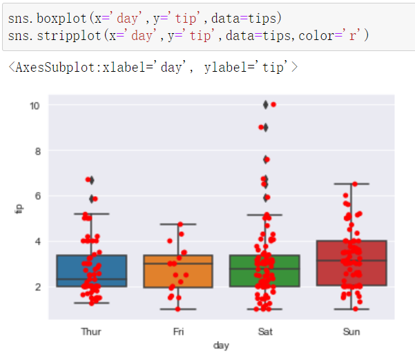
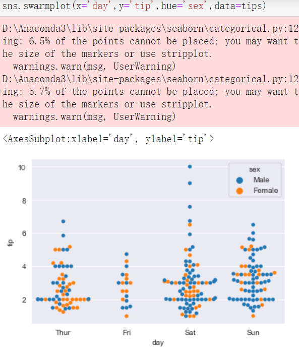
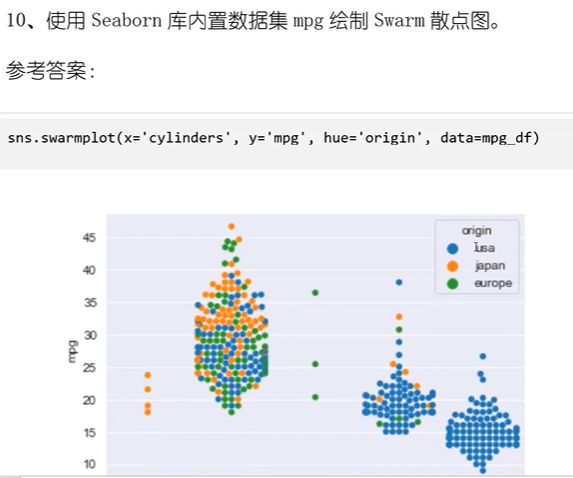
分类散点图–Swarm图


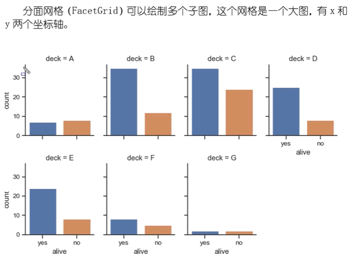
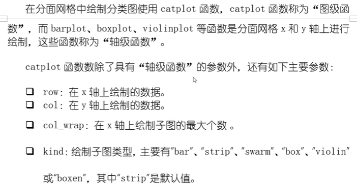
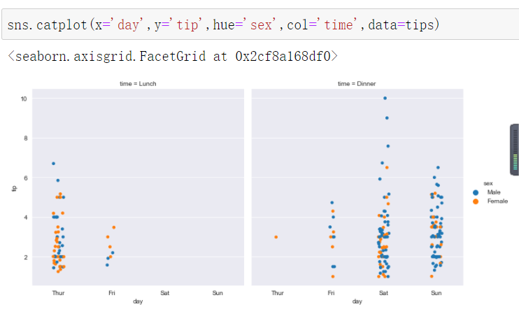
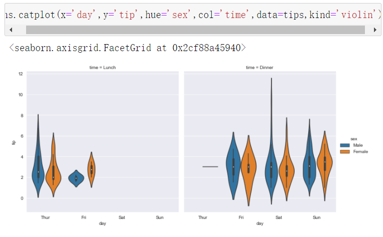
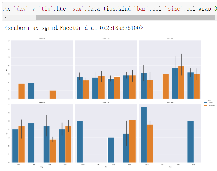
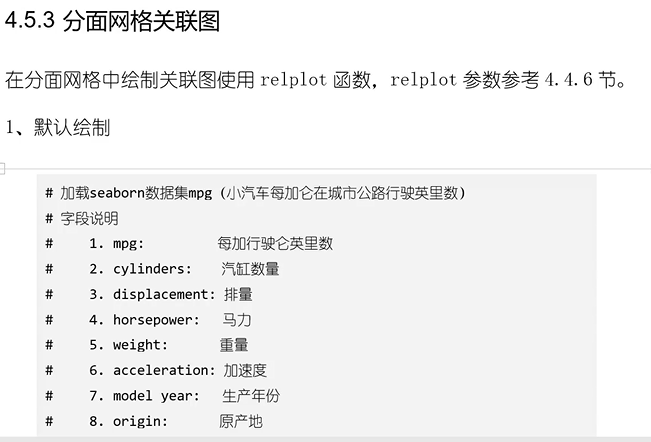
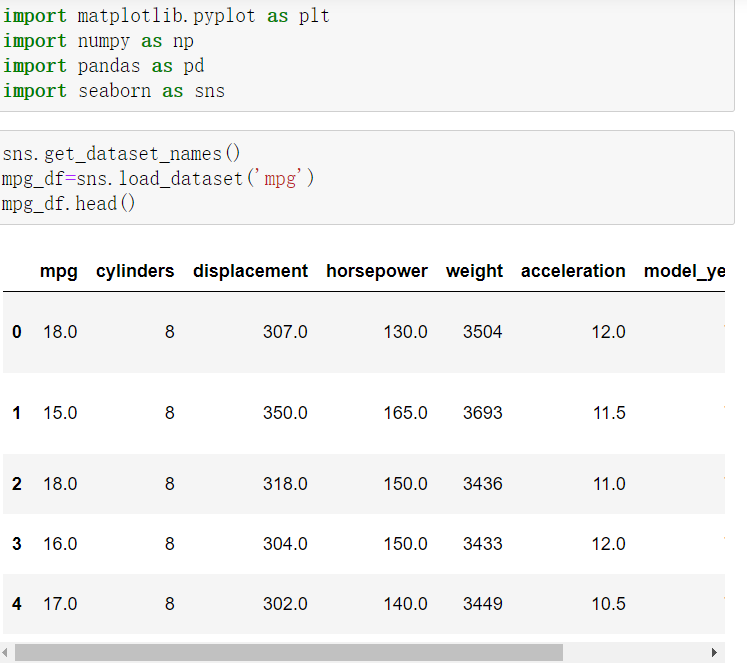
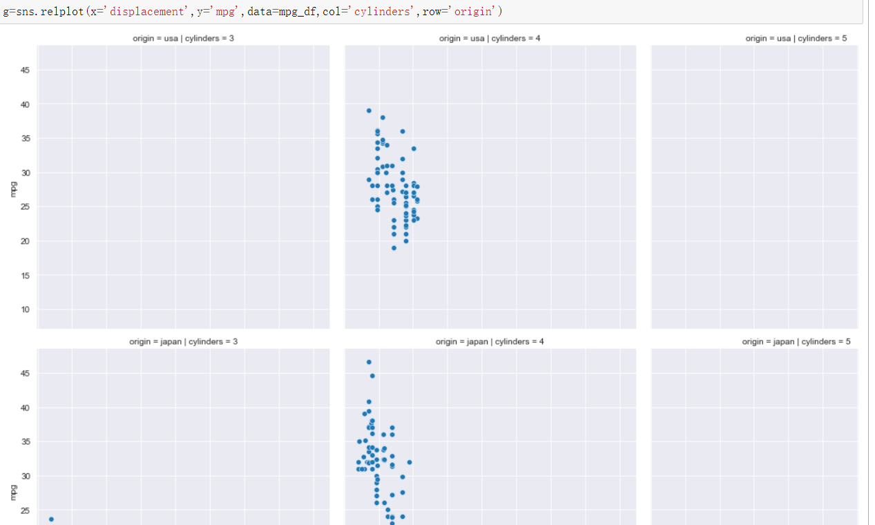
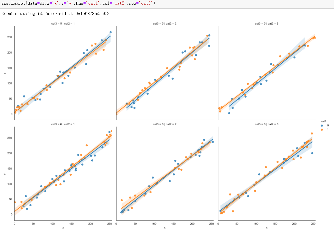
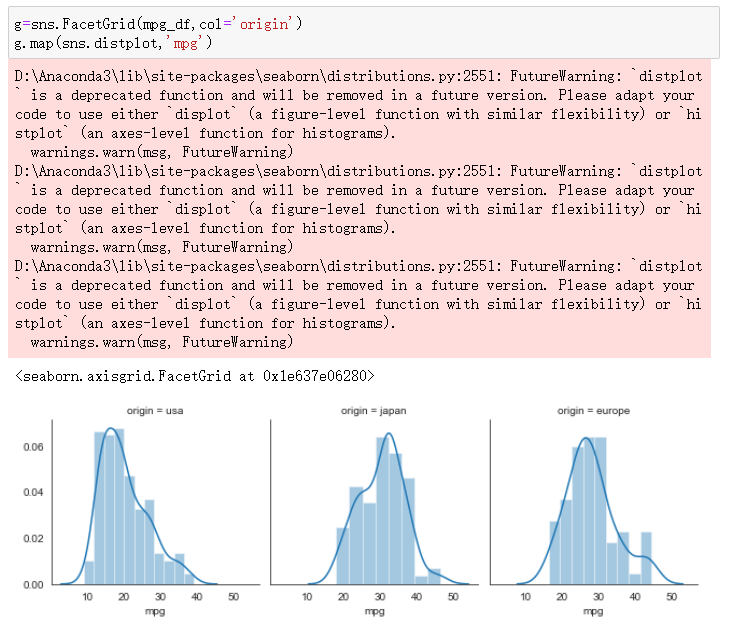
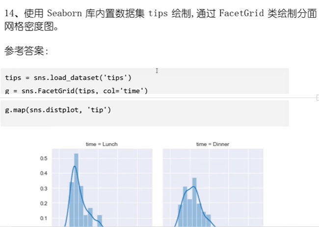
分面网格分类图


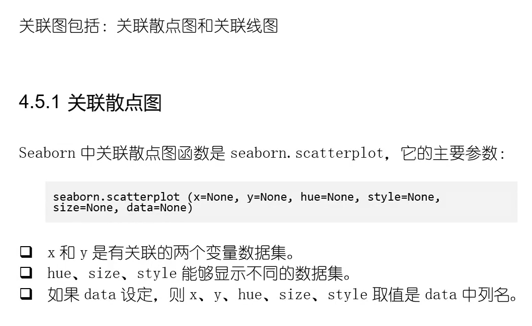
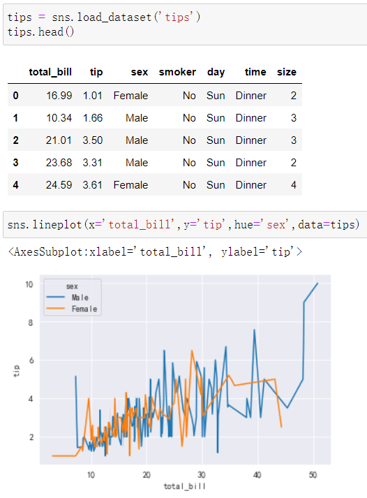
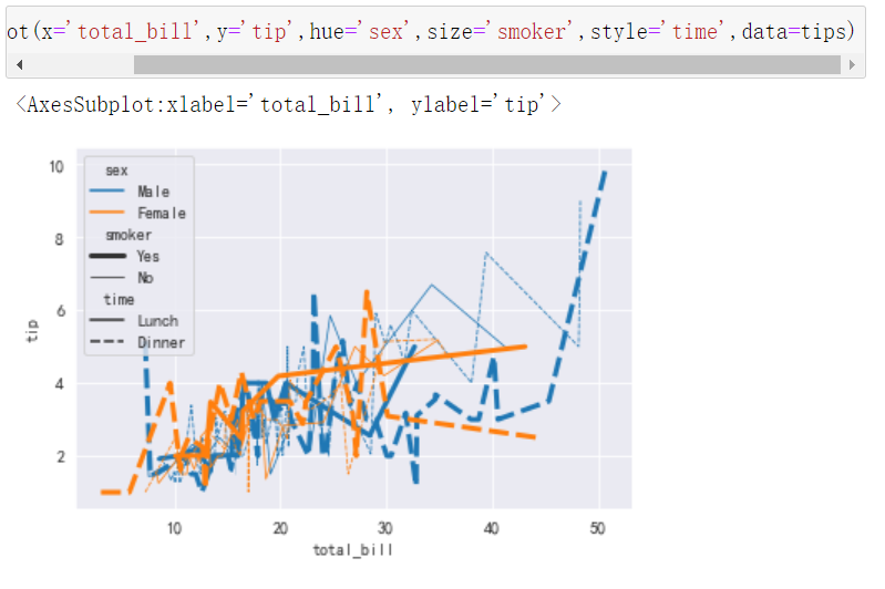
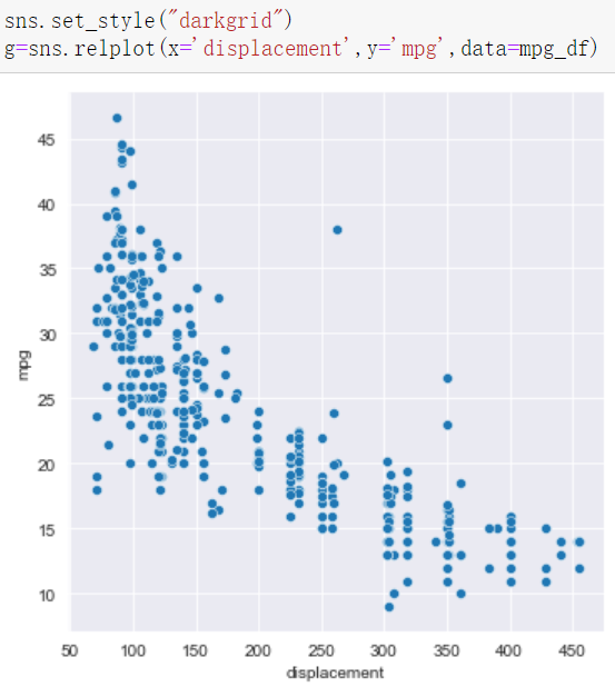
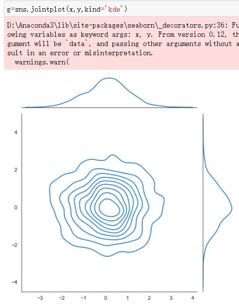
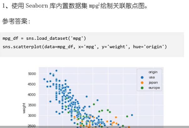
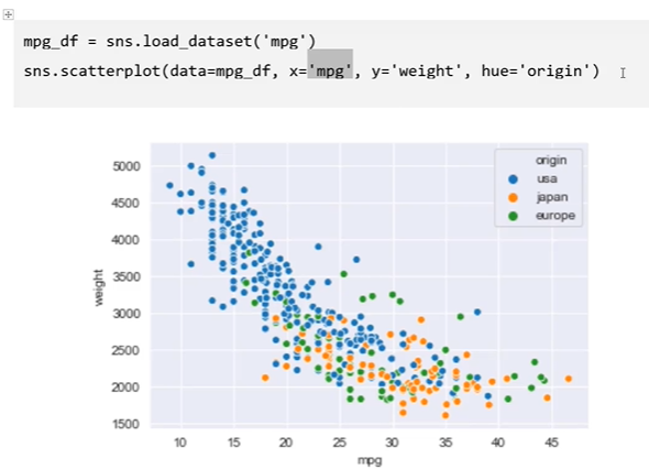
关联图

学习视频中使用的数据顶部和底部两行参数没用,所以使用了
skiprows=2,skipfooter=2
import pandas as pd

file_path-='data\\'
df20=pd.read_excel(file_path + '全国总人口数据.xls',sheet_name='20年数据',skiprows=2,skipfooter=2)
使用参数没有需要去除的地方所以不使用这两个参数
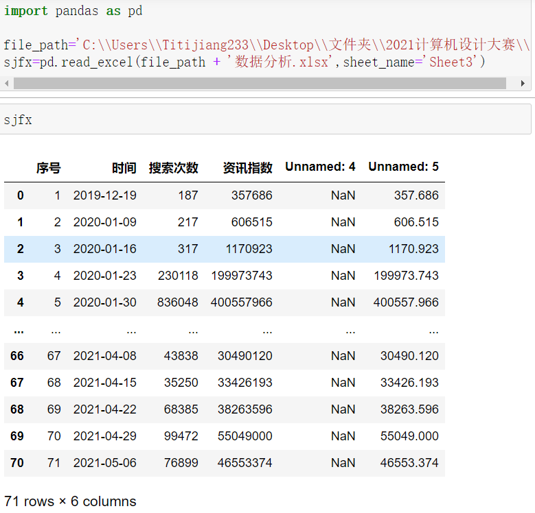
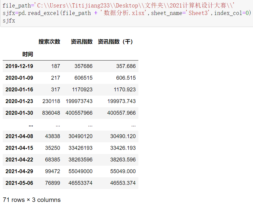
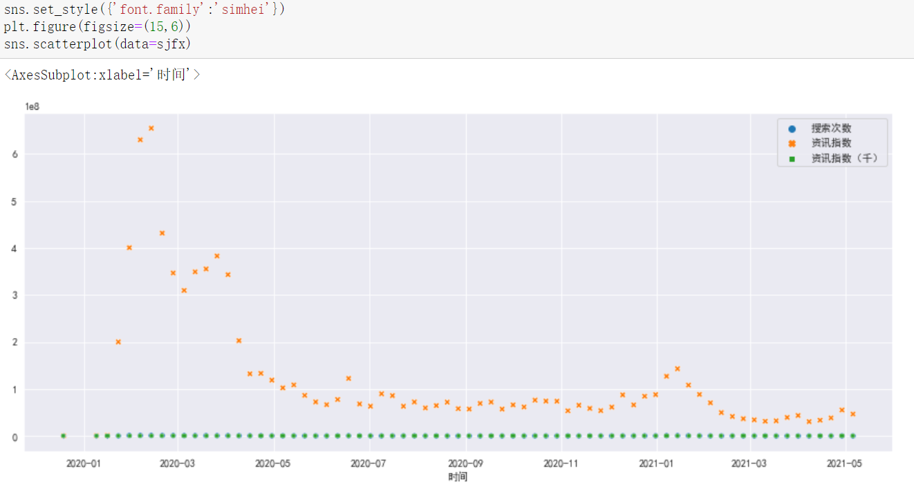
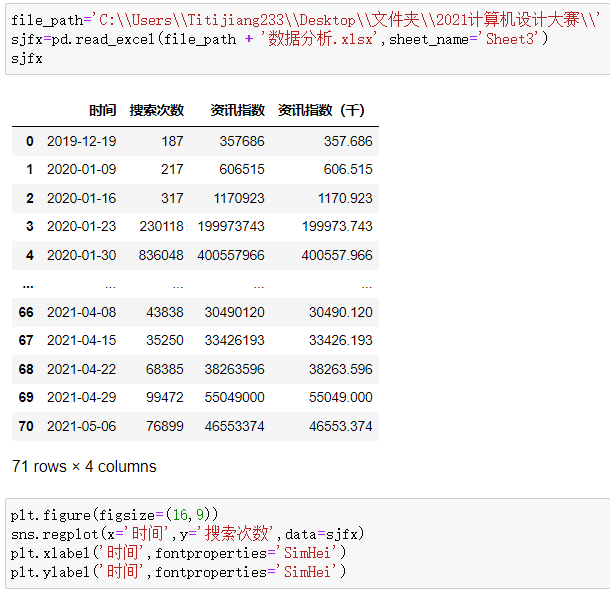
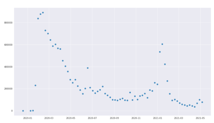
import pandas as pd

file_path='C:\\Users\\Titijiang233\\Desktop\\文件夹\\2021计算机设计大赛\\'
sjfx=pd.read_excel(file_path + '数据分析.xlsx',sheet_name='Sheet3')


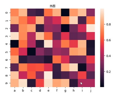
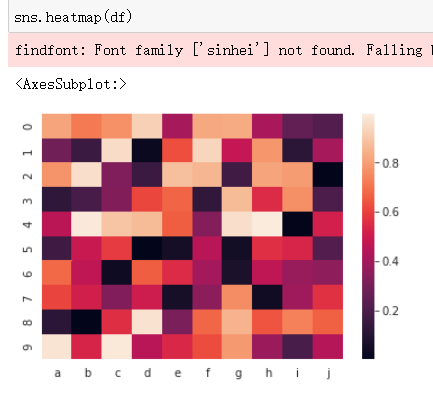
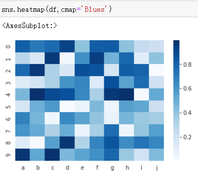
热力图


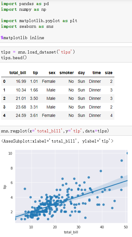
线性回归图

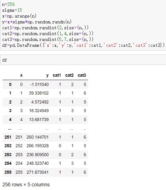


分面网格图


Original: https://blog.csdn.net/Titijiang233/article/details/120336436
Author: Titijiang233
Title: 数据可视化:Matplotlib和Seaborn
原创文章受到原创版权保护。转载请注明出处:https://www.johngo689.com/765468/
转载文章受原作者版权保护。转载请注明原作者出处!