

1 Matplotlib简介
- 自从numpy和pandas数据分析的广泛应用,人们发现虽然可以对大量的数据进行快速方便的,各种各样的操作,但是对结果查看不够直观,因此,Matplotlib应运而生,在数据分析与机器学习中,我们经常要用到大量的可视化操作。一张制作精美的数据图片,可以展示大量的信息,一图顶千言。而在可视化中,Matplotlib算得上是最常用的工具。Matplotlib 是 python 最著名的绘图库,它提供了一整套 API,十分适合绘制图表,或修改图表的一些属性,如字体、标签、范围等。
- numpy,pandas,Matplotlib被成为数据分析不可或缺的的三剑客。
- Matplotlib 是一个 Python 的 2D 绘图库,它交互式环境生成 出版质量级别的图形。通过 Matplotlib这个标准类库,开发者 只需要几行代码就可以实现生成绘图,折线图、散点图、柱状图、饼图、直方图、组合图等数据分析可视化图表。


- 安装方式:
安装了python之后,使用bash命令即可(建议使用anaconda,方便不同python环境的切换):
pip install matplotlib -i https://pypi.tuna.tsinghua.edu.cn/simple
2 基础知识
2.1 图形绘制
import numpy as np
import matplotlib.pyplot as plt

x = np.linspace(0,2*np.pi)
y = np.sin(x)

plt.figure(figsize=(9,6))
plt.plot(x,y)

plt.grid(linestyle = "--",
        color = 'green',
        alpha = 0.75)

plt.axis([-1,10,-1.5,1.5])
plt.xlim([-1,10])
plt.ylim([-1.5,1.5])

2.2 坐标轴刻度、标签、标题
import numpy as np
import matplotlib.pyplot as plt

x = np.linspace(0,2*np.pi)
y = np.sin(x)
plt.plot(x,y)

plt.xticks(np.arange(0,7,np.pi/2))
plt.yticks([-1,0,1])

_ = plt.yticks(ticks = [-1,0,1],labels=['min',' 0 ','max'],fontsize = 20,ha = 'right')
font= {'family':'serif','style':'italic','weight':'normal','color':'red','size':16}

_ = plt.xticks(ticks = np.arange(0,7,np.pi/2),

               labels = ['0',r'$\frac{\pi}{2}$',r'$\pi$',r'$\frac{3\pi} {2}$',r'$2\pi$'],
               fontsize = 20,
               fontweight = 'normal',
               color = 'red')

plt.ylabel('y = sin(x)',
           rotation = 0,
           horizontalalignment = 'right',
           fontstyle = 'normal',
           fontsize = 20)

from matplotlib.font_manager import FontManager
fm = FontManager()
mat_fonts = set(f.name for f in fm.ttflist)

plt.rcParams['font.sans-serif'] = 'STZhongsong'

plt.title('正弦波')

2.3 图例
import numpy as np
import matplotlib.pyplot as plt

x = np.linspace(0,2*np.pi)
y = np.sin(x)

plt.figure(figsize=(9,6))
plt.plot(x,y)

plt.plot(x,np.cos(x))
plt.legend(['Sin','Cos'],fontsize = 18,loc = 'center',ncol = 2,bbox_to_anchor = [0,1.05,1,0.2])

2.4 脊柱移动
import numpy as np
import matplotlib.pyplot as plt

x = np.linspace(-np.pi,np.pi,50)
plt.rcParams['axes.unicode_minus'] = False
plt.figure(figsize=(9,6))
plt.plot(x,np.sin(x),x,np.cos(x))
ax = plt.gca()

ax.spines['right'].set_color('white')
ax.spines['top'].set_color('#FFFFFF')

ax.spines['bottom'].set_position(('data',0))
ax.spines['left'].set_position(('data',0))

plt.yticks([-1,0,1],labels=['-1','0','1'],fontsize = 18)
_ = plt.xticks([-np.pi,-np.pi/2,np.pi/2,np.pi],
               labels=[r'$-\pi$',r'$-\frac{\pi}{2}$',r'$\frac{\pi}{2}$',r'$\pi$'],
               fontsize = 18)

2.5 图片保存
import numpy as np
import matplotlib.pyplot as plt

x = np.linspace(0,2*np.pi)
y = np.sin(x)
plt.figure(linewidth = 4)
plt.plot(x,y,color = 'red')
plt.plot(x,np.cos(x),color = 'k')

ax = plt.gca()
ax.set_facecolor('lightgreen')

plt.legend(['Sin','Cos'],fontsize = 18,loc = 'center',ncol = 2,bbox_to_anchor = [0,1.05,1,0.2])

plt.savefig('./基础5.png',
            dpi = 100,
            facecolor = 'violet',
            edgecolor = 'lightgreen',
            bbox_inches = 'tight')

3 风格和样式
3.1 颜色、线形、点形、线宽、透明度

import numpy as np
import matplotlib.pyplot as plt
x = np.linspace(0,2*np.pi,20)
y1 = np.sin(x)
y2 = np.cos(x)

plt.plot(x,y1,color = 'indigo',ls = '-.',marker = 'p')
plt.plot(x,y2,color = '#FF00EE',ls = '--',marker = 'o')
plt.plot(x,y1 + y2,color = (0.2,0.7,0.2),marker = '*',ls = ':')
plt.plot(x,y1 + 2*y2,linewidth = 3,alpha = 0.7,color = 'orange')
plt.plot(x,2*y1 - y2,'bo--')

3.2 更多属性设置
import numpy as np
import matplotlib.pyplot as plt

def f(x):
    return np.exp(-x)*np.cos(2*np.pi*x)
x = np.linspace(0,5,50)
plt.figure(figsize=(9,6))
plt.plot(x,f(x),color = 'purple',
        marker = 'o',
        ls = '--',
        lw = 2,
        alpha = 0.6,
        markerfacecolor = 'red',
        markersize = 10,
        markeredgecolor = 'green',
        markeredgewidth = 3)
_ = plt.xticks(size = 18)
_ = plt.yticks(size = 18)

4 多图布局
4.1 子视图
import numpy as np
import matplotlib.pyplot as plt
x = np.linspace(-np.pi,np.pi,50)
y = np.sin(x)

plt.figure(figsize=(9,6))
ax = plt.subplot(221)
ax.plot(x,y,color = 'red')
ax.set_facecolor('green')

ax = plt.subplot(2,2,2)
line, = ax.plot(x,-y)
line.set_marker('*')
line.set_markerfacecolor('red')
line.set_markeredgecolor('green')
line.set_markersize(10)

ax = plt.subplot(2,1,2)
plt.sca(ax)
x = np.linspace(-np.pi,np.pi,200)
plt.plot(x,np.sin(x*x),color = 'red')

4.2 嵌套
import numpy as np
import matplotlib.pyplot as plt
x = np.linspace(-np.pi,np.pi,25)
y = np.sin(x)
fig = plt.figure(figsize=(9,6))

plt.plot(x,y)

ax = plt.axes([0.2,0.55,0.3,0.3])
ax.plot(x,y,color = 'g')

ax = fig.add_axes([0.55,0.2,0.3,0.3])
ax.plot(x,y,color = 'r')

4.3 多图布局分格显示
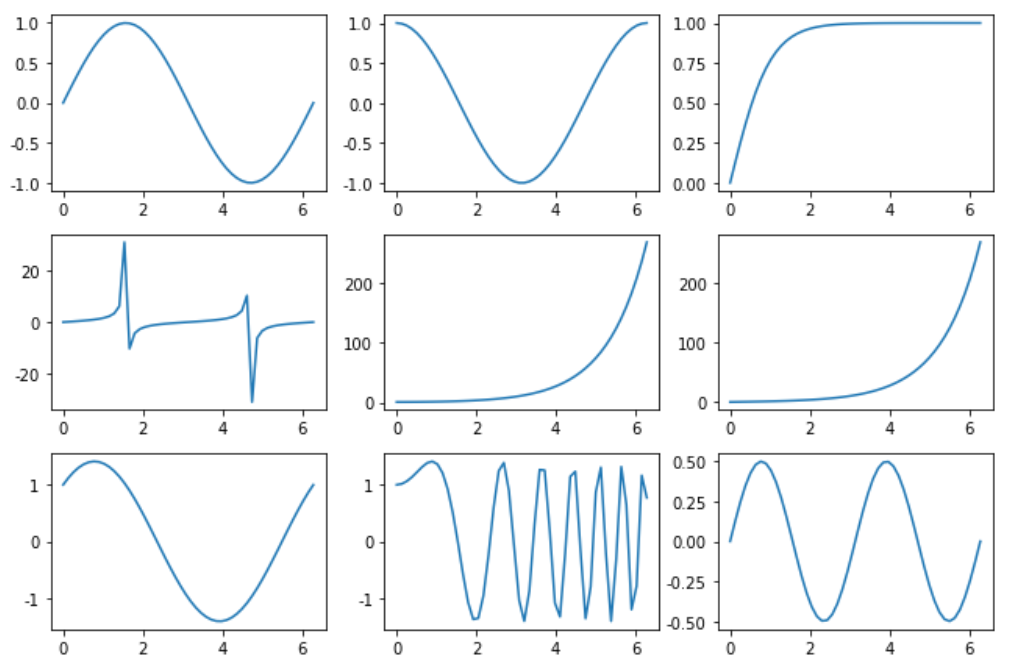
4.3.1 均匀布局
import numpy as np
import matplotlib.pyplot as plt
x = np.linspace(0,2*np.pi)

fig, ((ax11,ax12,ax13), (ax21,ax22,ax23),(ax31,ax32,ax33)) = plt.subplots(3, 3)

fig.set_figwidth(9)
fig.set_figheight(6)
ax11.plot(x,np.sin(x))
ax12.plot(x,np.cos(x))
ax13.plot(x,np.tanh(x))
ax21.plot(x,np.tan(x))
ax22.plot(x,np.cosh(x))
ax23.plot(x,np.sinh(x))
ax31.plot(x,np.sin(x) + np.cos(x))
ax32.plot(x,np.sin(x*x) + np.cos(x*x))
ax33.plot(x,np.sin(x)*np.cos(x))

plt.tight_layout()
plt.show()
4.3.2 不均匀布局
- 方式一
import numpy as np
import matplotlib.pyplot as plt

x = np.linspace(0,2*np.pi,200)
fig = plt.figure(figsize=(12,9))

ax1 = plt.subplot(3,1,1)
ax1.plot(x,np.sin(10*x))

ax1.set_title('ax1_title')

ax2 = plt.subplot(3,3,(4,5))
ax2.set_facecolor('green')
ax2.plot(x,np.cos(x),color = 'red')
ax3 = plt.subplot(3,3,(6,9))

ax3.plot(x,np.sin(x) + np.cos(x))
ax4 = plt.subplot(3,3,7)
ax4.plot([1,3],[2,4])
ax5 = plt.subplot(3,3,8)
ax5.scatter([1,2,3], [0,2, 4])
ax5.set_xlabel('ax5_x',fontsize = 12)
ax5.set_ylabel('ax5_y',fontsize = 12)
plt.show()

- 方式二
import numpy as np
import matplotlib.pyplot as plt

x = np.linspace(0,2*np.pi,100)
plt.figure(figsize=(12,9))

ax1 = plt.subplot2grid(shape = (3, 3),
                       loc = (0, 0),
                       colspan=3)

ax1.set_title('ax1_title')

ax2 = plt.subplot2grid((3, 3), (1, 0), colspan=2)
ax2.set_facecolor('green')
ax2.plot(x,np.cos(x),color = 'red')

ax3 = plt.subplot2grid((3, 3), (1, 2), rowspan=2)
ax3.plot(x,np.sin(x) + np.cos(x))

ax4 = plt.subplot2grid((3, 3), (2, 0))
ax4.plot([1,3],[2,4])

ax5 = plt.subplot2grid((3, 3), (2, 1))
ax5.scatter([1,2,3], [0,2, 4])
ax5.set_xlabel('ax5_x',fontsize = 12)
ax5.set_ylabel('ax5_y',fontsize = 12)

- 方式三
import numpy as np
import matplotlib.pyplot as plt

import matplotlib.gridspec as gridspec

x = np.linspace(0,2*np.pi,200)
fig = plt.figure(figsize=(12,9))

gs = gridspec.GridSpec(3, 3)

ax1 = fig.add_subplot(gs[0,:])
ax1.plot(x,np.sin(10*x))

ax1.set_title('ax1_title')
ax2 = plt.subplot(gs[1, :2])
ax2.set_facecolor('green')
ax2.plot(x,np.cos(x),color = 'red')

ax3 = plt.subplot(gs[1:, 2])
ax3.plot(x,np.sin(x) + np.cos(x))

ax4 = plt.subplot(gs[-1, 0])
ax4.plot([1,3],[2,4])

ax5 = plt.subplot(gs[-1, -2])
ax5.scatter([1,2,3], [0,2, 4])
ax5.set_xlabel('ax5_x',fontsize = 12)
ax5.set_ylabel('ax5_y',fontsize = 12)
plt.show()

4.4 双轴显示
import numpy as np
import matplotlib.pyplot as plt

x = np.linspace(-np.pi,np.pi,100)
data1 = np.exp(x)
data2 = np.sin(x)
plt.figure(figsize=(9,6))
plt.rcParams['font.size'] = 16

ax1 = plt.gca()
ax1.set_xlabel('time (s)')
ax1.set_ylabel('exp', color='red')
ax1.plot(data1, color='red')
ax1.tick_params(axis='y', labelcolor='red')

ax2 = ax1.twinx()
ax2.set_ylabel('sin', color='blue')
ax2.plot(data2, color='blue')
ax2.tick_params(axis='y', labelcolor='blue')
plt.tight_layout()

5 文本、注释、箭头
- 常用函数如下:

; 5.1 文本
import numpy as np
import matplotlib.pyplot as plt

from matplotlib.font_manager import FontManager
fm = FontManager()
mat_fonts = set(f.name for f in fm.ttflist)

font = {'fontsize': 20, 'family': 'STCaiyun', 'color': 'red', 'weight': 'bold'}
x = np.linspace(0.0, 5.0, 100)
y = np.cos(2*np.pi*x) * np.exp(-x)
plt.figure(figsize=(9,6))
plt.plot(x, y, 'k')
plt.title('exponential decay',fontdict=font)
plt.suptitle('指数衰减',y = 1.05,fontdict = font,fontsize = 30)
plt.text(x = 2, y = 0.65,
         s = r'$\cos(2 \pi t) \exp(-t)$')
plt.xlabel('time (s)')
plt.ylabel('voltage (mV)')
plt.show()

5.2 箭头
import matplotlib.pyplot as plt
import numpy as np

loc = np.random.randint(0,10,size = (10,2))
plt.figure(figsize=(10, 10))
plt.plot(loc[:,0], loc[:,1], 'g*', ms=20)
plt.grid(True)
way = np.arange(10)
np.random.shuffle(way)
for i in range(0, len(way)-1):
    start = loc[way[i]]
    end = loc[way[i+1]]
    plt.arrow(start[0], start[1], end[0]-start[0], end[1]-start[1],
              head_width=0.2, lw=2,
              length_includes_head = True)
    plt.text(start[0],start[1],s = i,fontsize = 18,color = 'red')
    if i == len(way) - 2:
        plt.text(end[0],end[1],s = i + 1,fontsize = 18,color = 'red')

5.3 注释
import numpy as np
import pandas as pd
import matplotlib.pyplot as plt

fig,ax = plt.subplots()
x = np.arange(0.0,5.0,0.01)
y = np.cos(2*np.pi*x)
line, = ax.plot(x,y,lw=2)
ax.annotate('local max',
            xy=(2, 1),
            xytext=(3, 1.5),
            arrowprops=dict(facecolor='black', shrink=0.05))

ax.annotate('local min',
            xy = (2.5,-1),
            xytext = (4,-1.8),
            arrowprops = dict(facecolor = 'black', width = 2,
                              headwidth = 10,
                              headlength = 10,
                              shrink = 0.1))
ax.annotate('median',
            xy = (2.25,0),
            xytext = (0.5,-1.8),
            arrowprops = dict(arrowstyle = '-|>'),
            fontsize = 20)
ax.set_ylim(-2, 2)

5.4 注释箭头连接形状
import matplotlib.pyplot as plt
def annotate_con_style(ax, connectionstyle):
    x1, y1 = 3,2
    x2, y2 = 8,6
    ax.plot([x1, x2], [y1, y2], ".")
    ax.annotate(" ",
                xy=(x1, y1),
                xytext=(x2, y2),
                arrowprops=dict(arrowstyle='->', color='red',
                                shrinkA = 5,shrinkB = 5,
                                connectionstyle=connectionstyle))

    ax.text(0.05, 0.95, connectionstyle.replace(",", "\n"),
            transform=ax.transAxes,
            ha="left", va="top")

fig, axs = plt.subplots(3, 5, figsize=(9,6))
annotate_con_style(axs[0, 0], "angle3,angleA=90,angleB=0")
annotate_con_style(axs[1, 0], "angle3,angleA=0,angleB=90")
annotate_con_style(axs[2, 0], "angle3,angleA = 0,angleB=150")
annotate_con_style(axs[0, 1], "arc3,rad=0.")
annotate_con_style(axs[1, 1], "arc3,rad=0.3")
annotate_con_style(axs[2, 1], "arc3,rad=-0.3")
annotate_con_style(axs[0, 2], "angle,angleA=-90,angleB=180,rad=0")
annotate_con_style(axs[1, 2], "angle,angleA=-90,angleB=180,rad=5")
annotate_con_style(axs[2, 2], "angle,angleA=-90,angleB=10,rad=5")
annotate_con_style(axs[0, 3], "arc,angleA=-90,angleB=0,armA=30,armB=30,rad=0")
annotate_con_style(axs[1, 3], "arc,angleA=-90,angleB=0,armA=30,armB=30,rad=5")
annotate_con_style(axs[2, 3], "arc,angleA=-90,angleB=0,armA=0,armB=40,rad=0")
annotate_con_style(axs[0, 4], "bar,fraction=0.3")
annotate_con_style(axs[1, 4], "bar,fraction=-0.3")
annotate_con_style(axs[2, 4], "bar,angle=180,fraction=-0.2")

for ax in axs.flat:
    ax.set(xlim=(0, 10), ylim=(0, 10),xticks = [],yticks = [],aspect=1)
fig.tight_layout(pad=0.2)

6 常用视图
6.1 折线图
import numpy as np
import matplotlib.pyplot as plt
x = np.random.randint(0,10,size = 15)
print(x)

plt.figure(figsize=(9,6))
plt.plot(x,marker = '*',color = 'r')
plt.plot(x.cumsum(),marker = 'o')

fig,axs = plt.subplots(2,1)
fig.set_figwidth(9)
fig.set_figheight(6)
axs[0].plot(x,marker = '*',color = 'red')
axs[1].plot(x.cumsum(),marker = 'o')

6.2 柱状图
- 堆叠柱状图
import numpy as np
import matplotlib.pyplot as plt

labels = ['G1', 'G2', 'G3', 'G4', 'G5','G6']
men_means = np.random.randint(20,35,size = 6)
women_means = np.random.randint(20,35,size = 6)
men_std = np.random.randint(1,7,size = 6)
women_std = np.random.randint(1,7,size = 6)
width = 0.35
plt.bar(labels,
        men_means,
        width,
        yerr=4,
        label='Men')
plt.bar(labels, women_means, width, yerr=2, bottom=men_means, label='Women')
plt.ylabel('Scores')
plt.title('Scores by group and gender')
plt.legend()

- 分组带标签柱状图
import matplotlib
import matplotlib.pyplot as plt
import numpy as np

labels = ['G1', 'G2', 'G3', 'G4', 'G5','G6']
men_means = np.random.randint(20,35,size = 6)
women_means = np.random.randint(20,35,size = 6)
x = np.arange(len(men_means))
width = 0.35
plt.figure(figsize=(9,6))
rects1 = plt.bar(x - width/2, men_means, width)
rects2 = plt.bar(x + width/2, women_means, width)

plt.ylabel('Scores')
plt.title('Scores by group and gender')
plt.xticks(x,labels)
plt.legend(['Men','Women'])

def set_label(rects):
    for rect in rects:
        height = rect.get_height()
        plt.text(x = rect.get_x() + rect.get_width()/2,
                 y = height + 0.5,
                 s = height,
                 ha = 'center')
set_label(rects1)
set_label(rects2)
plt.tight_layout()

6.3 极坐标图
- 极坐标线形图
import numpy as np
import matplotlib.pyplot as plt

r = np.arange(0, 4*np.pi, 0.01)
y = np.linspace(0,2,len(r))

ax = plt.subplot(111,projection = 'polar',facecolor = 'lightgreen')
ax.plot(r, y,color = 'red')
ax.set_rmax(3)
ax.set_rticks([0.5, 1, 1.5, 2])
ax.set_rlabel_position(-22.5)
ax.grid(True)

ax.set_title("A line plot on a polar axis", va='center',ha = 'center',pad = 30)

- 极坐标柱状图
import numpy as np
import matplotlib.pyplot as plt
N = 8
theta = np.linspace(0.0, 2 * np.pi, N, endpoint=False)
radii = np.random.randint(3,15,size = N)
width = np.pi / 4
colors = np.random.rand(8,3)
ax = plt.subplot(111, projection='polar')
ax.bar(theta, radii, width=width, bottom=0.0,color = colors)

6.4 直方图
import numpy as np
import matplotlib.pyplot as plt

mu = 100
sigma = 15
x = np.random.normal(loc = mu,scale = 15,size = 10000)
fig, ax = plt.subplots()

n, bins, patches = ax.hist(x, 200, density=True)

y = ((1 / (np.sqrt(2 * np.pi) * sigma)) *
     np.exp(-0.5 * (1 / sigma * (bins - mu))**2))
plt.plot(bins, y, '--')
plt.xlabel('Smarts')
plt.ylabel('Probability density')
plt.title(r'Histogram of IQ: $\mu=100$, $\sigma=15$')

fig.tight_layout()
plt.savefig('./直方图.png')

6.5 箱型图
import numpy as np
import matplotlib.pyplot as plt
data=np.random.normal(size=(500,4))
lables = ['A','B','C','D']

plt.boxplot(data,1,'gD',labels=lables)

6.6 散点图
import numpy as np
import matplotlib.pyplot as plt
data = np.random.randn(100,2)
s = np.random.randint(100,300,size = 100)
color = np.random.randn(100)
plt.scatter(data[:,0],
            data[:,1],
            s = s,
            c = color,
            alpha = 0.5)

6.7 饼图
6.7.1 一般饼图
import numpy as np
import matplotlib.pyplot as plt

matplotlib.rcParams['font.sans-serif']='Kaiti SC'

labels =["五星","四星","三星","二星","一星"]
percent = [95,261,105,30,9]

fig=plt.figure(figsize=(5,5), dpi=150)

explode = (0, 0.1, 0, 0, 0)

plt.pie(x = percent,
        explode=explode,
        labels=labels,
        autopct='%0.1f%%',
        shadow=True)
plt.savefig("./饼图.jpg")

6.7.2 嵌套饼图
import pandas as pd
import matplotlib.pyplot as plt
food = pd.read_excel('./food.xlsx')

inner = food.groupby(by = 'type')['花费'].sum()
outer = food['花费']
plt.rcParams['font.family'] = 'Kaiti SC'
plt.rcParams['font.size'] = 18
fig=plt.figure(figsize=(8,8))

plt.pie(x = inner,
        radius=0.6,
        wedgeprops=dict(linewidth=3,width=0.6,edgecolor='w'),
        labels = inner.index,
        labeldistance=0.4)

plt.pie(x = outer,
        radius=1,
        wedgeprops=dict(linewidth=3,width=0.3,edgecolor='k'),
        labels = food['食材'],
        labeldistance=1.2)

plt.legend(inner.index,bbox_to_anchor = (0.9,0.6,0.4,0.4),title = '食物占比')
plt.tight_layout()
plt.savefig('./嵌套饼图.png',dpi = 200)

6.7.3 甜甜圈
import numpy as np
import matplotlib.pyplot as plt

plt.figure(figsize=(6,6))

recipe = ["225g flour",
          "90g sugar",
          "1 egg",
          "60g butter",
          "100ml milk",
          "1/2package of yeast"]

data = [225, 90, 50, 60, 100, 5]
wedges, texts = plt.pie(data,startangle=40)
bbox_props = dict(boxstyle="square,pad=0.3", fc="w", ec="k", lw=0.72)
kw = dict(arrowprops=dict(arrowstyle="-"),
          bbox=bbox_props,va="center")

for i, p in enumerate(wedges):
    ang = (p.theta2 - p.theta1)/2. + p.theta1

    y = np.sin(np.deg2rad(ang))
    x = np.cos(np.deg2rad(ang))
    ha = {-1: "right", 1: "left"}[int(np.sign(x))]
    connectionstyle = "angle,angleA=0,angleB={}".format(ang)
    kw["arrowprops"].update({"connectionstyle": connectionstyle})
    plt.annotate(recipe[i], xy=(x, y), xytext=(1.35*np.sign(x), 1.4*y),
                 ha=ha,**kw,fontsize = 18,weight = 'bold')
plt.title("Matplotlib bakery: A donut",fontsize = 18,pad = 25)
plt.tight_layout()

6.8 热力图
import numpy as np
import matplotlib
import matplotlib.pyplot as plt

vegetables = ["cucumber", "tomato", "lettuce", "asparagus","potato", "wheat", "barley"]
farmers = list('ABCDEFG')

harvest = np.random.rand(7,7)*5

plt.rcParams['font.size'] = 18
plt.rcParams['font.weight'] = 'heavy'
plt.figure(figsize=(9,9))
im = plt.imshow(harvest)

plt.xticks(np.arange(len(farmers)),farmers,rotation = 45,ha = 'right')
plt.yticks(np.arange(len(vegetables)),vegetables)

for i in range(len(vegetables)):
    for j in range(len(farmers)):
        text = plt.text(j, i, round(harvest[i, j],1),
                       ha="center", va="center", color='r')
plt.title("Harvest of local farmers (in tons/year)",pad = 20)
fig.tight_layout()
plt.savefig('./热力图.png')

6.9 面积图
import matplotlib.pyplot as plt
plt.figure(figsize=(9,6))
days = [1,2,3,4,5]
sleeping =[7,8,6,11,7]
eating = [2,3,4,3,2]
working =[7,8,7,2,2]
playing = [8,5,7,8,13]
plt.stackplot(days,sleeping,eating,working,playing)
plt.xlabel('x')
plt.ylabel('y')
plt.title('Stack Plot',fontsize = 18)
plt.legend(['Sleeping','Eating','Working','Playing'],fontsize = 18)

6.10 蜘蛛图
import numpy as np
import matplotlib.pyplot as plt
plt.rcParams['font.family'] = 'Kaiti SC'
labels=np.array(["个人能力","IQ","服务意识","团队精神","解决问题能力","持续学习"])
stats=[83, 61, 95, 67, 76, 88]

angles=np.linspace(0, 2*np.pi, len(labels), endpoint=False)
stats=np.concatenate((stats,[stats[0]]))
angles=np.concatenate((angles,[angles[0]]))

fig = plt.figure(figsize=(9,9))
ax = fig.add_subplot(111, polar=True)
ax.plot(angles, stats, 'o-', linewidth=2)
ax.fill(angles, stats, alpha=0.25)

ax.set_thetagrids(angles*180/np.pi,
                  labels,
                  fontsize = 18)
ax.set_rgrids([20,40,60,80],fontsize = 18)

7 3D绘图
7.1 三维折线图散点图
import numpy as np
import matplotlib.pyplot as plt
from mpl_toolkits.mplot3d.axes3d import Axes3D

x = np.linspace(0,60,300)
y = np.sin(x)
z = np.cos(x)

fig = plt.figure(figsize=(9,6))
ax3 = Axes3D(fig)
ax3.plot(x,y,z)

ax3.scatter(np.random.rand(50)*60,np.random.rand(50),np.random.rand(50),
            color = 'red',s = 100)

7.2 三维柱状图
import numpy as np
import matplotlib.pyplot as plt
from mpl_toolkits.mplot3d.axes3d import Axes3D
month = np.arange(1,5)

fig = plt.figure(figsize=(9,6))
ax3 = Axes3D(fig)

for m in month:
    ax3.bar(np.arange(4),
            np.random.randint(1,10,size = 4),
            zs = m ,
            zdir = 'x',
            alpha = 0.7,
            width = 0.5)
ax3.set_xlabel('X',fontsize = 18,color = 'red')
ax3.set_ylabel('Y',fontsize = 18,color = 'red')
ax3.set_zlabel('Z',fontsize = 18,color = 'green')

Original: https://blog.csdn.net/qq_34516746/article/details/124391585
Author: jaydenStyle
Title: Matplotlib数据可视化(3)Python数据分析
原创文章受到原创版权保护。转载请注明出处:https://www.johngo689.com/764868/
转载文章受原作者版权保护。转载请注明原作者出处!