

网上关于Python使用matplotlib包进行绘图的文章不少,自己写一遍掌握得才更好。matplotlib是用于创建二维图表和图形的库,它不在标准python库之中,需要单独安装。
安装
在windows的控制台里输入:
pip install matplotlib
执行import matplotlib,如果没有错误提示,则表示安装成功。
折线图
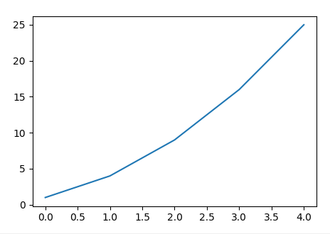
先画一个最简单的折线图。
import matplotlib.pyplot as plt
squares = [1, 4, 9, 16, 25]
plt.plot(squares)
plt.show()

为了便于将来更灵活地摆放多个图,推荐下面这种写法:
import matplotlib.pyplot as plt

fig, ax = plt.subplots()

squares = [1, 4, 9, 16, 25]
ax.plot(squares)
fig.show()
保存为图片或PDF
fig.savefig(“test-figure.png”, dpi=300)
fig.savefig(“test-figure.pdf”)
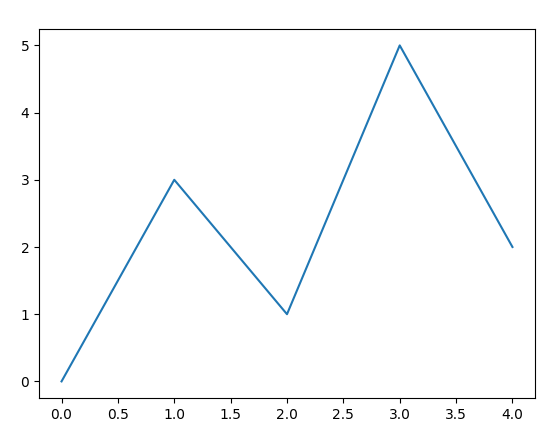
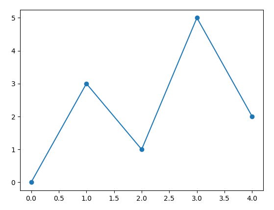
分别定义x和y
前面的例子实际上省略了x列表,如果x和y都写上,是这样:
import matplotlib.pyplot as plt

fig, ax = plt.subplots()

x=[0, 1, 2, 3, 4]
y=[0, 3, 1, 5, 2]
ax.plot(x, y)
fig.show()
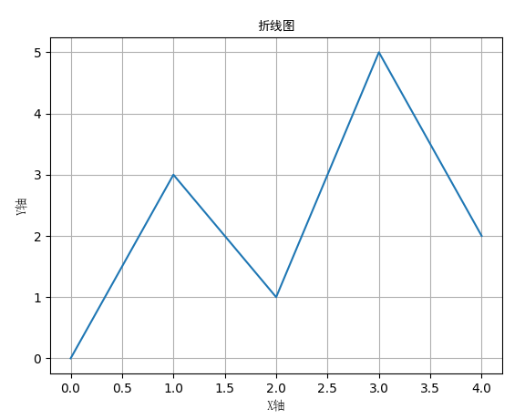
加上标题、坐标轴标签和网格线
set_title()设置图名。
set_xlabel()和set_ylabel()设置X轴和Y轴的名称。
grid()加网格线。
关于中文显示的问题
https://www.jb51.net/article/134546.htm
import matplotlib.pyplot as plt

fig, ax = plt.subplots()

x=[0, 1, 2, 3, 4]
y=[0, 3, 1, 5, 2]
ax.plot(x, y)

ax.set_title('折线图', fontproperties="SimHei")
ax.set_xlabel('X轴', fontproperties="SimSun")
ax.set_ylabel('Y轴', fontproperties="SimSun")
ax.grid(True)

fig.show()
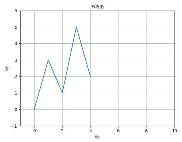
自定义X轴和Y轴的范围
用set_xlim()和 set_ylim()定义轴的最小刻度和最大刻度值。
import matplotlib.pyplot as plt

fig, ax = plt.subplots()

x=[0, 1, 2, 3, 4]
y=[0, 3, 1, 5, 2]
ax.plot(x, y)

ax.set_title('折线图', fontproperties="SimHei")
ax.set_xlabel('X轴', fontproperties="SimSun")
ax.set_ylabel('Y轴', fontproperties="SimSun")
ax.grid(True)

ax.set_xlim(xmin=-1, xmax=10)
ax.set_ylim(ymin=-1, ymax=6)

fig.show()
在数据点上显示标记
plot(x, y, marker=’o’) 显示圆点标记
还有很多种标记:
- ‘o’ 圆圈 Circle
- ‘s’ 方块标记 Square
- ‘*’ 星形标记 Star
- ‘x’或’X’ 叉
- ‘d’或’D’ 钻石形状标记(菱形) Diamond
- ‘+’或’P’ 十字 Plus
- ‘^’ 向上三角
- ‘v’ 下三角
- ‘>’ 左三角
- ‘

; 设置标记的大小,连线的线型、颜色等
plt.plot(x, y, marker=’o’, markersize=16, linestyle=’dotted’, color=’r’)
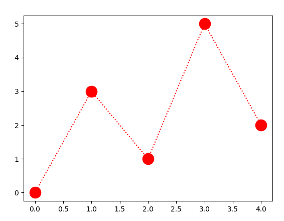
线型:
‘-‘ 实线 solid
‘:’ 点虚线 dotted
‘–’ 虚线 dashed
‘-.’ 点划线 dashdot
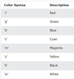
颜色:
可以用一个字母表示的颜色。
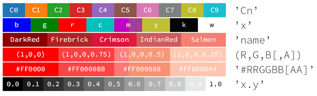
还可以这样表示颜色:
(1)一个字母
(2)颜色名称
(3)C0 到 C9
(4)RGB元组,RGBA元组
(5)16进制的0-255的RGB分量,’#RRGGBB’或’#RRGGBBAA’
(6)’0.0’到’1.0’的小数
散点图
plot(x, y, ‘s’) 可以直接画出散点图。
注意与前面折线图的区别:
plot(x, y, marker=’s’)
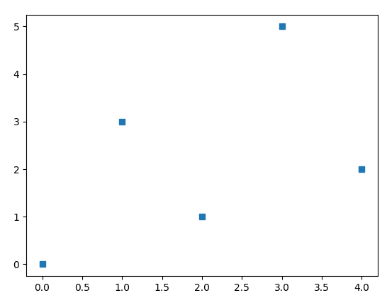
import matplotlib.pyplot as plt

fig, ax = plt.subplots()

x=[0, 1, 2, 3, 4]
y=[0, 3, 1, 5, 2]
ax.plot(x, y, 's')
fig.show()
更直观的写法是用scatter()
import matplotlib.pyplot as plt

fig, ax = plt.subplots()

x=[0, 1, 2, 3, 4]
y=[0, 3, 1, 5, 2]
ax.scatter(x, y, marker='s')
fig.show()
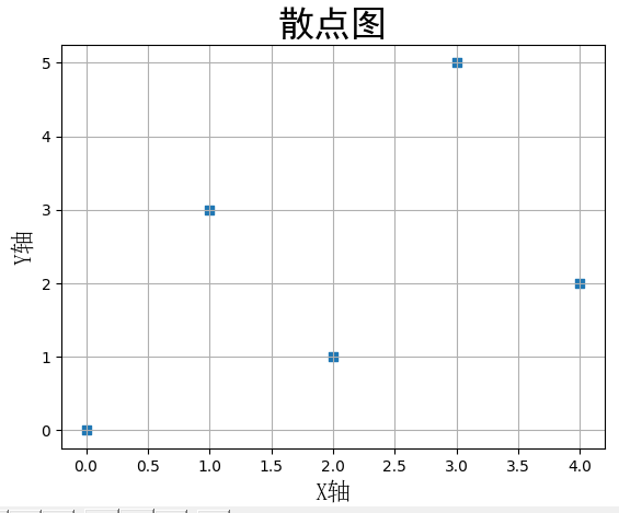
改变字体大小
使用fontsize参数。
import matplotlib.pyplot as plt

fig, ax = plt.subplots()

x=[0, 1, 2, 3, 4]
y=[0, 3, 1, 5, 2]
ax.scatter(x, y, marker='s')

ax.set_title('折线图', fontproperties="SimHei", fontsize=24)
ax.set_xlabel('X轴', fontproperties="SimSun", fontsize=16)
ax.set_ylabel('Y轴', fontproperties="SimSun", fontsize=16)
ax.grid(True)

fig.show()
使用内置样式
有许多内置样式可用。
>>> import matplotlib.pyplot as plt
>>> plt.style.available
['Solarize_Light2', '_classic_test_patch', '_mpl-gallery',
'_mpl-gallery-nogrid', 'bmh', 'classic', 'dark_background',
'fast', 'fivethirtyeight', 'ggplot', 'grayscale', 'seaborn',
'seaborn-bright', 'seaborn-colorblind', 'seaborn-dark',
'seaborn-dark-palette', 'seaborn-darkgrid', 'seaborn-deep',
'seaborn-muted', 'seaborn-notebook', 'seaborn-paper', 'seaborn-pastel',
'seaborn-poster', 'seaborn-talk', 'seaborn-ticks', 'seaborn-white',
'seaborn-whitegrid', 'tableau-colorblind10']
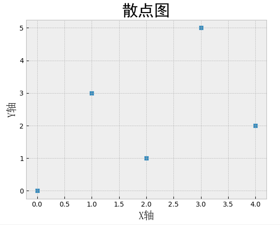
换一种样式:
plt.style.use()
import matplotlib.pyplot as plt

plt.style.use('bmh')

fig, ax = plt.subplots()

x=[0, 1, 2, 3, 4]
y=[0, 3, 1, 5, 2]

ax.scatter(x, y, marker='s')

ax.set_title('折线图', fontproperties="SimHei", fontsize=24)
ax.set_xlabel('X轴', fontproperties="SimSun", fontsize=16)
ax.set_ylabel('Y轴', fontproperties="SimSun", fontsize=16)
ax.grid(True)

fig.show()
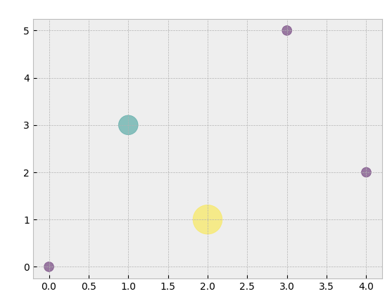
每个散点可以设置不同的大小和颜色。
import matplotlib.pyplot as plt

plt.style.use('bmh')

fig, ax = plt.subplots()

x=[0, 1, 2, 3, 4]
y=[0, 3, 1, 5, 2]

colors = [1, 2, 3, 1, 1]
size = [100 * c * c for c in colors]
ax.scatter(x, y, s=size, c=colors, alpha=0.5)

fig.show()
Original: https://blog.csdn.net/slofslb/article/details/124331076
Author: 申龙斌
Title: 在Python3里使用matplotlib绘折线图和散点图
原创文章受到原创版权保护。转载请注明出处:https://www.johngo689.com/764759/
转载文章受原作者版权保护。转载请注明原作者出处!