

文章目录
- Part.I 基础知识
* - Chap.I 快应用
- Chap.II 常用语句
- Part.II 画图样例
* - Chap.I 散点图
- Chap.II 柱状图
- Chap.III 折线图
- Chap.IV 概率分布直方图
- Chap.V 累计概率分布曲线
- Chap.VI 概率分布直方图+累计概率分布图
说实话,Python 画图和 Matlab 画图十分相似『Matlab 转战 Python』—— 沃兹·基硕德
Part.I 基础知识
Chap.I 快应用
下面是『进阶使用』:
Chap.II 常用语句
下面是一些基本的绘图语句:
import matplotlib.pyplot as plt

plt.style.use('ggplot')
fig=plt.figure(1)
fig=plt.figure(figsize=(12,6.5),dpi=100,facecolor='w')
fig.patch.set_alpha(0.5)
font1 = {'weight' : 60, 'size' : 10}
ax1.set_xlim(0,100)
ax1.set_ylim(-0.1,0.1)
plt.xlim(0,100)
plt.ylim(-1,1)
ax1.set_xlabel('X name',font1)
ax1.set_ylabel('Y name',font1)
plt.xlabel('aaaaa')
plt.ylabel('aaaaa')
plt.grid(True)
plt.grid(axis="y")
plt.grid(axis="x")
ax=plt.gca()
fig=plt.gcf()
plt.gca().set_aspect(1)
plt.text(x,y,string)
plt.gca().set_xticklabels(labels, rotation=30, fontsize=16)
plt.xticks(ticks, labels, rotation=30, fontsize=15)
plt.legend(['Float'],ncol=1,prop=font1,frameon=False)
plt.title('This is a Title')
plt.show()
plt.savefig(path, dpi=300)

plt.savefig(path, format='svg',dpi=300)

plt.savefig(path, format='svg', bbox_inches='tight', pad_inches=0, dpi=300)

plt.savefig(path, format='pdf', bbox_inches='tight', pad_inches=0, dpi=300)

plt.rcParams['font.sans-serif'] = ['SimHei']
mpl.rcParams['axes.unicode_minus'] = False
ax.spines['right'].set_color('none')
ax.spines['top'].set_color('none')

ax1=plt.subplot(3,1,1)
ax1.scatter(time,data[:,1],s=5,color='blue',marker='o')
ax1=plt.subplot(3,1,2)
...

plt.subplots_adjust(left=0, bottom=0, right=1, top=1, hspace=0.1,wspace=0.1)

plt.rcParams['xtick.direction'] = 'in'
ax = plt.gca()
ax.invert_xaxis()
ax.invert_yaxis()
Part.II 画图样例
不要忘记 import plt
import matplotlib.pyplot as plt
下面是一些简单的绘图示例,上面快应用『进阶使用』部分会有些比较复杂的操作,感兴趣的可参看。
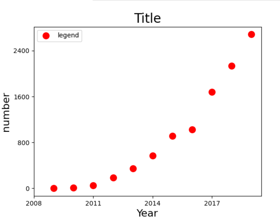
Chap.I 散点图
years = [2009, 2010, 2011, 2012, 2013, 2014, 2015, 2016, 2017, 2018, 2019]
turnovers = [0.5, 9.36, 52, 191, 350, 571, 912, 1027, 1682, 2135, 2684]
plt.figure()
plt.scatter(years, turnovers, c='red', s=100, label='legend')
plt.xticks(range(2008, 2020, 3))
plt.yticks(range(0, 3200, 800))
plt.xlabel("Year", fontdict={'size': 16})
plt.ylabel("number", fontdict={'size': 16})
plt.title("Title", fontdict={'size': 20})
plt.legend(loc='best')
plt.show()

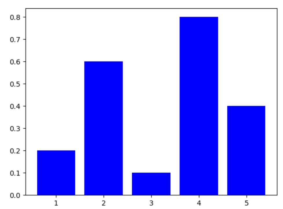
Chap.II 柱状图
X=[1,2,3,4,5]
Y=[0.2,0.6,0.1,0.8,0.4]
plt.bar(X,Y,color='b')
plt.show()
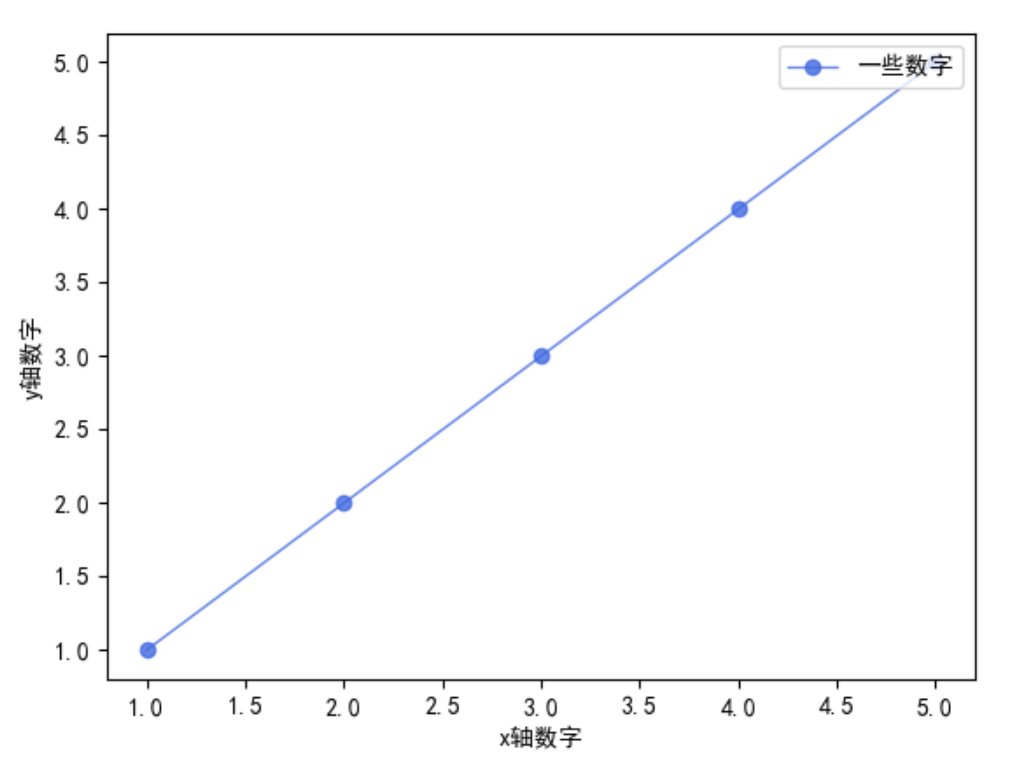
Chap.III 折线图
参考:https://blog.csdn.net/AXIMI/article/details/99308004
plt.rcParams['font.sans-serif'] = ['SimHei']
x_axis_data = [1, 2, 3, 4, 5]
y_axis_data = [1, 2, 3, 4, 5]

plt.plot(x_axis_data, y_axis_data, 'ro-', color='#4169E1', alpha=0.8, linewidth=1, label='一些数字')

plt.legend(loc="upper right")
plt.xlabel('x轴数字')
plt.ylabel('y轴数字')
plt.show()
Chap.IV 概率分布直方图
主要通过函数 plt.hist()来实现,
matplotlib.pyplot.hist(
x, bins=10, range=None, normed=False,edgecolor='k',
weights=None, cumulative=False, bottom=None,
histtype=u'bar', align=u'mid', orientation=u'vertical',
rwidth=None, log=False, color=None, label=None, stacked=False,
hold=None, **kwargs)
其中,常用的参数及其含义如下:
- bins:”直方条”的个数,一般可取20
- range=(a,b):只考虑区间
(a,b)之间的数据,绘图的时候也只绘制区间之内的 - edgecolor=’k’:给直方图加上黑色边界,不然看起来很难看(下面的例子就没加,所以很难看)
example_list=[]
n=10000
for i in range(n):
    tmp=[np.random.normal()]
    example_list.extend(tmp)
width=100
n, bins, patches = plt.hist(example_list,bins = width,color='blue',alpha=0.5)
X = bins[0:width]+(bins[1]-bins[0])/2.0
Y = n
maxn=max(n)
maxn1=int(maxn%8+maxn+8*2)
ydata=list(range(0,maxn1+1,maxn1//8))
yfreq=[str(i/sum(n)) for i in ydata]
plt.plot(X,Y,color='green')
p1 = np.polyfit(X, Y, 7)
Y1 = np.polyval(p1,X)
plt.plot(X,Y1,color='red')
plt.xlim(-2.5,2.5)
plt.ylim(0)
plt.yticks(ydata,yfreq)
plt.legend(['midpoint','fitting'],ncol=1,frameon=False)
plt.show()
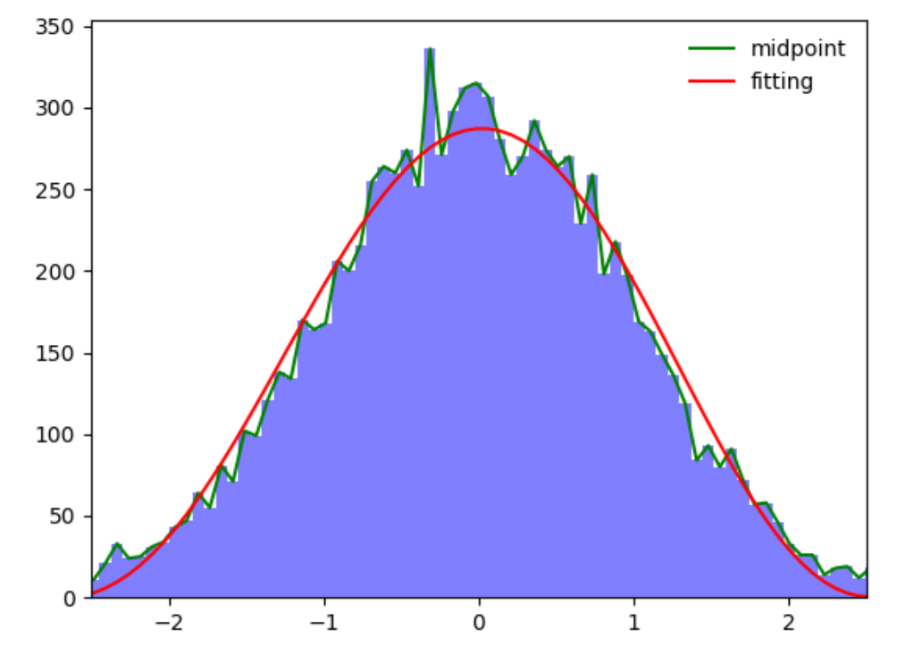
上面的图片中,绿线是直方图矩形的中点连线,红线是根据直方图的中点7次拟合的曲线。
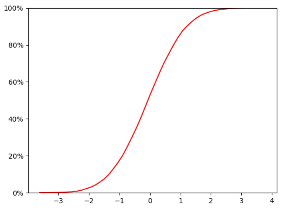
Chap.V 累计概率分布曲线
累积分布函数(Cumulative Distribution Function),又叫分布函数,是概率密度函数的积分,能完整描述一个实随机变量X的概率分布。
example_list=[]
n=10000
for i in range(n):
    tmp=[np.random.normal()]
    example_list.extend(tmp)
width=50
n, bins, patches = plt.hist(example_list,bins = width,color='blue',alpha=0.5)
plt.clf()
X = bins[0:width]+(bins[1]-bins[0])/2.0
bins=bins.tolist()
freq=[f/sum(n) for f in n]
acc_freq=[]
for i in range(0,len(freq)):
    if i==0:
        temp=freq[0]
    else:
        temp=sum(freq[:i+1])
    acc_freq.append(temp)
plt.plot(X,acc_freq,color='r')
yt=plt.yticks()
yt1=yt[0].tolist()
def to_percent(temp,position=0):
    return '%1.0f'%(100*temp) + '%'
ytk1=[to_percent(i) for i in yt1 ]
plt.yticks(yt1,ytk1)
plt.ylim(0,1)
plt.show()
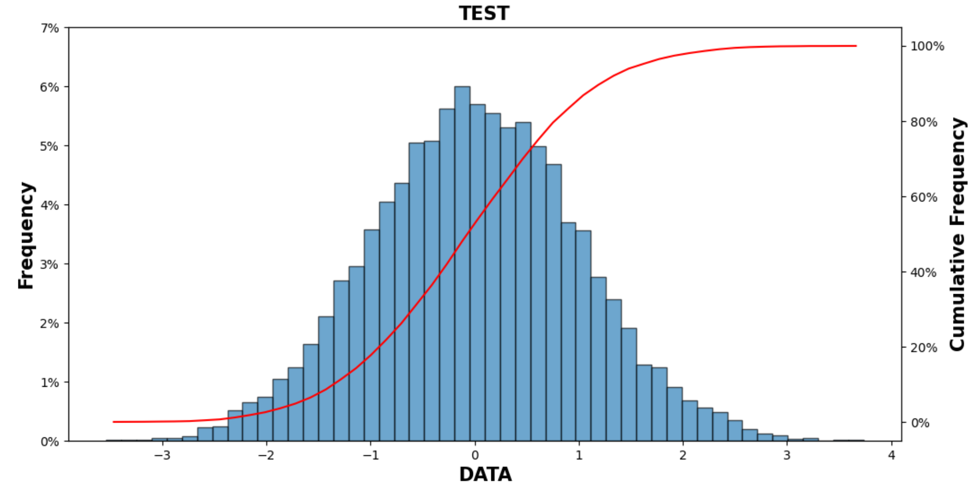
Chap.VI 概率分布直方图+累计概率分布图
参考:https://blog.csdn.net/qq_38412868/article/details/105319818
可以绘制概率分布直方图和累计概率曲线
笔者进行了一些的改编:
def draw_cum_prob_curve(data,bins=20,title='Distribution Of Errors',xlabel='The Error(mm)',pic_path=''):
"""
    plot Probability distribution histogram and Cumulative probability curve.

    > @param[in] data:          The error data
    > @param[in] bins:          The number of hist
    > @param[in] title:         The titile of the figure
    > @param[in] xlabel:        The xlable name
    > @param[in] pic_path:      The path where you want to save the figure
    return:     void
"""
    import matplotlib.pyplot as plt
    import matplotlib as mpl
    from matplotlib.ticker import FuncFormatter
    from matplotlib.pyplot import MultipleLocator
    def to_percent(temp,position=0):
        return '%1.0f'%(100*temp) + '%'
    fig, ax1 = plt.subplots(1, 1, figsize=(12, 6), dpi=100, facecolor='w')
    font1 = {'weight': 600, 'size': 15}

    n, bins, patches=ax1.hist(data,bins =bins, alpha = 0.65,edgecolor='k')
    yt=plt.yticks()
    yt1=yt[0].tolist()
    yt2=[i/sum(n) for i in yt1]
    ytk1=[to_percent(i) for i in yt2 ]
    plt.yticks(yt1,ytk1)
    X=bins[0:-1]+(bins[1]-bins[0])/2.0
    bins=bins.tolist()
    freq=[f/sum(n) for f in n]
    acc_freq=[]
    for i in range(0,len(freq)):
        if i==0:
            temp=freq[0]
        else:
            temp=sum(freq[:i+1])
        acc_freq.append(temp)
    ax2=ax1.twinx()
    ax2.plot(X,acc_freq)
    ax2.yaxis.set_major_formatter(FuncFormatter(to_percent))
    ax1.set_xlabel(xlabel,font1)
    ax1.set_title(title,font1)
    ax1.set_ylabel('Frequency',font1)
    ax2.set_ylabel("Cumulative Frequency",font1)
调用示例:
example_list=[]
n=10000
for i in range(n):
    tmp=[np.random.normal()]
    example_list.extend(tmp)
tit='TEST'
xla='DATA'
draw_cum_prob_curve(example_list,50,tit,xla)
plt.show()
Original: https://blog.csdn.net/Gou_Hailong/article/details/120089602
Author: 流浪猪头拯救地球
Title: Python 各种画图
原创文章受到原创版权保护。转载请注明出处:https://www.johngo689.com/727424/
转载文章受原作者版权保护。转载请注明原作者出处!