

Python 绘制数据图表
- matplotlib绘图库模块安装
pip install matplotlib

- 导入pyplot子模块
import matplotlib.pyplot as plt
1. 绘制折线图
1.1 绘制简单的折线图
import matplotlib
import matplotlib.pyplot as plt

matplotlib.rc("font", family='Microsoft YaHei')

squares = [0, 1, 4, 9, 16, 25, 36, 49, 64, 81, 100]

plt.plot(squares, linewidth=2)

plt.axis([0, 10, 0, 100])

"""
title():图表标题,title(标题名称,fontsize=字体大小)
xlabel():x轴标题
ylabel():y轴标题
"""
plt.title(label='0~10的平方', fontsize=18)
plt.xlabel(xlabel='值', fontsize=15)
plt.ylabel(ylabel='平方值', fontsize=15)

"""
使用tick_params()方法设置:
    - 应用范围(axis):x-->应用到x轴,y-->应用到y轴,both-->应用到x轴和y轴
    - 坐标轴的刻度大小(labelsize)
    - 线条颜色(color)
如:tick_params(axis='x', labelsize=10, color='green')
"""
plt.tick_params(axis='both', labelsize=12, color='red', labelcolor='green')

plt.show()
效果:

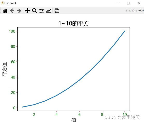
1.2 修改图表的初始值
import matplotlib
import matplotlib.pyplot as plt

matplotlib.rc("font", family='Microsoft YaHei')

squares = [1, 4, 9, 16, 25, 36, 49, 64, 81, 100]

seq = [1, 2, 3, 4, 5, 6, 7, 8, 9, 10]

plt.plot(seq, squares, linewidth=2.5)

plt.title(label='1~10的平方', fontsize=18)
plt.xlabel(xlabel='值', fontsize=15)
plt.ylabel(ylabel='平方值', fontsize=15)

plt.tick_params(axis='both', labelsize=12, color='red', labelcolor='green')

plt.show()
效果:
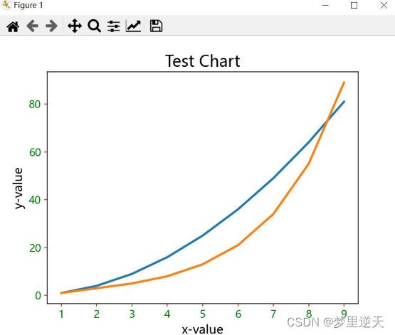
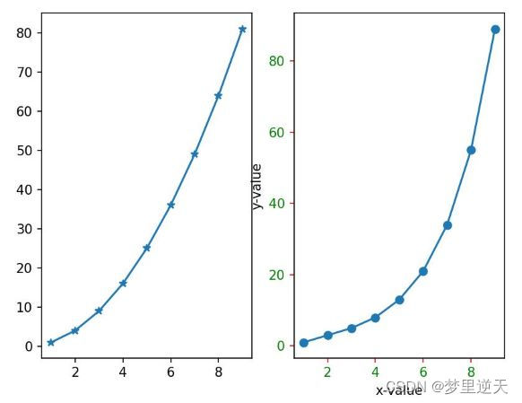
1.3 多组数据的应用
import matplotlib
import matplotlib.pyplot as plt

matplotlib.rc("font", family='Microsoft YaHei')

data1 = [1, 4, 9, 16, 25, 36, 49, 64, 81]
data2 = [1, 3, 5, 8, 13, 21, 34, 55, 89]

seq = [1, 2, 3, 4, 5, 6, 7, 8, 9]

plt.plot(seq, data1, seq, data2, linewidth=2.5)

plt.title(label='Test Chart', fontsize=18)
plt.xlabel(xlabel='x-value', fontsize=14)
plt.ylabel(ylabel='y-value', fontsize=14)

plt.tick_params(axis='both', labelsize=12, color='red', labelcolor='green')

plt.show()
效果:
1.4 设置线条颜色及样式
- 设置颜色,可在plot()中添加参数:
- ‘b’: blue
- ‘c’: cyan
- ‘g’: green
- ‘k’: black
- ‘m’: magenta
- ‘r’: red
- ‘w’: white
- ‘y’: yellow
- 设置线条样式:
- ‘-‘或’solid’: 预设实线
- ‘–’或’dashed’: 虚线
- ‘-.’或’dashdot’: 虚点线
- ‘:’或’dotted’:点线
- ‘.’:点标记
- ‘,’:像素标记
- ‘o’: 圆标记
- ‘v’: 反三角标记
- ‘^’: 三角标记
- ‘s’:方形标记
- ‘p’:五角标记
- ‘*’: 星号标记
- ‘+’:加号标记
- ‘-‘:减号标记
import matplotlib.pyplot as plt

data1 = [1, 2, 3, 4, 5, 6, 7, 8, 9]
data2 = [1, 4, 9, 16, 25, 36, 49, 64, 81]
data3 = [1, 3, 5, 8, 13, 21, 34, 55, 89]
data4 = [1, 6, 12, 20, 30, 41, 56, 72, 90]

seq = [1, 2, 3, 4, 5, 6, 7, 8, 9]

plt.plot(seq, data1, 'g--', seq, data2, 'r-.', seq, data3, 'b:', seq, data4, 'mp')

plt.title(label='Test Chart', fontsize=18)
plt.xlabel(xlabel='x-value', fontsize=14)
plt.ylabel(ylabel='y-value', fontsize=14)

plt.tick_params(axis='both', labelsize=12, color='red')

plt.show()
效果:
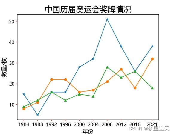
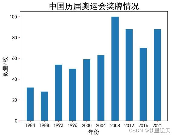
1.5 刻度设置
import matplotlib
import matplotlib.pyplot as plt

matplotlib.rc("font", family='Microsoft YaHei')

gold_medal = [15, 5, 16, 16, 28, 32, 51, 38, 26, 38]
silver_medal = [8, 11, 22, 22, 16, 17, 21, 27, 18, 32]
bronze_medal = [9, 12, 16, 12, 15, 14, 28, 23, 26, 18]

year = [1984, 1988, 1992, 1996, 2000, 2004, 2008, 2012, 2016, 2021]

"""
设置刻度:
- xticks():设置x轴刻度
- yticks():设置y轴刻度
"""

plt.xticks(year)

plt.plot(year, gold_medal, '-*', year, silver_medal, '-o', year, bronze_medal, '-^')

plt.title('中国历届奥运会奖牌情况', fontsize=20)
plt.xlabel('年份', fontsize=14)
plt.ylabel('数量/枚', fontsize=14)

plt.tick_params(axis='both', labelsize=12, color='red')

plt.show()
效果:
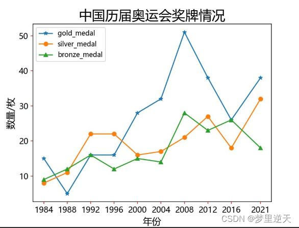
1.6 图例legend()
参数loc可以设置图例的位置:
- ‘best’: 0,
- ‘upper right’: 1 ,–>右上角
- ‘upper left’: 2,–>左上角
- ‘lower left’: 3,–>左下角
- ‘lower right’: 4,–>右下角
- ‘right’: 5,
- ‘center left’: 6,–>左侧中央
- ‘center right’: 7,–>右侧中间
- ‘lower center’: 8,–>底部正中
- ‘upper center’: 9,–>顶部正中
-
‘center’: 10
-
将图例放在图表内
import matplotlib
import matplotlib.pyplot as plt

matplotlib.rc("font", family='Microsoft YaHei')

gold_medal = [15, 5, 16, 16, 28, 32, 51, 38, 26, 38]
silver_medal = [8, 11, 22, 22, 16, 17, 21, 27, 18, 32]
bronze_medal = [9, 12, 16, 12, 15, 14, 28, 23, 26, 18]

year = [1984, 1988, 1992, 1996, 2000, 2004, 2008, 2012, 2016, 2021]

"""
设置刻度:
- xticks():设置x轴刻度
- yticks():设置y轴刻度
"""

plt.xticks(year)

line_gold, = plt.plot(year, gold_medal, '-*', label='gold_medal')
line_silver, = plt.plot(year, silver_medal, '-o', label='silver_medal')
line_bronze, = plt.plot(year, bronze_medal, '-^', label='bronze_medal')

"""
参数loc可以设置图例的位置
    'best': 0,
    'upper right': 1,-->右上角
    'upper left': 2,-->左上角
    'lower left': 3,-->左下角
    'lower right': 4,-->右下角
    'right': 5,
    'center left': 6,-->左侧中央
    'center right': 7,-->右侧中间
    'lower center': 8,-->底部正中
    'upper center': 9,-->顶部正中
    'center': 10
"""
plt.legend(handles=[line_gold, line_silver, line_bronze], loc='best')

plt.title('中国历届奥运会奖牌情况', fontsize=20)
plt.xlabel('年份', fontsize=14)
plt.ylabel('数量/枚', fontsize=14)

plt.tick_params(axis='both', labelsize=12, color='red')

plt.show()
效果:
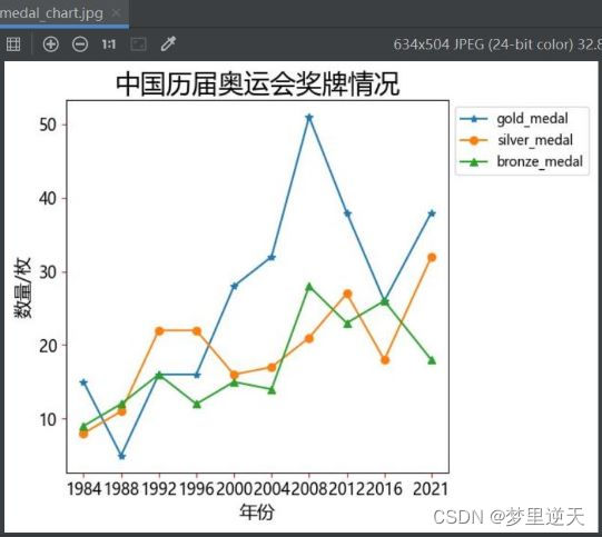
- 将图例放在图表外,使用savefig()方法保存图片文件
import matplotlib
import matplotlib.pyplot as plt

matplotlib.rc("font", family='Microsoft YaHei')

gold_medal = [15, 5, 16, 16, 28, 32, 51, 38, 26, 38]
silver_medal = [8, 11, 22, 22, 16, 17, 21, 27, 18, 32]
bronze_medal = [9, 12, 16, 12, 15, 14, 28, 23, 26, 18]

year = [1984, 1988, 1992, 1996, 2000, 2004, 2008, 2012, 2016, 2021]

"""
设置刻度:
- xticks():设置x轴刻度
- yticks():设置y轴刻度
"""

plt.xticks(year)

line_gold, = plt.plot(year, gold_medal, '-*', label='gold_medal')
line_silver, = plt.plot(year, silver_medal, '-o', label='silver_medal')
line_bronze, = plt.plot(year, bronze_medal, '-^', label='bronze_medal')

plt.legend(handles=[line_gold, line_silver, line_bronze], loc='best', bbox_to_anchor=(1, 1))

plt.tight_layout(pad=2)

plt.title('中国历届奥运会奖牌情况', fontsize=20)
plt.xlabel('年份', fontsize=14)
plt.ylabel('数量/枚', fontsize=14)

plt.tick_params(axis='both', labelsize=12, color='red')

plt.savefig('medal_chart.jpg', bbox_inches='tight')

plt.show()
效果:
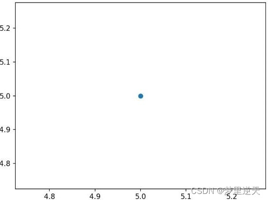
2. 绘制散点图
2.1 基本散点图的绘制
- 绘制一个点
"""
scatter(x, y, s, c)
s: 绘图点的大小
c:颜色
"""
import matplotlib.pyplot as plt

plt.scatter(5, 5)
plt.show()
效果:
- 绘制系列点
"""
scatter(x, y, s, c)
s: 绘图点的大小
c:颜色
"""
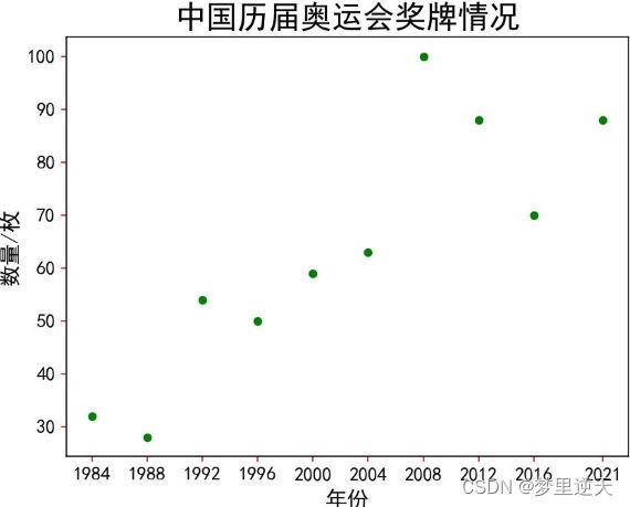
import matplotlib.pyplot as plt
plt.rcParams['font.sans-serif'] = ['SimHei']
plt.rcParams['axes.unicode_minus'] = False
medal = [32, 28, 54, 50, 59, 63, 100, 88, 70, 88]
year = [1984, 1988, 1992, 1996, 2000, 2004, 2008, 2012, 2016, 2021]
plt.xticks(year)
plt.scatter(x=year, y=medal, s=20, c='green')
plt.title('中国历届奥运会奖牌情况', fontsize=20)
plt.xlabel('年份', fontsize=14)
plt.ylabel('数量/枚', fontsize=14)
plt.tick_params(axis='both', labelsize=12, color='red')
plt.show()
效果:
2.2 设置绘制区间
axis()设置绘图区间:
- axis([xmin, xmax, ymin, ymax])
- xmin/xmax:x轴的最小/最大区间
- ymin/ymxa:y轴的最小/最大区间
"""
axis()设置绘图区间:
axis([xmin, xmax, ymin, ymax])
xmin/xmax:x轴的最小/最大区间
ymin/ymxa:y轴的最小/最大区间
"""
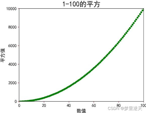
import matplotlib.pyplot as plt
plt.rcParams['font.sans-serif'] = ['SimHei']
plt.rcParams['axes.unicode_minus'] = False
x = [i for i in range(1, 101)]
y = [i**2 for i in x]
plt.axis([0, 100, 0, 10000])
plt.scatter(x=x, y=y, s=20, c='green')
plt.title('1-100的平方', fontsize=20)
plt.xlabel('数值', fontsize=14)
plt.ylabel('平方值', fontsize=14)
plt.tick_params(axis='both', labelsize=12, color='red')
plt.show()
效果:
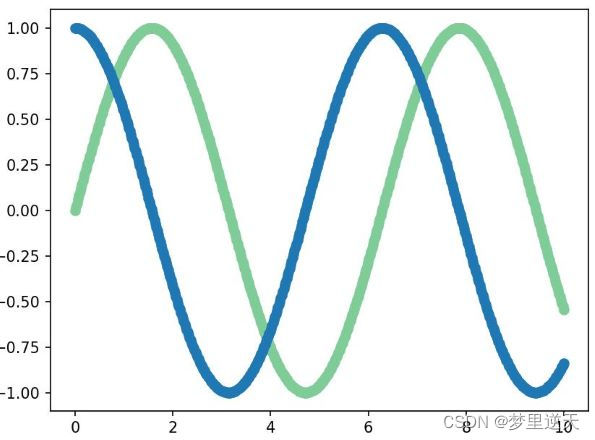
2.3 绘制波形
import matplotlib.pyplot as plt
import numpy as np

x = np.linspace(0, 10, 500)

y1 = np.sin(x)
y2 = np.cos(x)
plt.scatter(x, y1, color=(0.5, 0.8, 0.6))
plt.scatter(x, y2)
plt.show()
效果:
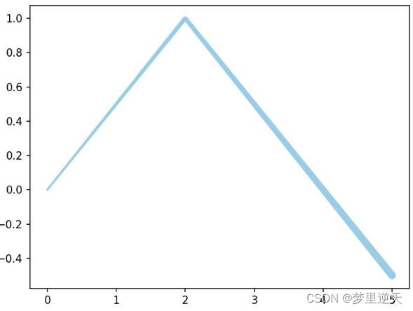
2.4 创建不等宽的散点图
import matplotlib.pyplot as plt
import numpy as np

x = np.linspace(0, 5, 500)
y = 1 - 0.5*np.abs(x-2)
lwidths = (1+x)**2
plt.scatter(x=x, y=y, s=lwidths, color=(0.6, 0.8, 0.9))
plt.show()
效果:
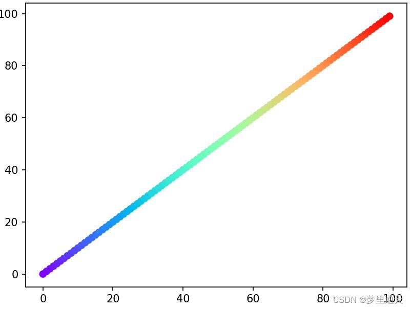
2.5 色彩映射
import matplotlib.pyplot as plt
import numpy as np

x = np.arange(100)
plt.scatter(x=x, y=x, c=x, cmap='rainbow')
plt.show()
效果:
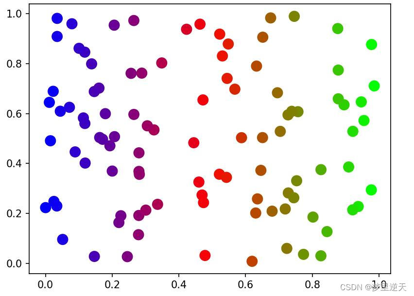
2.6 利用随机数绘制散点图
import matplotlib.pyplot as plt
import numpy as np

while True:
    x = np.random.random(100)
    y = np.random.random(100)
    t = x
    plt.scatter(x, y, s=100, c=t, cmap='brg')
    plt.show()
    is_exit = input('是否继续?(y/n)')
    if is_exit.upper() == 'N':
        break
2.7 利用随机数实现位置的移动
import random

import matplotlib.pyplot as plt

def loc(index):
    """处理坐标的移动"""
    x_mov = random.choice([-3, 3])
    xloc = x[index - 1] + x_mov
    y_mov = random.choice([-5, -1, 1, 5])
    yloc = y[index - 1] + y_mov
    x.append(xloc)
    y.append(yloc)

num = 8000
x = [0]
y = [0]

while True:
    for i in range(1, num):
        loc(i)

    t = x
    plt.scatter(x, y, s=2, c=t, cmap='brg')

    plt.axis('off')
    plt.savefig('image.png', bbox_inches='tight', pad_inches=0)
    plt.show()
    is_exit = input('是否继续?(y/n)')
    if is_exit.upper() == 'N':
        break
    else:
        x[0] = x[num - 1]
        y[0] = y[num - 1]
        del x[1:]
        del y[1:]

3. 绘制多个图表
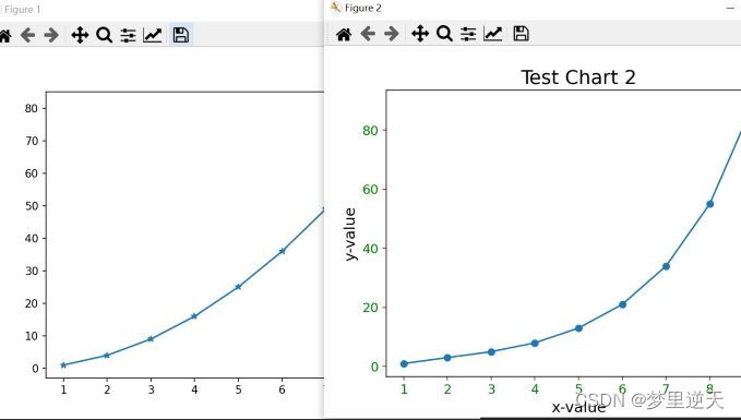
3.1 一个程序绘制多个图表
import matplotlib.pyplot as plt

data1 = [1, 4, 9, 16, 25, 36, 49, 64, 81]
data2 = [1, 3, 5, 8, 13, 21, 34, 55, 89]

seq = [1, 2, 3, 4, 5, 6, 7, 8, 9]

plt.figure(1)

plt.plot(seq, data1, '-*')

plt.figure(2)
plt.plot(seq, data2, '-o')

plt.title(label='Test Chart 2', fontsize=18)
plt.xlabel(xlabel='x-value', fontsize=14)
plt.ylabel(ylabel='y-value', fontsize=14)

plt.tick_params(axis='both', labelsize=12, color='red', labelcolor='green')

plt.show()
效果:
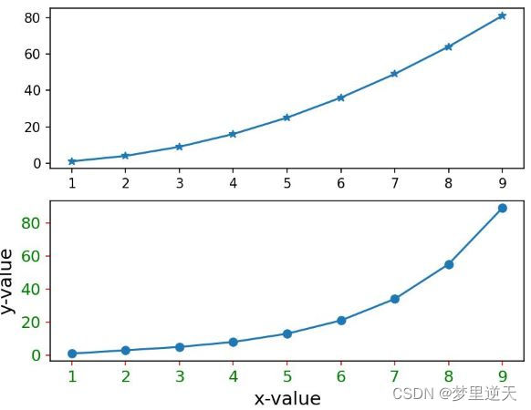
3.2 含有子表的图表
subplot(x1, x2, x3)
- x1: 上下(垂直)方向绘制图表数
- x2:左右(水平)方向绘制图表数
-
x3:表示这是第几张
-
一个Figure内绘制上下子图
"""
subplot(x1, x2, x3)
x1: 上下(垂直)方向绘制图表数
x2:左右(水平)方向绘制图表数
x3:表示这是第几张
"""
import matplotlib.pyplot as plt

data1 = [1, 4, 9, 16, 25, 36, 49, 64, 81]
data2 = [1, 3, 5, 8, 13, 21, 34, 55, 89]

seq = [1, 2, 3, 4, 5, 6, 7, 8, 9]

plt.subplot(2, 1, 1)

plt.plot(seq, data1, '-*')

plt.subplot(2, 1, 2)
plt.plot(seq, data2, '-o')

plt.xlabel(xlabel='x-value', fontsize=14)
plt.ylabel(ylabel='y-value', fontsize=14)

plt.tick_params(axis='both', labelsize=12, color='red', labelcolor='green')

plt.show()
效果:
* 一个Figure内绘制左右子图
"""
subplot(x1, x2, x3)
x1: 上下(垂直)方向绘制图表数
x2:左右(水平)方向绘制图表数
x3:表示这是第几张
"""
import matplotlib.pyplot as plt

data1 = [1, 4, 9, 16, 25, 36, 49, 64, 81]
data2 = [1, 3, 5, 8, 13, 21, 34, 55, 89]

seq = [1, 2, 3, 4, 5, 6, 7, 8, 9]

plt.subplot(2, 1, 1)

plt.plot(seq, data1, '-*')

plt.subplot(2, 1, 2)
plt.plot(seq, data2, '-o')

plt.xlabel(xlabel='x-value', fontsize=14)
plt.ylabel(ylabel='y-value', fontsize=14)

plt.tick_params(axis='both', labelsize=12, color='red', labelcolor='green')

plt.show()
效果:
4. 绘制直方图
"""
bar(x, height, width)
x: 序列,x轴位置
height:序列数值大小
width:直方图的宽度
"""
import matplotlib.pyplot as plt
import numpy as np

plt.rcParams['font.sans-serif'] = ['SimHei']
plt.rcParams['axes.unicode_minus'] = False

medal = [32, 28, 54, 50, 59, 63, 100, 88, 70, 88]
x = np.arange(len(medal))

year = [1984, 1988, 1992, 1996, 2000, 2004, 2008, 2012, 2016, 2021]

plt.bar(x, medal, width=0.5)

plt.title('中国历届奥运会奖牌情况', fontsize=20)
plt.xlabel('年份', fontsize=14)
plt.ylabel('数量/枚', fontsize=14)
plt.xticks(x, year)

plt.tick_params(axis='both', labelsize=12, color='red')
plt.show()
效果:
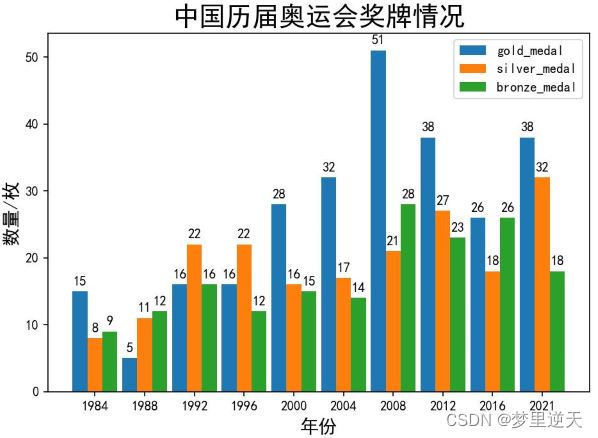
import matplotlib.pyplot as plt
import numpy as np

plt.rcParams['font.sans-serif'] = ['SimHei']
plt.rcParams['axes.unicode_minus'] = False

labels = [1984, 1988, 1992, 1996, 2000, 2004, 2008, 2012, 2016, 2021]
gold_medal = [15, 5, 16, 16, 28, 32, 51, 38, 26, 38]
silver_medal = [8, 11, 22, 22, 16, 17, 21, 27, 18, 32]
bronze_medal = [9, 12, 16, 12, 15, 14, 28, 23, 26, 18]

x = np.arange(len(labels))
width = 0.3

fig, ax = plt.subplots()
rects1 = ax.bar(x - width, gold_medal, width, label='gold_medal')
rects2 = ax.bar(x, silver_medal, width, label='silver_medal')
rects3 = ax.bar(x + width, bronze_medal, width, label='bronze_medal')

ax.set_xlabel('年份', fontsize=14)
ax.set_ylabel('数量/枚', fontsize=14)
ax.set_title('中国历届奥运会奖牌情况', fontsize=20)
ax.set_xticks(x, labels)

ax.legend()

ax.bar_label(rects1, padding=3)
ax.bar_label(rects2, padding=3)
ax.bar_label(rects3, padding=3)

fig.tight_layout()

plt.show()
效果:
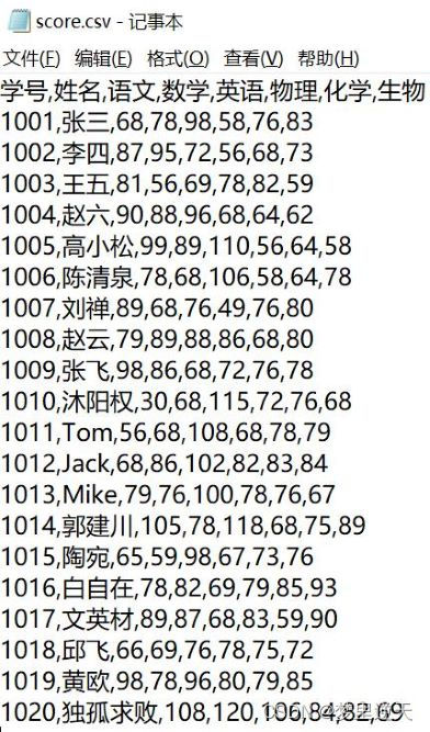
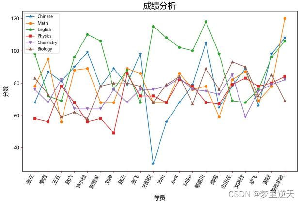
5. 使用CSV文件绘制图表
import csv

import matplotlib
import matplotlib.pyplot as plt

matplotlib.rc("font", family='Microsoft YaHei')

filename = 'score.csv'

with open(file=filename) as csvFile:
    csvReader = csv.reader(csvFile)
    headerRow = next(csvReader)
    print(headerRow)

    names, Chinese, Math, English, Physics, Chemistry, Biology = [], [], [], [], [], [], []
    for row in csvReader:

        names.append(row[1])
        Chinese.append(int(row[2]))
        Math.append(int(row[3]))
        English.append(int(row[4]))
        Physics.append(int(row[5]))
        Chemistry.append(int(row[6]))
        Biology.append(int(row[7]))
    print(f'语文:{Chinese}')
    print(f'数学:{Math}')
    print(f'英语:{English}')
    print(f'物理:{Physics}')
    print(f'化学:{Chemistry}')
    print(f'生物:{Biology}')

fig = plt.figure(dpi=80, figsize=(12, 8))

line_Chinese, = plt.plot(names, Chinese, '-*', label='Chinese')
line_Math, = plt.plot(names, Math, '-o', label='Math')
line_English, = plt.plot(names, English, '-p', label='English')
line_Physics, = plt.plot(names, Physics, '-s', label='Physics')
line_Chemistry, = plt.plot(names, Chemistry, '-v', label='Chemistry')
line_Biology, = plt.plot(names, Biology, '-^', label='Biology')

plt.legend(handles=[line_Chinese, line_Math, line_English, line_Physics, line_Chemistry, line_Biology], loc='best')

fig.autofmt_xdate(rotation=60)
plt.title('成绩分析', fontsize=20)
plt.xlabel('学员', fontsize=14)
plt.ylabel('分数', fontsize=14)
plt.tick_params(axis='both', labelsize=12, color='red')
plt.show()
score.csv:
效果:
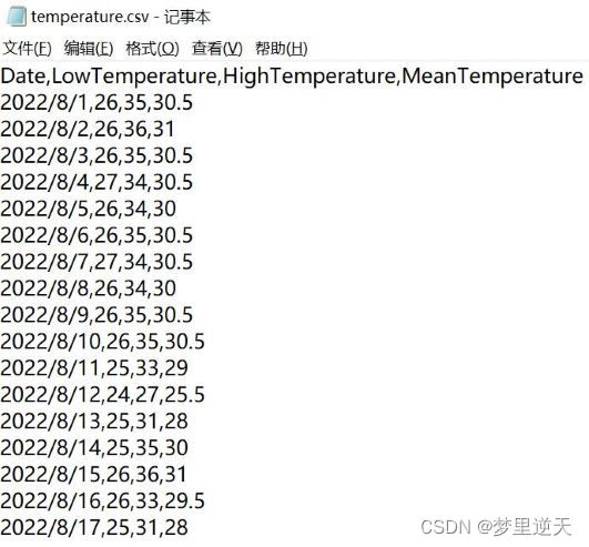
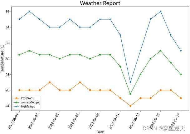
import csv
from datetime import datetime

import matplotlib
import matplotlib.pyplot as plt

matplotlib.rc("font", family='Microsoft YaHei')

filename = 'temperature.csv'

with open(file=filename) as csvFile:
    csvReader = csv.reader(csvFile)
    headerRow = next(csvReader)

    dates, lowTemps, highTemps, averageTemps = [], [], [], []
    for row in csvReader:
        try:

            currentDate = datetime.strptime(row[0], '%Y/%m/%d')

            lowTemp = float(row[1])

            highTemp = float(row[2])

            averageTemp = float(row[3])
        except Exception as e:
            print('有缺值', e)
        else:

            dates.append(currentDate)
            lowTemps.append(lowTemp)
            highTemps.append(highTemp)
            averageTemps.append(averageTemp)
    print(f'最低温度:{lowTemps}')
    print(f'最高温度:{highTemps}')
    print(f'平均温度:{averageTemps}')

fig = plt.figure(dpi=80, figsize=(12, 8))

line_highTemps, = plt.plot(dates, highTemps, '-*', label='highTemps')
line_lowTemps, = plt.plot(dates, lowTemps, '-o', label='lowTemps')
line_averageTemps, = plt.plot(dates, averageTemps, '-p', label='averageTemps')

plt.legend(handles=[line_lowTemps, line_averageTemps, line_highTemps], loc='best')

fig.autofmt_xdate(rotation=60)
plt.title('Weather Report', fontsize=20)
plt.xlabel('Date', fontsize=12)
plt.ylabel('Temperature (C)', fontsize=14)
plt.tick_params(axis='both', labelsize=12, color='red')
plt.show()
temperature.csv:
效果:
参考:
- 官网:http://matplotlib.org
- 官方文档:https://matplotlib.org/stable/index.html
- 色彩映射:http://matplotlib.org/examples/color/colormaps_reference.html
- https://blog.csdn.net/weixin_46233323/article/details/108038706
- https://blog.csdn.net/weixin_43838785/article/details/104515455
- https://blog.csdn.net/weixin_41783077/article/details/110734759
- https://www.pudn.com/news/62623526dfdd9a1c0c529522.html
- https://www.yzlfxy.com/jiaocheng/python/430158.html
- https://www.zhihu.com/question/506015285
Original: https://blog.csdn.net/username666/article/details/126395818
Author: 梦里逆天
Title: Python 绘制数据图表
原创文章受到原创版权保护。转载请注明出处:https://www.johngo689.com/722878/
转载文章受原作者版权保护。转载请注明原作者出处!