

python数据分析入门项目–分析全球五百强的数据
这里我用一个简单的简单数据分析入门项目,这里我就先不讲数据数据下载、抓取的问题,我直接给出CSV文件的链接,点击就可以下载。
链接: link.
好,我们直接开始,我们把解析直接用注释的形式打在旁白。
import pandas as pd#一个很常用的数据分析模块--pandas
import matplotlib.pyplot as plt
'''导入函数pyplot,并指定别名为plt,可以后期不用反复输入pyplot。模块pyplot包含很多用于生成图表的函数'''
import seaborn as sns#调用样式声明
sns.set(style="darkgrid")#这里设置自己喜欢的样式

df = pd.read_csv('fortune500.csv')#这里在读取我们要分析的文件

df.head()
"""df是DataFrame的缩写,这里表示读取进来的数据
df.head()会将excel表格中的第一行看作列名,并默认输出之后的五行,
在head后面的括号里面直接写你想要输出的行数也行,比如2,10,100之类的。"""


df.tail()
""""同样的道理读取数据表格中的后五项"""

df.columns = ['year', 'rank', 'company', 'revenue', 'profit']
#重命名这些列,以便以后可以引用它们。
len(df)
#检测数据纵向的长度
25500
df.dtypes
'''检测数据类型,
如果一列中含有多个类型,则该列的类型会是object,同样字符串类型的列也会被当成object类型.

不同的数据类型也会被当成object,比如int32,float32'''
year int64
rank int64
company object
revenue float64
profit object
dtype: object
non_numberic_profits = df.profit.str.contains('[^0-9.-]')
df.loc[non_numberic_profits].head()
'''我们这里通过检测查出没有利润的数据'''

#检测一些明显的错误
round(100*len(df.profit[non_numberic_profits])/len(df),2)
1.45
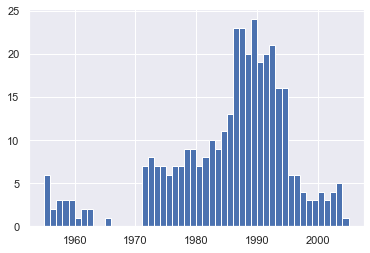
bin_sizes, _, _ = plt.hist(df.year[non_numberic_profits], bins=range(1955, 2006))
#清空不符合的行
df = df.loc[~non_numberic_profits]
df.profit = df.profit.apply(pd.to_numeric)
len(df)
#再次测长度
25313
df.dtypes
year int64
rank int64
company object
revenue float64
profit float64
dtype: object
#再次测类型
group_by_year = df.loc[:, ['year', 'revenue', 'profit']].groupby('year')
avgs = group_by_year.mean()
x = avgs.index
def plot(x, y, ax, title, y_label):#设立一个函数,方便后期的图标绘制
    ax.set_title(title)#给图标加上标题
    ax.set_ylabel(y_label)#给y轴加上标题
    ax.plot(x, y)#给出了输入、输出值的大小
    ax.margins(x=0, y=0)#给定了原点的坐标
#开始绘制曲线
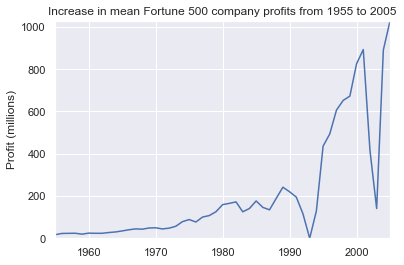
y1 = avgs.profit#这里利润的数据给y1
fig, ax = plt.subplots()
"""常用的调用,调用函数subplots(),变量fig表示整张图片,ax表示图片中的各个图表,后面不再反复提了"""
#绘制曲线
plot(x, y1, ax, 'Increase in mean Fortune 500 company profits from 1955 to 2005', 'Profit (millions)')
#绘制收入曲线
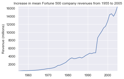
y2 = avgs.revenue#把收入的数据给y2
fig, ax = plt.subplots()#见上文
plot(x, y2, ax, 'Increase in mean Fortune 500 company revenues from 1955 to 2005', 'Revenue (millions)')
#绘制曲线
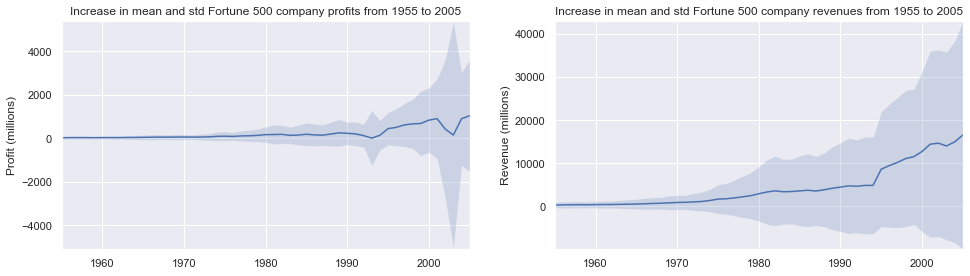
def plot_with_std(x, y, stds, ax, title, y_label):#这里又定义了一个绘制曲线的函数
    ax.fill_between(x, y - stds, y + stds, alpha=0.2)#设置透明度
    plot(x, y, ax, title, y_label)

fig, (ax1, ax2) = plt.subplots(ncols=2)
title = 'Increase in mean and std Fortune 500 company %s from 1955 to 2005'#给定标题
stds1 = group_by_year.std().profit.values
stds2 = group_by_year.std().revenue.values
plot_with_std(x, y1.values, stds1, ax1, title % 'profits', 'Profit (millions)')
plot_with_std(x, y2.values, stds2, ax2, title % 'revenues', 'Revenue (millions)')
'''这里要绘制两个图像,所以有ax1,2之分'''
fig.set_size_inches(14, 4)#调节图像大小
fig.tight_layout()#紧密布局
源码参考–新加坡国立大学教学代码
Original: https://blog.csdn.net/weixin_47567401/article/details/113186853
Author: 翼达口香糖
Title: python数据分析入门项目–分析全球五百强的数据
原创文章受到原创版权保护。转载请注明出处:https://www.johngo689.com/677207/
转载文章受原作者版权保护。转载请注明原作者出处!