

Plotly简介

Plotly是用于机器学习、数据挖掘等领域的数据可视化包。
其图标视觉效果简洁大气,可互动性强,成为我工作中进行数据可视化的一大利器,接下来我们就从最简单的折线图,带领大家逐渐入门plotly。
; 1. 事先准备
为了方便学习,此处列出两种可以快速使用Plotly的方法。
- 网络ipynb环境,如colab,datalore等
- 本地ipynb环境,python + jupyter + plotly
注:此教程并不讲解python环境管理相关内容
1.1 网络ipynb环境
推荐使用 jetbrains 公司推出的:Datalore
点击上面的链接,使用 jetbrains 账户,即可享受免费的 cpu、gpu 资源。Plotly已经预装在其环境中可直接调用,而且自带代码补全功能,十分强大(强力安利)
1.2 本地ipynb环境
本地的话需要使用pip安装一下包:
- numpy
- plotly
-
jupyter
-
绘制折线图
本片教程,将以折线图的形式来展现一名同学的成绩数据,并包含如何设置标题、添加标签等功能。
2.1 数据准备
我们假设小明每个月考一次数学,那么在这步中,我们使用numpy随机生成小明12次考试的成绩,并打印出来
import numpy as np

month_list = [i + 1 for i in range(12)]
score_list = np.random.randint(0, 100, 12)
print("考试月份:", month_list)
print("考试分数:", score_list)

考试月份: [1, 2, 3, 4, 5, 6, 7, 8, 9, 10, 11, 12]
数学分数: [42 13 59 92 60 26 75 33 66  8 74 34]
语文分数: [64 71 71 18 87 44 18 45  1  7 83 55]
英语分数: [25 53 82 26 36 20  8 69 56 43  9 56]
图表生成部分: 我们照猫画虎,多添加两条折线图
import plotly.graph_objects as go

fig = go.Figure()
fig.add_trace(
    go.Scatter(
        x=month_list,
        y=math_list,
        mode="markers+lines+text",
        text=math_list,
        textposition="top center"
))
fig.add_trace(
    go.Scatter(
        x=month_list,
        y=chinese_list,
        mode="markers+lines+text",
        text=chinese_list,
        textposition="top center"
))
fig.add_trace(
    go.Scatter(
        x=month_list,
        y=english_list,
        mode="markers+lines+text",
        text=english_list,
        textposition="top center"
))
fig.update_layout(
    title="小明2022年成绩单",
    xaxis=dict(title="month", nticks=13),
    yaxis=dict(title="score", nticks=11, rangemode="tozero", range=(0,100)),
    width=1000,
    height=500
)
fig.show()
图表,效果如下
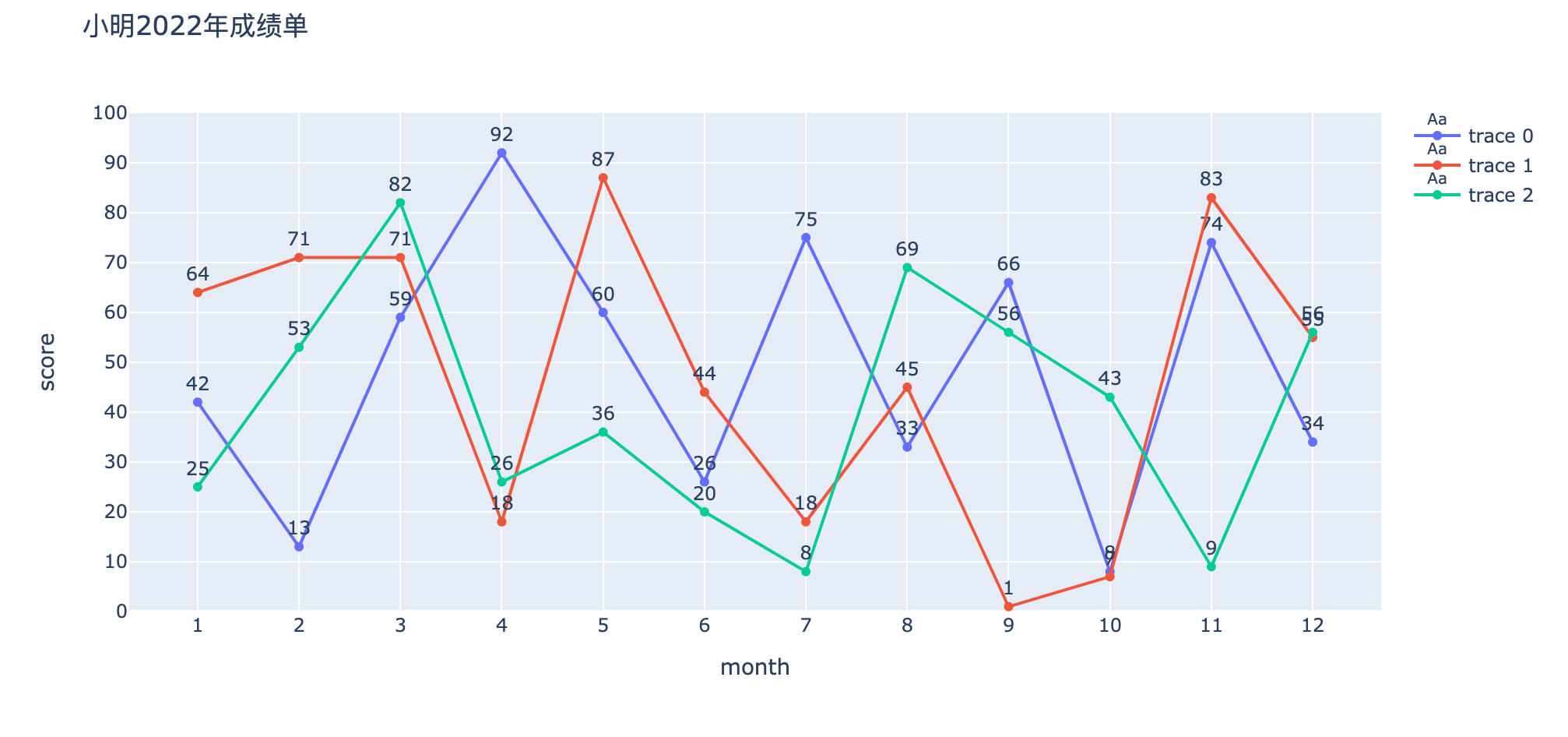
可以看到右侧出现了图示,但是没有显示具体的科目,于是我们在每个scatter中添加name属性:
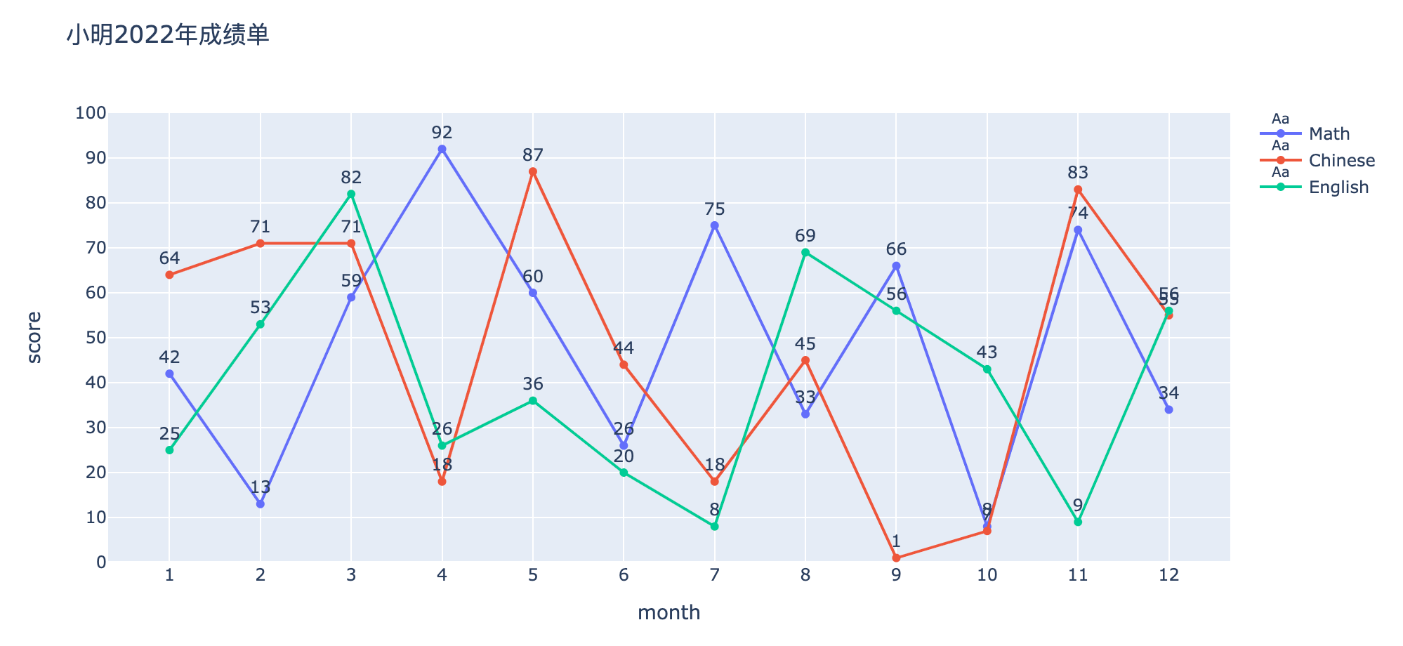
fig.add_trace(
    go.Scatter(
        name="Math",
        x=month_list,
        y=math_list,
        mode="markers+lines+text",
        text=math_list,
        textposition="top center"
))
可以看到,右侧的图示已经显示了相应的学科。至此,我们的折线图表绘制完成了。
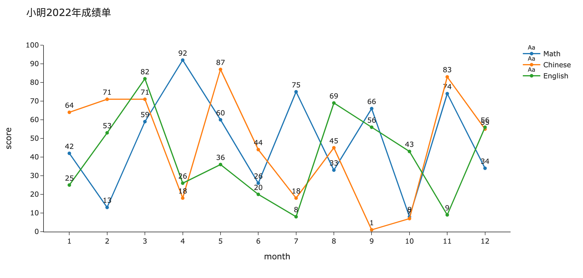
2.6 图表的主题风格
我们还能通过设置 fig.update_layout() 中的 template 属性来轻松的变化图表风格,比如
fig.update_layout(
    title="小明2022年成绩单",
    xaxis=dict(title="month", nticks=13),
    yaxis=dict(title="score", nticks=11, rangemode="tozero", range=(0,100)),
    width=1000,
    height=500,
    template="simple_white"
)
fig.show()
通过设置 template 属性为simple_white,我们得到了以下图表,更多的主题可以搜索官方文档。
- 总结
以上就是使用ploty绘制折线图的基本方法了,我们学习了
- 如何声明一个图表
- 如何设置折线图的数据
- 如何设置横纵坐标、范围等
- 如何设置图表大小
- 如何在折线图上显示数据
- 如何更换图表风格
感谢您的耐心阅读,我们下一讲将学习如何绘制条形图Bar Chart。
敬请期待!
Original: https://blog.csdn.net/paperplaneY/article/details/114317458
Author: paperplaneY
Title: 【Plotly】python数据可视化神器——绘制折线图
原创文章受到原创版权保护。转载请注明出处:https://www.johngo689.com/672271/
转载文章受原作者版权保护。转载请注明原作者出处!