

今天接着单细胞文章的内容:
- 从Cell学单细胞转录组分析(一):开端!!!
- 跟着Cell学单细胞转录组分析(二):单细胞转录组测序文件的读入及Seurat对象构建
- 跟着Cell学单细胞转录组分析(三):单细胞转录组数据质控(QC)及合并去除批次效应
- 跟着Cell学单细胞转录组分析(四):单细胞转录组测序UMAP降维聚类
- 跟着Cell学单细胞转录组分析(五):单细胞转录组marker基因鉴定及细胞群注释
前面几期主要说了下每个阶段出现图的个性化修饰,后面依然如此,有需要值得单拎出来说的,我们也是会讲到。
细胞分群命名完成之后,大多数研究会关注各个样本细胞群的比例,尤其是免疫学的研究中,各群免疫细胞比例的变化是比较受关注的。所以这里说说细胞群比例的计算,以及如何可视化。
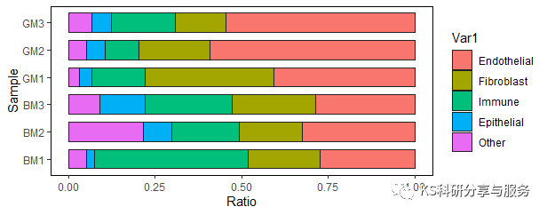
1、堆叠柱状图
这是比较普通也是最常用的细胞比例可视化方法。这种图在做微生物菌群的研究中非常常见。具体的思路是计算各个样本中细胞群的比例,形成数据框之后转化为长数据,用ggplot绘制即可。
table(scedata$orig.ident)#查看各组细胞数
#BM1 BM2 BM3 GM1 GM2 GM3
#2754 747 2158 1754 1528 1983
prop.table(table(Idents(scedata)))
table(Idents(scedata), scedata$orig.ident)#各组不同细胞群细胞数
#BM1 BM2 BM3 GM1 GM2 GM3
Endothelial 752 244 619 716 906 1084
Fibroblast 571 135 520 651 312 286
Immune 1220 145 539 270 149 365
Epithelial 69 62 286 62 82 113
Other 142 161 194 55 79 135
Cellratio <- prop.table(table(idents(scedata), scedata$orig.ident), margin="2)#计算各组样本不同细胞群比例" cellratio #bm1 bm2 bm3 gm1 gm2 gm3 # endothelial 0.27305737 0.32663989 0.28683967 0.40820981 0.59293194 0.54664650 fibroblast 0.20733479 0.18072289 0.24096386 0.37115165 0.20418848 0.14422592 immune 0.44299201 0.19410977 0.24976830 0.15393387 0.09751309 0.18406455 epithelial 0.02505447 0.08299866 0.13253012 0.03534778 0.05366492 0.05698437 other 0.05156137 0.21552878 0.08989805 0.03135690 0.05170157 0.06807867 <- as.data.frame(cellratio) colourcount="length(unique(Cellratio$Var1))" library(ggplot2) ggplot(cellratio) + geom_bar(aes(x="Var2," y="Freq," fill="Var1),stat" = "identity",width="0.7,size" 0.5,colour="#222222" )+ theme_classic() labs(x="Sample" ,y="Ratio" coord_flip()+ theme(panel.border="element_rect(fill=NA,color="black"," size="0.5," linetype="solid" )) < code></->

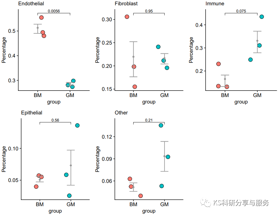
2、批量统计图
很多时候,我们不仅想关注各个样本中不同细胞群的比例,而且更想指导他们在不同样本之中的变化是否具有显著性。这时候,除了要计算细胞比例外,还需要进行显著性检验。这里我们提供了一种循环的做法,可以批量完成不同样本细胞比例的统计分析及可视化。
table(scedata$orig.ident)#查看各组细胞数
prop.table(table(Idents(scedata)))
table(Idents(scedata), scedata$orig.ident)#各组不同细胞群细胞数
Cellratio <- prop.table(table(idents(scedata), scedata$orig.ident), margin="2)#计算各组样本不同细胞群比例" cellratio <- data.frame(cellratio) library(reshape2) cellper dcast(cellratio,var2~var1, value.var="Freq" )#长数据转为宽数据 rownames(cellper) cellper[,1] cellper[,-1] ###添加分组信息 sample c("bm1","bm2","bm3","gm1","gm2","gm3") group c("bm","bm","bm","gm","gm","gm") samples data.frame(sample, group)#创建数据框 rownames(samples)="samples$sample" cellper$sample samples[rownames(cellper),'sample']#r添加列 cellper$group samples[rownames(cellper),'group']#r添加列 ###作图展示 pplist="list()" sce_groups="c('Endothelial','Fibroblast','Immune','Epithelial','Other')" library(ggplot2) library(dplyr) library(ggpubr) for(group_ in sce_groups){ cellper_="cellper" %>% select(one_of(c('sample','group',group_)))#选择一组数据
colnames(cellper_) = c('sample','group','percent')#对选择数据列命名
cellper_$percent = as.numeric(cellper_$percent)#数值型数据
cellper_ <- cellper_ %>% group_by(group) %>% mutate(upper = quantile(percent, 0.75),
lower = quantile(percent, 0.25),
mean = mean(percent),
median = median(percent))#上下分位数
print(group_)
print(cellper_$median)
pp1 = ggplot(cellper_,aes(x=group,y=percent)) + #ggplot作图
geom_jitter(shape = 21,aes(fill=group),width = 0.25) +
stat_summary(fun=mean, geom="point", color="grey60") +
theme_cowplot() +
theme(axis.text = element_text(size = 10),axis.title = element_text(size = 10),legend.text = element_text(size = 10),
legend.title = element_text(size = 10),plot.title = element_text(size = 10,face = 'plain'),legend.position = 'none') +
labs(title = group_,y='Percentage') +
geom_errorbar(aes(ymin = lower, ymax = upper),col = "grey60",width = 1)
###组间t检验分析
labely = max(cellper_$percent)
compare_means(percent ~ group, data = cellper_)
my_comparisons <- list( c("gm", "bm") ) pp1="pp1" + stat_compare_means(comparisons="my_comparisons,size" = 3,method="t.test" pplist[[group_]]="pp1" } library(cowplot) plot_grid(pplist[['endothelial']], pplist[['fibroblast']], pplist[['immune']], pplist[['epithelial']], pplist[['other']]) < code></-></-></->
好了,以上就是我们的分享了,起到抛砖引玉的效果,还有很多其他的展示方法,不必全都会,中意就好。
更多内容请至我的个人公众号《KS科研分享与服务》
Original: https://blog.csdn.net/qq_42090739/article/details/123392130
Author: TS的美梦
Title: 跟着Cell学单细胞转录组分析(六):细胞比例计算及可视化
原创文章受到原创版权保护。转载请注明出处:https://www.johngo689.com/647953/
转载文章受原作者版权保护。转载请注明原作者出处!