

HTML+CSS制作彩色波动
原创
wx62bdb159cc187博主文章分类:【Web】 ©著作权
文章标签 css css3 html html5 4s 文章分类 Hadoop 大数据
©著作权归作者所有:来自51CTO博客作者wx62bdb159cc187的原创作品,请联系作者获取转载授权,否则将追究法律责任
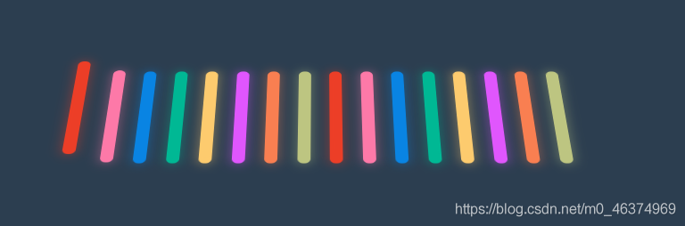
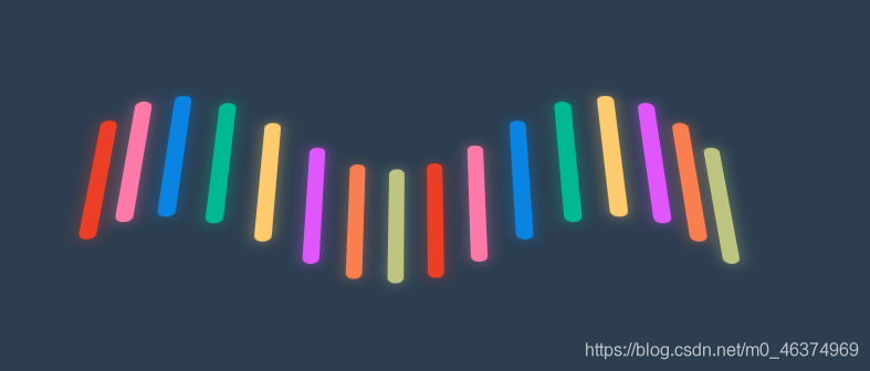
HTML+CSS制作彩色波动
效果图如下:

HTML部分源码如下:
<html lang="en">

<head>
    <meta charset="UTF-8">
    <meta name="viewport" content="width=device-width, initial-scale=1.0">
    <title>彩色波动title>
    <link rel="stylesheet" href="style.css">
head>

<body>
    <div class="container">
        <div class="fence">div>
        <div class="fence">div>
        <div class="fence">div>
        <div class="fence">div>
        <div class="fence">div>
        <div class="fence">div>
        <div class="fence">div>
        <div class="fence">div>
        <div class="fence">div>
        <div class="fence">div>
        <div class="fence">div>
        <div class="fence">div>
        <div class="fence">div>
        <div class="fence">div>
        <div class="fence">div>
        <div class="fence">div>
    div>
body>

html>
CSS部分源码如下:
:root { --background-color: #2c3e50; --border-color: #7591AD; --text-color: #34495e; --color1: #EC3E27; --color2: #fd79a8; --color3: #0984e3; --color4: #00b894; --color5: #fdcb6e; --color6: #e056fd; --color7: #F97F51; --color8: #BDC581;}* { margin: 0; padding: 0;}html { font-size: 14px;}body { width: 100vw; height: 100vh; background-color: var(--background-color); display: flex; justify-content: center; align-items: center; perspective: 1000px; }.container { width: 400px; height: 100px; display: flex; justify-content: space-around; align-items: center; perspective: 1000px; transform-style: preserve-3d; transform: rotateX(45deg);}.fence { position: relative; width: 10px; height: 100%; border-radius: 10px; animation: animate 1s ease-in-out infinite alternate both;}.fence::before { content: ''; width: 100%; height: 100%; position: absolute; background-color: inherit; filter: blur(5px); opacity: 0.5;}.fence:nth-child(1) { background-color: var(--color1); animation-delay: 0s;}.fence:nth-child(2) { background-color: var(--color2); animation-delay: 0.2s;}.fence:nth-child(3) { background-color: var(--color3); animation-delay: 0.4s;}.fence:nth-child(4) { background-color: var(--color4); animation-delay: 0.6s;}.fence:nth-child(5) { background-color: var(--color5); animation-delay: 0.8s;}.fence:nth-child(6) { background-color: var(--color6); animation-delay: 1s;}.fence:nth-child(7) { background-color: var(--color7); animation-delay: 1.2s;}.fence:nth-child(8) { background-color: var(--color8); animation-delay: 1.4s;}.fence:nth-child(9) { background-color: var(--color1); animation-delay: 1.6s;}.fence:nth-child(10) { background-color: var(--color2); animation-delay: 1.8s;}.fence:nth-child(11) { background-color: var(--color3); animation-delay: 2.0s;}.fence:nth-child(12) { background-color: var(--color4); animation-delay: 2.2s;}.fence:nth-child(13) { background-color: var(--color5); animation-delay: 2.4s;}.fence:nth-child(14) { background-color: var(--color6); animation-delay: 2.6s;}.fence:nth-child(15) { background-color: var(--color7); animation-delay: 2.8s;}.fence:nth-child(16) { background-color: var(--color8); animation-delay: 3s;}@keyframes animate { 0% { transform: translateZ(-30px); } 100% { transform: translateZ(30px); }}
- 赞
- 收藏
- 评论
- *举报
下一篇:HTML+CSS制作一个动画
Original: https://blog.51cto.com/u_15703678/5433850
Author: wx62bdb159cc187
Title: HTML+CSS制作彩色波动
原创文章受到原创版权保护。转载请注明出处:https://www.johngo689.com/516990/
转载文章受原作者版权保护。转载请注明原作者出处!